Category Archives: Engineering

Ab Normal Statistics and joke

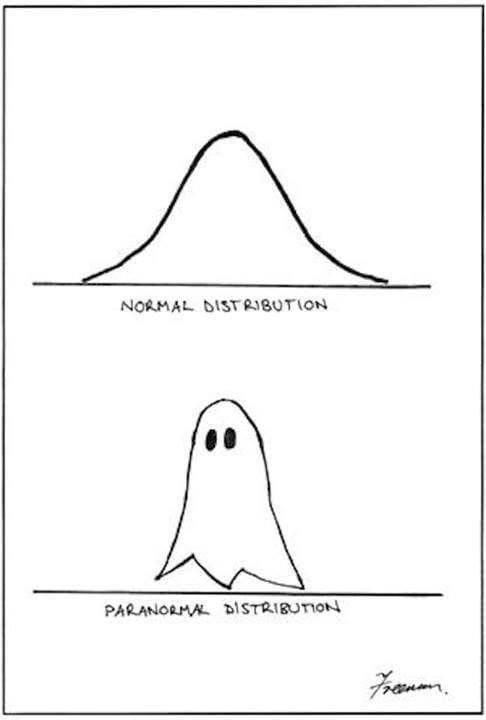
The normal distribution of observation data looks sort of like a ghost. A Distribution  that really looks like a ghost is scary.

The normal distribution of observation data looks sort of like a ghost. A Distribution that really looks like a ghost is scary.

It’s funny because …. the normal distribution curve looks sort-of like a ghost. It’s also funny because it would be possible to imagine data being distributed like the ghost, and most people would be totally clue-less as to how to deal with data like that — abnormal statistics. They’d find it scary and would likely try to ignore the problem. When faced with a statistics problem, most people just hope that the data is normal; they then use standard mathematical methods with a calculator or simulation package and hope for the best.

Take the following example: you’re interested in buying a house near a river. You’d like to analyze river flood data to know your risks. How high will the river rise in 100 years, or 1000. Or perhaps you would like to analyze wind data to know how strong to make a sculpture so it does not blow down. Your first thought is to use the normal distribution math in your college statistics book. This looks awfully daunting (it doesn’t have to) and may be wrong, but it’s all you’ve got.

The normal distribution graph is considered normal, in part, because it’s fairly common to find that measured data deviates from the average in this way. Also, this distribution can be derived from the mathematics of an idealized view of the world, where any variety derives from multiple small errors around a common norm, and not from some single, giant issue. It’s not clear this is a realistic assumption in most cases, but it is comforting. I’ll show you how to do the common math as it’s normally done, and then how to do it better and quicker with no math at all, and without those assumptions.

Lets say you want to know the hundred-year maximum flood-height of a river near your house. You don’t want to wait 100 years, so you measure the maximum flood height every year over five years, say, and use statistics. Lets say you measure 8 foot, 6 foot, 3 foot (a draught year), 5 feet, and 7 feet.

The “normal” approach (pardon the pun), is to take a quick look at the data, and see that it is sort-of normal (many people don’t bother). One now takes the average, calculated here as (8+6+3+5+7)/5 = 5.8 feet. About half the times the flood waters should be higher than this (a good researcher would check this, many do not). You now calculate the standard deviation for your data, a measure of the width of the ghost, generally using a spreadsheet. The formula for standard deviation of a sample is s = √{[(8-5.8)2 + (6-5.8)2 + (3-5.8)2 + (5-5.8)2 + (7-5.8)2]/4} = 1.92. The use of 4 here in the denominator instead of 5 is called the Brussels correction – it refers to the fact that a standard of deviation is meaningless if there is only one data point.

For normal data, the one hundred year maximum height of the river (the 1% maximum) is the average height plus 2.2 times the deviation; in this case, 5.8 + 2.2 x 1.92 = 10.0 feet. If your house is any higher than this you should expect few troubles in a century. But is this confidence warranted? You could build on stilts or further from the river, but you don’t want to go too far. How far is too far?

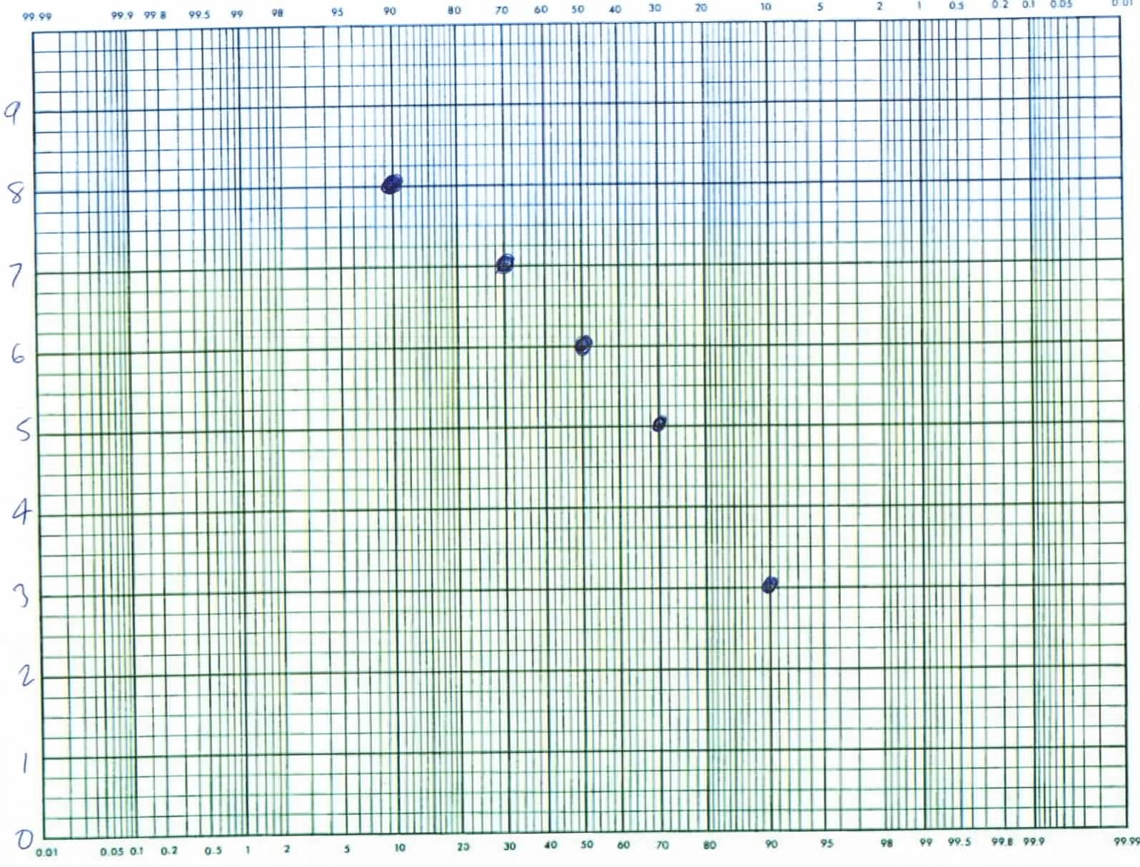
So let’s do this better. We can, with less math, through the use of probability paper. As with any good science we begin with data, not assumptions, like that the data is normal. Arrange the river height data in a list from highest to lowest (or lowest to highest), and plot the values in this order on your probability paper as shown below. That is on paper where likelihoods from .01% to 99.99% are arranged along the bottom — x axis, and your other numbers, in this case the river heights, are the y values listed at the left. Graph paper of this sort is sold in university book stores; you can also get jpeg versions on line, but they don’t look as nice.

probability plot of maximum river height over 5 years -- looks reasonably normal, but slightly ghost-like.

Probability plot of the maximum river height over 5 years. If the data suggests a straight line, like here the data is reasonably normal. Extrapolating to 99% suggests the 100 year flood height would be 9.5 to 10.2 feet, and that it is 99.99% unlikely to reach 11 feet. That’s once in 10,000 years, other things being equal.

For the x axis values of the 5 data points above, I’ve taken the likelihood to be the middle of its percentile. Since there are 5 data points, each point is taken to represent its own 20 percentile; the middles appear at 10%, 30%, 50%, etc. I’ve plotted the highest value (8 feet) at the 10% point on the x axis, that being the middle of the upper 20%. I then plotted the second highest (7 feet) at 30%, the middle of the second 20%; the third, 6 ft at 50%; the fourth at 70%; and the draught year maximum (3 feet) at 90%.  When done, I judge if a reasonably straight line would describe the data. In this case, a line through the data looks reasonably straight, suggesting a fairly normal distribution of river heights. I notice that, if anything the heights drop off at the left suggesting that really high river levels are less likely than normal. The points will also have to drop off at the right since a negative river height is impossible. Thus my river heights describe a version of the ghost distribution in the cartoon above. This is a welcome finding since it suggests that really high flood levels are unlikely. If the data were non-normal, curving the other way we’d want to build our house higher than a normal distribution would suggest. 

You can now find the 100 year flood height from the graph above without going through any the math. Just draw your best line through the data, and look where it crosses the 1% value on your graph (that’s two major lines from the left in the graph above — you may have to expand your view to see the little 1% at top). My extrapolation suggests the hundred-year flood maximum will be somewhere between about 9.5 feet, and 10.2 feet, depending on how I choose my line. This prediction is a little lower than we calculated above, and was done graphically, without the need for a spreadsheet or math. What’s more, our predictions is more accurate, since we were in a position to evaluate the normality of the data and thus able to fit the extrapolation line accordingly. There are several ways to handle extreme curvature in the line, but all involve fitting the curve some way. Most weather data is curved, e.g. normal against a fractal, I think, and this affects you predictions. You might expect to have an ice age in 10,000 years.

The standard deviation we calculated above is related to a quality standard called six sigma — something you may have heard of. If we had a lot of parts we were making, for example, we might expect to find that the size deviation varies from a target according to a normal distribution. We call this variation σ, the greek version of s. If your production is such that the upper spec is 2.2 standard deviations from the norm, 99% of your product will be within spec; good, but not great. If you’ve got six sigmas there is one-in-a-billion confidence of meeting the spec, other things being equal. Some companies (like Starbucks) aim for this low variation, a six sigma confidence of being within spec. That is, they aim for total product uniformity in the belief that uniformity is the same as quality. There are several problems with this thinking, in my opinion. The average is rarely an optimum, and you want to have a rational theory for acceptable variation boundaries. Still, uniformity is a popular metric in quality management, and companies that use it are better off than those that do nothing. At REB Research, we like to employ the quality methods of W. Edwards Deming; we assume non-normality and aim for an optimum (that’s subject matter for a further essay). If you want help with statistics, or a quality engineering project, contact us.

I’ve also meant to write about the phrase “other things being equal”, Ceteris paribus in Latin. All this math only makes sense so long as the general parameters don’t change much. Your home won’t flood so long as they don’t build a new mall up river from you with runoff in the river, and so long as the dam doesn’t break. If these are concerns (and they should be) you still need to use statistics and probability paper, but you will now have to use other data, like on the likelihood of malls going up, or of dams breaking. When you input this other data, you will find the probability curve is not normal, but typically has a long tail (when the dam breaks, the water goes up by a lot). That’s outside of standard statistic analysis, but why those hundred year floods come a lot more often than once in 100 years. I’ve noticed that, even at Starbucks, more than 1/1,000,000,000 cups of coffee come out wrong. Even in analyzing a common snafu like this, you still use probability paper, though. It may be ‘situation normal”, but the distribution curve it describes has an abnormal tail.

by Dr. Robert E. Buxbaum, November 6, 2013. This is my second statistics post/ joke, by the way. The first one dealt with bombs on airplanes — well, take a look.

An Aesthetic of Mechanical Strength

Back when I taught materials science to chemical engineers, I used the following except of a poem to teach an aesthetic for good design, at least as concerns mechanical strength:

“…The secret to design, as the parson explained, is that the weakest part must withstand the strain. And if that part is to withstand the test, then it must be made as strong as all the rest….” (by R.E. Buxbaum, based on “The Wonderful, One-hoss Shay, by Oliver Wendell Holmes, 1858).

I figured that students needed an idea they could remember of what good design looked like. I wanted them to realize that there is always a weakest part in any device or process, and that this is the likely point of failure. Good design accepts this truth and designs everything around it. You make sure that the device will fail at a part or time of your choosing, and that, when it fails (not if), it’s preferably at at time and place where you can repair it easily and cheaply (a fuse, or a door hinge), and that doesn’t cause too much mayhem when it fails. Once this failure part is chosen and in place, I taught that the rest should be stronger, but there is no point in making any other part vastly stronger than your weakest link. Thus for example, once you’ve decided to use a fuse that fails at a certain amperage, there is no point in choosing wiring to take more than 2-3 times the amperage of the fuse.

This is an aesthetic argument, of course, but it’s important for a person to know what good work looks like (to me, and perhaps to the student). An engineer needs a positive view of craftwork beyond compliments from the boss or grades from me. Some day, I’ll be gone, and the boss won’t be looking. Only self-esteem keeps you going.

Many engineering aspects relate to failure points. If you don’t know what the failure point is, make a prototype and test it to failure. Then, if you don’t like what you see, remodel accordingly. If you like the point of failure but decide you really want to make the device stronger or more robust, be aware that this may involve more than strengthening that part only. You may need to re-engineer the entire chain of parts so they are as failure resistant as this part.

I also wanted to teach that there are many failure chains to look out for: many ways that things can wrong beyond breaking. Check for failure by fire, melting, explosion, smell, shock, rust, and even color change. Color change should not be ignored, BTW; there are many products that people won’t use as soon as they look bad (cars, for example). Make sure that each failure chain has it’s own, known weak links. In a car, the paint should fade, chip, or peel before the metal underneath starts rusting or sagging (at least that’s my aesthetic). And in the DuPont gun-powder mill below, one wall should be weaker so that the walls blow outward the right way (away from traffic). Be aware that human error is the most common failure mode: design should be acceptably idiot-proof.

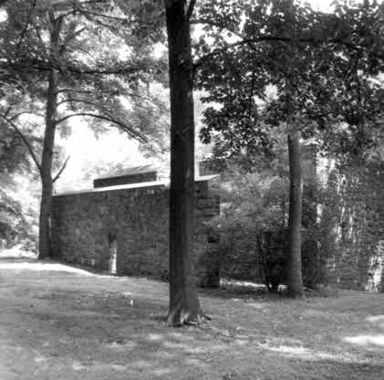
Dupont powder mills had a thinner wall and a stronger wall so that, if there were an explosion it would blow out towards the river. This mill has a second wall to protect workers. The thinner wall should be barely strong enough to stand up to wind and rain; the stronger walls should stand up to explosions that blow out the other wall.

Dupont powder mills had a thinner wall and a stronger wall so that, if there were an explosion, it would blow out ‘safely.’ This mill has a second wall to protect workers. The thinner wall must be strong enough to stand up to wind and rain; the stronger walls should stand up to all likely explosions.

Related to my aesthetic of mechanical strength, I tried to teach an aesthetic of cost, weight, appearance, and green-soundness: Choose materials that are cheaper, rather than more expensive and that weigh less rather than more. Use materials that look better if you’ve the choice, and use recyclable materials. These all derive from the well-known axiom, omit needless stuff. Or, as William of Occam put it, “Entia non sunt multiplicanda sine necessitate.” As an aside, I’ve found that, when engineers use Latin, we sound smarter: “lingua bona lingua motua est.” (a good language is a dead language) — it’s the same with quoting dead 19th century poets. Dead 19th century poets are far better than undead ones, but I digress.

Use of recyclable materials gets you out of lots of problems relative to materials that must be disposed of. E.g. if you use aluminum insulation (recyclable) instead of ceramic fiber, you will have an easier time getting rid of the scrap. As a result, you are not as likely to expose your workers (or you) to mesothelioma, or similar disease. You should not have to pay someone to haul away excess or damaged product; a scraper will oblige, and he may even pay you for it if you have enough. Recycling helps cash flow with decommissioning too, when money is tight. It’s better to find your $1 worth of scrap is now worth $2 instead of discovering that your $1 worth of garbage now costs $2 to haul away. By the way, most heat loss is from black body radiation, so aluminum foil may actually work better than ceramics of the same thermal conductivity.

Buildings can be recycled too. Buy them and sell them as needed. Shipping containers make for great lab buildings because they are cheap, strong, and movable. You can sell them off-site when you’re done. We have a shipping container lab building, and a shipping container storage building — both worth more now than when I bought them. They are also rather attractive with our advertising on them — attractive according to my design aesthetic. Here’s an insight into why chemical engineers earn more than chemists; and insight into the difference between mechanical engineering and civil engineering. Here’s an architecture aesthetic. Here’s one about the scientific method.

Robert E. Buxbaum, October 31, 2013

Lets make a Northwest Passage

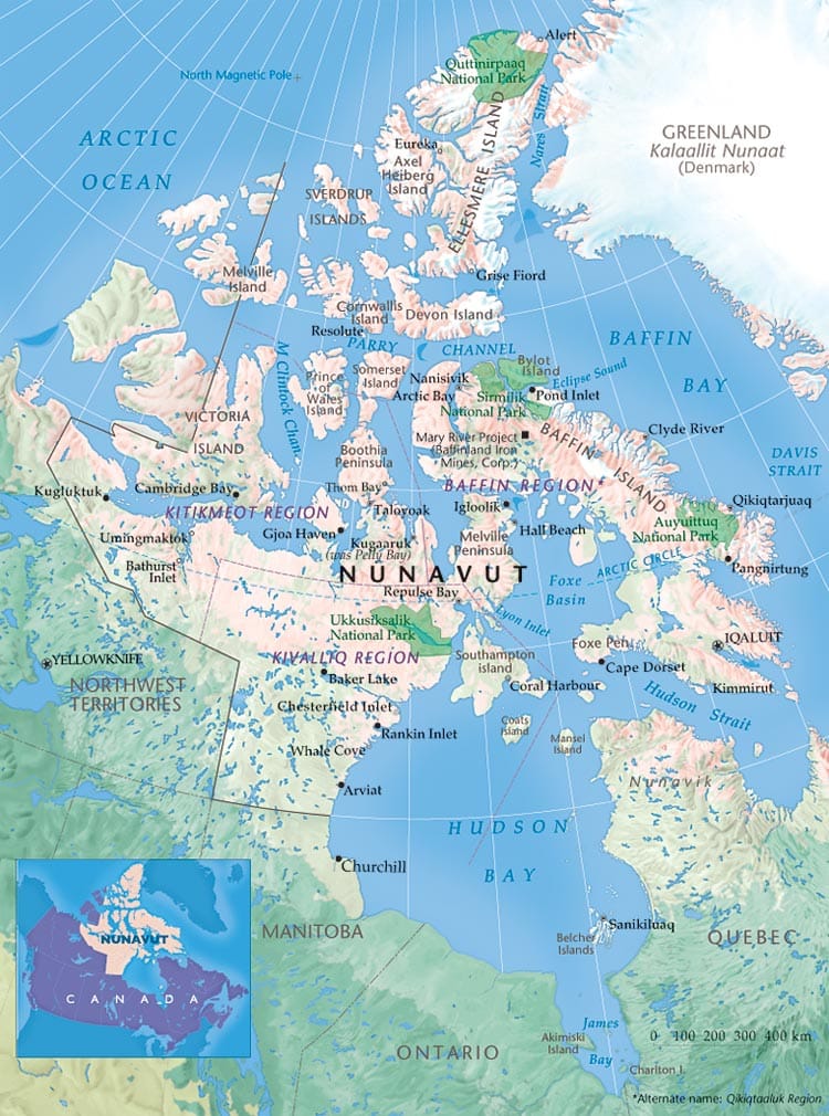
The Northwest passage opened briefly last year, and the two years before allowing some minimal shipping between the Atlantic and the Pacific by way of the Arctic ocean, but was closed in 2013 because there was too much ice. I’ve a business / commercial thought though: we could make a semi-permanent northwest passage if we dredged a canal across the Bootha peninsula at Taloyoak, Nunavut (Canada).Map of Northern Canada showing cities and the Perry Channel, the current Northwest passage. A canal north of the Bootha Peninsula would seem worthwhile.

Map of Northern Canada showing cities and the Perry Channel, the current Northwest passage. A canal north or south of the Bootha Peninsula would seem worthwhile.

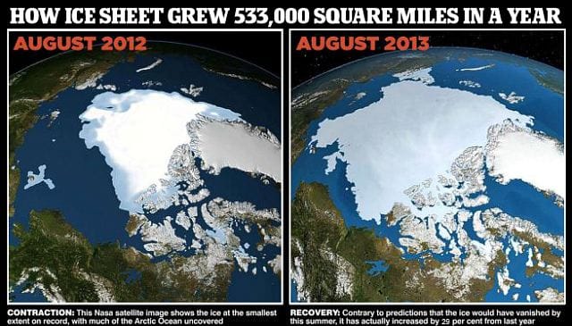
As things currently stand, ships must sail 500 miles north of Taloyoak, and traverse the Parry Channel. Shown below is a picture of ice levels in August 2012 and 2013. The proposed channels could have been kept open even in 2013 providing a route for valuable shipping commerce. As a cheaper alternative, one could maintain the Hudson Bay trading channel at Fort Ross, between the Bootha Peninsula and Somerset Island. This is about 250 miles north of Taloyoak, but still 250 miles south of the current route.

Arctic Ice August 2012-2013; both Taloyoak and Igloolik appear open this year.

The NW passage was open by way of the Perry Channel north of Somerset Island and Baffin Island in 2012, but not 2013. The proposed channels could have been kept open even this year.

Dr. Robert E. Buxbaum, October 2013. Here are some random thoughts on Canadian crime, the true north, and the Canadian pastime (Ice fishing).

Why random experimental design is better

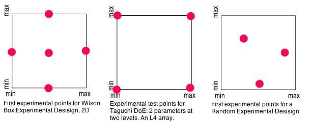
In a previous post I claimed that, to do good research, you want to arrange experiments so there is no pre-hypothesis of how the results will turn out. As the post was long, I said nothing direct on how such experiments should be organized, but only alluded to my preference: experiments should be organized at randomly chosen conditions within the area of interest. The alternative, shown below is that experiments should be done at the cardinal points in the space, or at corner extremes: the Wilson Box and Taguchi design of experiments (DoE), respectively. Doing experiments at these points implies a sort of expectation of the outcome; generally that results will be linearly, orthogonal related to causes; in such cases, the extreme values are the most telling. Sorry to say, this usually isn’t how experimental data will fall out. First experimental test points according to a Wilson Box, a Taguchi, and a random experimental design. The Wilson box and Taguchi are OK choices if you know or suspect that there are no significant non-linear interactions, and where experiments can be done at these extreme points. Random is the way nature works; and I suspect that's best -- it's certainly easiest.

First experimental test points according to a Wilson Box, a Taguchi, and a random experimental design. The Wilson box and Taguchi are OK choices if you know or suspect that there are no significant non-linear interactions, and where experiments can be done at these extreme points. Random is the way nature works; and I suspect that’s best — it’s certainly easiest.

The first test-points for experiments according to the Wilson Box method and Taguchi method of experimental designs are shown on the left and center of the figure above, along with a randomly chosen set of experimental conditions on the right. Taguchi experiments are the most popular choice nowadays, especially in Japan, but as Taguchi himself points out, this approach works best if there are “few interactions between variables, and if only a few variables contribute significantly.” Wilson Box experimental choices help if there is a parabolic effect from at least one parameter, but are fairly unsuited to cases with strong cross-interactions.

Perhaps the main problems with doing experiments at extreme or cardinal points is that these experiments are usually harder than at random points, and that the results from these difficult tests generally tell you nothing you didn’t know or suspect from the start. The minimum concentration is usually zero, and the minimum temperature is usually one where reactions are too slow to matter. When you test at the minimum-minimum point, you expect to find nothing, and generally that’s what you find. In the data sets shown above, it will not be uncommon that the two minimum W-B data points, and the 3 minimum Taguchi data points, will show no measurable result at all.

Randomly selected experimental conditions are the experimental equivalent of Monte Carlo simulation, and is the method evolution uses. Set out the space of possible compositions, morphologies and test conditions as with the other method, and perhaps plot them on graph paper. Now, toss darts at the paper to pick a few compositions and sets of conditions to test; and do a few experiments. Because nature is rarely linear, you are likely to find better results and more interesting phenomena than at any of those at the extremes. After the first few experiments, when you think you understand how things work, you can pick experimental points that target an optimum extreme point, or that visit a more-interesting or representative survey of the possibilities. In any case, you’ll quickly get a sense of how things work, and how successful the experimental program will be. If nothing works at all, you may want to cancel the program early, if things work really well you’ll want to expand it. With random experimental points you do fewer worthless experiments, and you can easily increase or decrease the number of experiments in the program as funding and time allows.

Consider the simple case of choosing a composition for gunpowder. The composition itself involves only 3 or 4 components, but there is also morphology to consider including the gross structure and fine structure (degree of grinding). Instead of picking experiments at the maximum compositions: 100% salt-peter, 0% salt-peter, grinding to sub-micron size, etc., as with Taguchi, a random methodology is to pick random, easily do-able conditions: 20% S and 40% salt-peter, say. These compositions will be easier to ignite, and the results are likely to be more relevant to the project goals.

The advantages of random testing get bigger the more variables and levels you need to test. Testing 9 variables at 3 levels each takes 27 Taguchi points, but only 16 or so if the experimental points are randomly chosen. To test if the behavior is linear, you can use the results from your first 7 or 8 randomly chosen experiments, derive the vector that gives the steepest improvement in n-dimensional space (a weighted sum of all the improvement vectors), and then do another experimental point that’s as far along in the direction of that vector as you think reasonable. If your result at this point is better than at any point you’ve visited, you’re well on your way to determining the conditions of optimal operation. That’s a lot faster than by starting with 27 hard-to-do experiments. What’s more, if you don’t find an optimum; congratulate yourself, you’ve just discovered an non-linear behavior; something that would be easy to overlook with Taguchi or Wilson Box methodologies.

The basic idea is one Sherlock Holmes pointed out (Study in Scarlet): It is a capital mistake to theorize before one has data. Insensibly one begins to twist facts to suit theories, instead of theories to suit facts.” (Case of Identity). Life is infinitely stranger than anything which the mind of man could invent.

Robert E. Buxbaum, September 11, 2013. A nice description of the Wilson Box method is presented in Perry’s Handbook (6th ed). SInce I had trouble finding a free, on-line description, I linked to a paper by someone using it to test ingredient choices in baked bread. Here’s a link for more info about random experimental choice, from the University of Michigan, Chemical Engineering dept. Here’s a joke on the misuse of statistics, and a link regarding the Taguchi Methodology. Finally, here’s a pointless joke on irrational numbers, that I posted for pi-day.

Surrealists art joke

How many surrealists does it take to screw in a lightbulb.

The fish.

Surrealism aims to show the reality that exceeds realism; the dream-like absurd that is beyond the rational, common-sensical and practical. Beyond control engineering.

And you know “How many engineers would it take to screw in a lightbulb?” —- “Minimally two, and it would have to be a very large lightbulb.”

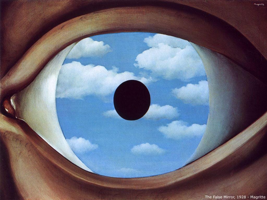
Even if the insights of surrealism are common-place, for example, that the eye is a false mirror of the world, I like is that they become real (if the surrealist is talented.)

False Mirror by Magritte; The idea, I suppose is that the eye is a false mirror of the world, seeing what's already within it.

False Mirror by Magritte; the idea, I suppose is that we see what’s already within us.

“The greatest obstacle to discovering the shape of the earth, the continents, and the oceans was not ignorance but the illusion of knowledge.” What I particularly like is the falseness of the mirror is shown as both false and true. The world is rarely this or that. Another insight / joke.

We all have masks, especially with those we love.

We all have masks, especially with those we love.

I imagine most I could make second-rate surrealistic works. The way to know your work is second rate it’s beautiful and insightful, but not funny.

Creation of Man-the-militant in the style of Michelangelo

Creation of Man-the-militant. Kuksi. It’s well done, and interesting (a retake on Michelangelo), but it’s not funny. See my cartoon in mechanical v civil engineers joke.

And then there is bad modern art. You could argue that this isn’t surreal, but some sort of other modern art, or post modern art. But that’s all false: it’s just bad art.

Bad modern art: little skill, little meaning, no humor. If you have to ask: "is it art?" It usually isn't.

Bad modern art: little skill, little meaning, no humor. If you have to ask: “is it art?” It usually isn’t.

If you buy something like this, and put it in your corporate headquarters lobby, the joke’s on you, and the artist is laughing his or her way to the bank.  Here is a link to why surrealism should be funny, And why architecture should not be (someone’s got to live in that joke).

R. E. Buxbaum, August 5, 2013

Mechanical Engineer v Civil Engineer Joke

What’s the difference between a mechanical engineer and a civil engineer?

Mechanical engineers make weapons, and civil engineers make targets.

Is funny because ….. it’s sort of true. Much of engineering is war-related, and always was. In earlier times, an engineer was someone who made engines of war: catapults, battering rams, and the like. Nowadays, mechanical engineers are the main designers for tanks, cannons, and ships. A civil engineer is one whose projects have civilian applications. But as these projects have military uses (roads, ports, offices, and bridges, for example), civilian projects are major targets for an opposing army.

An observation about war and peace: if you are really at making peacetime products, you’re a hero in your country and outside; if you design weapons, you are vilified by the enemy and likely to become a prisoner in your own land. Consider the designers of the atom bomb in the US, Russia, Israel, India, or Iran. They can’t go abroad, and are likely suspect at home. The leaders have to worry that these scientists will give the same weapons to their enemies (it’s happened) or that they will not be dedicated enough to make the next iteration of the weapon (ditto).

My advice: specialize items for peacetime or civilian use if you can. Those who make better cars, music, art or architecture are welcome everywhere; advances in death usually rebound on the inventor. Here’s a joke comparing chemists and chemical engineers, a piece on a favorite car engine advance, on perfect tuning of musical instrumentsan architecture joke, and a control engineer joke. People like civil engineers.

What sort of guy does a king keep locked in the castle dungeon — not the common thief.  #wordstothewise.

R. E. Buxbaum, August 1, 2013. I’m a chemical engineer, who makes hydrogen stuff and consults, mostly for peace-time use.

Global warming takes a 15 year rest

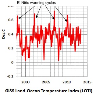
I have long thought that global climate change was chaotic, rather than steadily warming. Global temperatures show self-similar (fractal) variation with time and long-term cycles; they also show strange attractors generally states including ice ages and El Niño events. These are sudden rests of the global temperature pattern, classic symptoms of chaos. The standard models of global warming is does not predict El Niño and other chaotic events, and thus are fundamentally wrong. The models assume that a steady amount of sun heat reaches the earth, while a decreasing amount leaves, held in by increasing amounts of man-produced CO2 (carbon dioxide) in the atmosphere. These models are “tweaked” to match the observed temperature to the CO2 content of the atmosphere from 1930 to about 2004. In the movie “An Inconvenient Truth” Al Gore uses these models to predict massive arctic melting leading to a 20 foot rise in sea levels by 2100. To the embarrassment of Al Gore, and the relief of everyone else, though COconcentrations continue to rise, global warming took a 15 year break starting shortly before the movie came out, and the sea level is, more-or-less where it was except for temporary changes during periodic El Niño cycles.

Global temperature variation Fifteen years and four El Niño cycles, with little obvious change. Most models predict .25°C/decade.

Fifteen years of global temperature variation to June 2013; 4 El Niños but no sign of a long-term change.

Hans von Storch, a German expert on global warming, told the German newspaper, der Spiegel: “We’re facing a puzzle. Recent CO2 emissions have actually risen even more steeply than we feared. As a result, according to most climate models, we should have seen temperatures rise by around 0.25 degrees Celsius (0.45 degrees Fahrenheit) over the past 10 years. That hasn’t happened. [Further], according to the models, the Mediterranean region will grow drier all year round. At the moment, however, there is actually more rain there in the fall months than there used to be. We will need to observe further developments closely in the coming years.”

Aside from the lack of warming for the last 15 years, von Storch mentions that there has been no increase in severe weather. You might find that surprising given the news reports; still it’s so. Storms are caused by temperature and humidity differences, and these have not changed. (Click here to see why tornadoes lift stuff up).

At this point, I should mention that the majority of global warming experts do not see a problem with the 15 year pause. Global temperatures have been rising unsteadily since 1900, and even von Storch expects this trend to continue — sooner or later. I do see a problem, though, highlighted by the various chaotic changes that are left out of the models. A source of the chaos, and a fundamental problem with the models could be with how they treat the effects of water vapor. When uncondensed, water vapor acts as a very strong thermal blanket; it allows the sun’s light in, but prevents the heat energy from radiating out. CObehaves the same way, but weaker (there’s less of it).

More water vapor enters the air as the planet warms, and this should amplify the CO2 -caused run-away heating except for one thing. Every now and again, the water vapor condenses into clouds, and then (sometimes) falls as rain or show. Clouds and snow reflect the incoming sunlight, and this leads to global cooling. Rain and snow drive water vapor from the air, and this leads to accelerated global cooling. To the extent that clouds are chaotic, and out of man’s control, the global climate should be chaotic too. So far, no one has a very good global model for cloud formation, or for rain and snowfall, but it’s well accepted that these phenomena are chaotic and self-similar (each part of a cloud looks like the whole). Clouds may also admit “the butterfly effect” where a butterfly in China can cause a hurricane in New Jersey if it flaps at the right time.

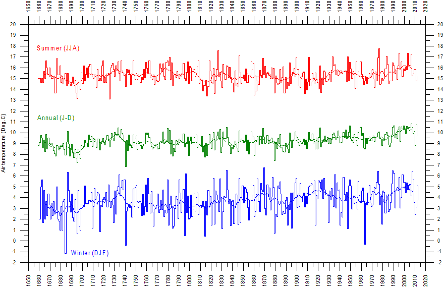
For those wishing to examine the longer-range view, here’s a thermal history of central England since 1659, Oliver Cromwell’s time. At this scale, each peak is an El Niño. There is a lot of chaotic noise, but you can also notice either a 280 year periodicity (lat peak around 1720), or a 100 year temperature rise beginning about 1900.

Global warming; Central England Since 1659; From http://www.climate4you.com

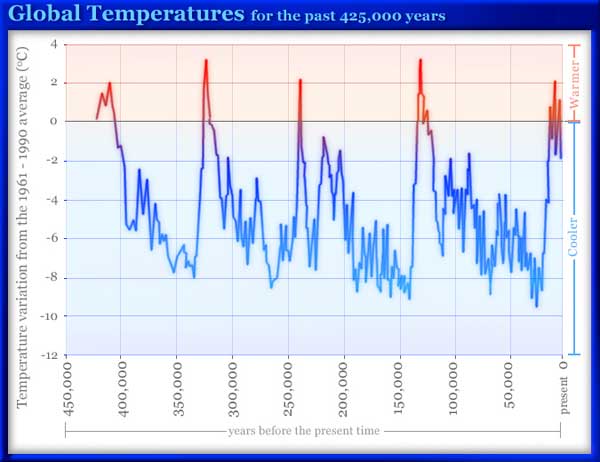
It is not clear that the cycle is human-caused,but my hope is that it is. My sense is that the last 100 years of global warming has been a good thing; for agriculture and trade it’s far better than an ice age. If we caused it with our  CO2, we could continue to use CO2 to just balance the natural tendency toward another ice age. If it’s chaotic, as I suspect, such optimism is probably misplaced. It is very hard to get a chaotic system out of its behavior. The evidence that we’ve never moved an El Niño out of its normal period of every 3 to 7 years (expect another this year or next). If so, we should expect another ice age within the next few centuries.

Global temperatures measured from the antarctic ice showing stable, cyclic chaos and self-similarity.

Global temperatures measured from the antarctic ice showing 4 Ice ages.

Just as clouds cool the earth, you can cool your building too by painting the roof white. If you are interested in more weather-related posts, here’s why the sky is blue on earth, and why the sky on Mars is yellow.

Robert E. Buxbaum July 27, 2013 (mostly my business makes hydrogen generators and I consult on hydrogen).

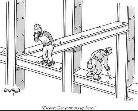
Escher Architecture – joke?

Caption will say where this is from.

Robert  Leighton, from the New Yorker,

Is funny because …. there’s an Escher-like impossible structure and a dirty word (ass, tee hee). Besides that, this joke highlights a fundamental conflict between the architect and the client (customer): what is good architecture?

Typically the customer whats a home or office that “looks nice”, “doesn’t cost too much”, and “works,” perhaps as an advertisement for the company. Often the architect wants to make a statement for him/herself, or wants to produce a work of art. Left to their own, architects can produce expensive monuments that no one can live in.

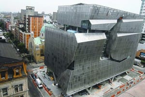
A wonderful (horrible) case concerns The Cooper Union, my alma mater, and more-or-less the only free college in America. The Cooper Union was founded by an inventive mechanic, Peter Cooper, see my biography, who invented jello, and rolled steel, laid the transatlantic cable, founded AT&T, and managed to give free education to a century and a half of students. The trustees of the school tore down the old, serviceable building, sold the land, and built a $270,000,000 dollar monstrosity. Hailed by the New York Times as great architecture, it bankrupted the school, and is unusable for the sort of hands-on education that Peter Cooper devised.

In hopes of attracting a rich donor, Cooper Union borrowed $175 million to erect this grotesque building for its engineering department. No donor materialized, and, as a result, the school’s 155-year-old policy of free tuition has vaporized.

In hopes of attracting a rich donor, Cooper Union sold its engineering building and borrowed $175 million to erect this replacement. No donor materialized, and, with it, a 155-year-old policy of free tuition.

Here’s a surrealist jokean engineer joke, and a thought on control engineering. Here too is a  sculpture I put on top of my building; the eyes follow you.

R.E. Buxbaum, July 8, 2013; I do consulting on hydrogen, and my company makes hydrogen products.

Control engineer joke

What made the control engineer go crazy?

He got positive feedback.

Is funny because …… it’s a double entente, where both meanings are true: (1) control engineers very rarely get compliments (positive feedback); the aim of control is perfection, something that’s unachievable for a dynamic system (and generally similar to near perfection: the slope at a maximum is zero). Also (2) systems go unstable if the control feedback is positive. This can happen if the controller was set backwards, but more usually happens when the response is too fast or too extreme. Positive feedback pushes a system further to error and the process either blows up, or (more commonly) goes wildly chaotic, oscillating between two or more “strange attractor” states.

It seems to me that hypnosis, control-freak love, and cult behaviors are the result of intentionally produced positive feedback. Palsies, economic cycles, and global warming are more likely the result of unintentional positive feedback. In each case, the behavior is oscillatory chaotic.

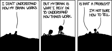
The  normal state of Engineering is lack of feedback. Perhaps this is good because messed up feedback leads to worse results. From xykd.

Our brains give little reliable feedback on how well they work, but that may be better than strong, immediate feedback, as that could lead to bipolar instability. From xkcd. For more on this idea, see Science and Sanity, by Alfred Korzbski (mini youtube)

Control engineers tend to be male (85%), married (80%), happy people (at least they claim to be happy). Perhaps they know that near-perfection is close enough for a complex system in a dynamic world, or that one is about as happy as believes ones-self to be. It also helps that control engineer salaries are about $95,000/ year with excellent benefits and low employment turnover.

Here’s a chemical engineer joke I made up, and an older engineering joke. If you like, I’ll be happy to consult with you on the behavior of your processes.

By Dr. Robert E. Buxbaum, July 4, 2013

Chemist v Chemical Engineer joke

What’s the difference between a chemist and a chemical engineer?

How much they make.

I made up this joke up as there were no other chemical engineer jokes I knew. It’s an OK double entente that’s pretty true — both in terms of product produced and the amount of salary (there’s probably a cause-and-effect relation here). Typical of these puns, this joke ignores the internal differences in methodologies and background (see my post, How is Chemical engineering?). If you like, here’s another engineering joke,  a chemistry joke, and a dwarf joke.

R.E. Buxbaum –  June 28, 2013.