Category Archives: quality

A mathematical approach to finding Mr (or Ms) Right.

A lot of folks want to marry their special soulmate, and there are many books to help get you there, but I thought I might discuss a mathematical approach that optimizes your chance of marrying the very best under some quite-odd assumptions. The set of assumptions is sometimes called “the fussy suitor problem” or the secretary problem. It’s sometimes presented as a practical dating guide, e.g. in a recent Washington Post article. My take, is that it’s not a great strategy for dealing with the real world, but neither is it total nonsense.

The basic problem was presented by Martin Gardner in Scientific American in 1960 or so. Assume you’re certain you can get whoever you like (who’s single); assume further that you have a good idea of the number of potential mates you will meet, and that you can quickly identify who is better than whom; you have a desire to marry none but the very best, but you don’t know who’s out there until you date, and you’ve an the inability to go back to someone you’ve rejected. This might be he case if you are a female engineering student studying in a program with 50 male engineers, all of whom have easily bruised egos. Assuming the above, it is possible to show, using Riemann Integrals (see solution here), that you maximize your chance of finding Mr/Ms Right by dating without intent to marry 36.8 % of the fellows (1/e), and then marrying the first fellow who’s better than any of the previous you’ve dated. I have a simpler, more flexible approach to getting the right answer, that involves infinite serieses; I’ll hope to show off some version of this at a later date.

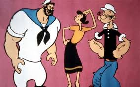
Bluto, Popeye, or wait for someone better? In the cartoon as I recall, she rejects the first few people she meets, then meets Bluto and Popeye. What to do?

With this strategy, one can show that there is a 63.2% chance you will marry someone, and a 36.8% you’ll wed the best of the bunch. There is a decent chance you’ll end up with number 2. You end up with no-one if the best guy appears among the early rejects. That’s a 36.8% chance. If you are fussy enough, this is an OK outcome: it’s either the best or no-one. I don’t consider this a totally likely assumption, but it’s not that bad, and I find you can recalculate fairly easily for someone OK with number 2 or 3. The optimal strategy then, I think, is to date without intent at the start, as before, but to take a 2nd or 3rd choice if you find you’re unmarried after some secondary cut off. It’s solvable by series methods, or dynamic computing.

It’s unlikely that you have a fixed passel of passive suitors, of course, or that you know nothing of guys at the start. It also seems unlikely that you’re able to get anyone to say yes or that you are so fast evaluating fellows that there is no errors involved and no time-cost to the dating process. The Washington Post does not seem bothered by any of this, perhaps because the result is “mathematical” and reasonable looking. I’m bothered, though, in part because I don’t like the idea of dating under false pretense, it’s cruel. I also think it’s not a winning strategy in the real world, as I’ll explain below.

One true/useful lesson from the mathematical solution is that it’s important to learn from each date. Even a bad date, one with an unsuitable fellow, is not a waste of time so long as you leave with a better sense of what’s out there, and of what you like. A corollary of this, not in the mathematical analysis but from life, is that it’s important to choose your circle of daters. If your circle of friends are all geeky engineers, don’t expect to find Prince Charming among them. If you want Prince Charming, you’ll have to go to balls at the palace, and you’ll have to pass on the departmental wine and cheese.

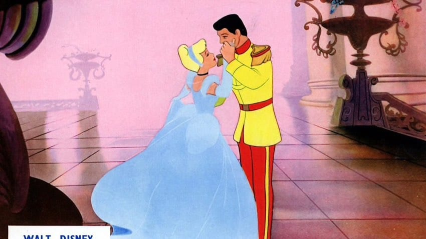
If you want Prince Charming, you may have to associate with a different crowd from the one you grew up with. Whether that’s a good idea for a happy marriage is another matter. By the way, perfect people are rarely perfect; it’s usually better to find one you relate to. I suspect that Cinderella here will be bored in the palace, like Princess Diana was.

The assumptions here that you know how many fellows there are is not a bad one, to my mind. Thus, if you start dating at 16 and hope to be married by 32, that’s 16 years of dating. You can use this time-frame as a stand in for total numbers. Thus if you decide to date-for-real after 37%, that’s about age 22, not an unreasonable age. It’s younger than most people marry, but you’re not likely to marry the fort person you meet after age 22. Besides, it’s not great dating into your thirties — trust me, I’ve done it.

The biggest problem with the original version of this model, to my mind, comes from the cost of non-marriage just because the mate isn’t the very best, or might not be. This cost gets worse when you realize that, even if you meet prince charming, he might say no; perhaps he’s gay, or would like someone royal, or richer. Then again, perhaps the Kennedy boy is just a cad who will drop you at some time (preferably not while crossing a bridge). I would therefor suggest, though I can’t show it’s optimal that you start out by collecting information on guys (or girls) by observing the people around you who you know: watch your parents, your brothers and sisters, your friends, uncles, aunts, and cousins. Listen to their conversation and you can get a pretty good idea of what’s available even before your first date. If you don’t like any of them, and find you’d like a completely different circle, it’s good to know early. Try to get a service job within ‘the better circle’. Working with people you think you might like to be with, long term, is a good idea even if you don’t decide to marry into the group in the end.

Once you’ve observed and interacted with the folks you think you might like, you can start dating for real from the start. If you’re super-organized, you can create a chart of the characteristics and ‘tells’ of characteristics you really want. Also, what is nice but not a deal-breaker. For these first dates, you can figure out the average and standard deviation, and aim for someone in the top 5%. A 5% target is someone whose two standard deviations above the average. This is simple Analysis of variation math (ANOVA), math that I discussed elsewhere. In general you’ll get to someone in the top 5% by dating ten people chosen with help from friends. Starting this way, you’ll avoid being unreasonably cruel to date #1, nor will you loose out on a great mate early on.

Some effort should be taken to look at the fellow’s family and his/her relationship with them. If their relationship is poor, or their behavior is, your kids may turn out similar.

After a while, you can say, I’ll marry the best I see, or the best that seems like he/she will say yes (a smaller sub-set). You should learn from each date, though, and don’t assume you can instantly size someone up. It’s also a good idea to meet the family since many things you would not expect seem to be inheritable. Meeting some friends too is a good idea. Even professionals can be fooled by a phony, and a phony will try to hide his/her family and friends. In the real world, dating should take time, and even if you discover that he/ she is not for you, you’ll learn something about what is out there: what the true average and standard deviation is. It’s not even clear that people fall on a normal distribution, by the way.

Don’t be too upset if you reject someone, and find you wish you had not. In the real world you can go back to one of the earlier fellows, to one of the rejects, if one does not wait too long. If you date with honesty from the start you can call up and say, ‘when I dated you I didn’t realize what a catch you were’ or words to that effect. That’s a lot better than saying ‘I rejected you based on a mathematical strategy that involved lying to all the first 36.8%.’

Robert Buxbaum, December 9, 2019. This started out as an essay on the mathematics of the fussy suitor problem. I see it morphed into a father’s dating advice to his marriage-age daughters. Here’s the advice I’d given to one of them at 16. I hope to do more with the math in a later post.

The main route of lead poisoning is from the soil by way of food, dust, and smoke.

While several towns have had problems with lead in their water, the main route for lead entering the bloodstream seems to be from the soil. The lead content in the water can be controlled by chemical means that I reviewed recently. Lead in the soil can not be controlled. The average concentration of lead in US water is less than 1 ppb, with 15 ppb as the legal limit. According to the US geological survey, of lead in the soil, 2014., the average concentration of lead in US soil is about 20 ppm. That’s more than 1000 times the legal limit for drinking water, and more than 20,000 times the typical water concentration. Lead is associated with a variety of health problems, including development problems in children, and 20 ppm is certainly a dangerous level. Here are the symtoms of lead poisoning.

Several areas have deadly concentrations of lead and other heavy metals. Central Colorado, Kansas, Washington, and Nevada is particularly indicated. These areas are associated with mining towns with names like Leadville, Telluride, Silverton, Radium, or Galena. If you live in an areas of high lead, you should probably not grow a vegetable garden, nor by produce at the local farmer’s market. Even outside of these towns, it’s a good idea to wash your vegetables to avoid eating the dirt attached. There are hardly any areas of the US where the dust contains less than 1000 times the lead level allowed for water.

Lead content of US soils, from the US geological survey of soils, 2014. Michigan doesn’t look half bad.

Breathing the dust near high-lead towns is a problem too. The soil near Telluride Colorado contains 1010 mg/kg lead, or 0.1%. On a dust-blown day in the area, you could breath several grams of the dust, each containing 1 mg of lead. That’s far more lead than you’d get from 1000 kg of water (1000 liters). Tests of blood lead levels, show they rise significantly in the summer, and drop in the winter. The likely cause is dust: There is more dust in the summer.

Recalled brand of curry powder associated with recent poisoning.

Produce is another route for lead entering the bloodstream. Michigan produce is relatively safe, as the soil contains only about 15 ppm, and levels in produce are generally far smaller than in the soil. Ohio soils contains about three times as much lead, and I’d expect the produce to similarly contain 3 times more lead. That should still be safe if you wash your food before eating. When buying from high-lead states, like Colorado and Washington, you might want to avoid produce that concentrates heavy metals. According Michigan State University’s outreach program, those are leafy and root vegetables including mustard, carrots, radishes, potatoes, lettuce, spices, and collard. Fruits do not concentrate metals, and you should be able to buy them anywhere. (I’d still avoid Leadville, Telluride, Radium, etc.). Spices tend to be particularly bad routes for heavy metal poisoning. Spices imported from India and Soviet Georgia have been observed to have as much as 1-2% lead and heavy metal content; saffron, curry and fenugreek among the worst. A recent outbreak of lead poisoning in Oakland county, MI in 2018 was associated with the brand of curry powder shown at left. It was imported from India.

Marijuana tends to be grown in metal polluted soil because it tolerates soil that is too polluted fro most other produce. The marijuana plant concentrates the lead into the leaves and buds, and smoking sends it to the lungs. While tobacco smoking is bad, tobacco leaves are washed and the tobacco products are regulated and tested for lead and other heavy metals. If you choose to smoke cigarettes, I’d suggest you chose brands that are low in lead. Here is an article comparing the lead levels of various brands. . Better yet, I’s suggest that you vape. There are several advantages of vaping relative to smoking the leaf directly. One of them is that the lead is removed in the process of making concentrate.

Some states test the lead content of marijuana; Michigans and Colorado do not, and even in products that are tested, there have been scandals that the labs under-report metal levels to help keep tainted products on the shelves. There is also a sense that the high cost encourages importers to add lead dust deliberately to increase the apparent density. I would encourage the customer to buy vape or tested products, only.

Here is a little song, “pollution” from Tom Lehrer, to lighten the mood.

Robert Buxbaum, November 24, 2019. I ran for water commissioner in 2016 and lost. I may run again in 2020. Who knows, this time I may win.

Harvard Eunuchs

Success is measured in different ways in different cultures. Among US academics, the first mark of success is going to a great college. If you graduate from Eureka college, as Ronald Reagan did, you are pretty-well assumed to be an idiot; if you went to Harvard and Princeton, as John Kennedy did, you’re off on a good start to popular acclaim, even if your entry essay was poor, and you got thrown out of one because of cheating. Graduation from a top college does not guarantee being seen as a success forever, though. You have to continue in the Harvard way: use big words — something that puts-off the less-educated; you have to win awards, write books or articles; have the right politics; work at a high power job and money, meet the right people, exercise regularly, etc. It’s hard work being successful; disposable income is tight, and one rarely has time for kids.

Fertility rates, 1950 and now

Fertility rates compared, world-wide, 1970 vs 2014.

By contrast, in ancient societies, success included food, leisure, land, and general respect. A successful person is seated at the front of the church, and consulted as few academics are. And there is another great measure: children. In traditional societies, children are valued, They are seen as a joy in your youth, and a comfort in your old age. They are you and your wife reborn, with reborn wonder. They are your future, and the defenders of your legacy; ready to take on the world with an outlook of their own, but one that you had a unique chance to mold. In the Bible, children are a sign of blessing, and the opposite is explicitly stated as a punishment for violating God’s commands.

I have come to wonder why rich countries have so few children, and why successful people in rich countries have yet fewer than the average. These people and countries are no worse than others, yet they are common. Harvard produces a surprising number of “Legal Eunuchs” — people with a refined place in society, but no time or children; people who work tirelessly for the pleasure and success of others. Harvard couples marry late, or not at all. If they marry, they usually produce childless households, DINKs — Double Income No Kids.

The same pattern is seen in Europe, UK, Japan, Canada, Russia, and China, as the map above shows. Particularly among the élite, the great works are being created for the deplorables and their children. Could anything be more depressing?

The seven things include that Eunuchs can be trusted, that they love to serve, that they are compassionate, that they are passionate (for excellence) and that they have fewer distractions.

There’s and organization for everything these days. In this case, the seven things you didn’t know include that Eunuchs can be trusted, that they love to serve, that they are compassionate, that they are passionate for excellence, and that they have fewer distractions. This is the opposite of toxic masculinity, but it comes at a cost. 

I think one reason for the growing ranks of Harvard Eunuchs is a dislike of masculinity; masculinity is sort-of toxic,  associated with war, revolution, and selfishness. In the 1800s, only Republicans and Communists had beards; the more-refined gentleman did not. The eunuch qualities listed above, are considered noble, charitable, and selfless. Clearly it helps others if you are selfless, but why do it? I think the answer is self-doubt about ones worthiness to enjoy the fruits of your labor. To get to Harvard takes striving, and that relates to a degree of self-doubt and loathing about your worthiness today.

I graduated from Cooper Union, and went to Princeton for graduate school. It was a magical place, I became machines chairman, then chairman of the Graduate College House Committee. I dealt with a lot of very bright, accomplished people, and a pattern I saw often was self-doubt and loathing. And the most accomplished students were the ones with the most self-loathing. It made them strive to be better; it drove the innovative research and the grant writing. It motivated graduates to try to become professors (only a few would succeed) or judges, or financiers, or politicians. All that takes time, striving, and putting off your wants in the here-and-now, for a reward to the future you that is worthy. It’s a system that produces greatness, but at great personal cost.

So what’s to be done? How do you help yourself, or some other, the bright, educated fellow see that he or she is good enough. Unfortunately, for those in the system, good enough equals bad. I found it helped to say, in my own words, the words or Solomon:”Eat, drink, and enjoy yourself.” “It is not good to be over-wise… Why wear yourself out?” Not that these words changed them, but they did seem to give comfort. I’d suggest the write things that were honest; that people understand, and that they take time for themselves. “May your fountain be blessed, and enjoy the wife of your youth.” (Ps.127:3-4, Ecc.8:15, Pr.5:18…) It suffices to retell old truths and raise a new generation. Only make sure that what you have to say is honest and logical, and trust your own value. As for toxic masculinity, it can have its own charm.

Robert E. Buxbaum, January 29, 2019. I got the title for this article, and the idea, from the phrase, “Legal Eunuchs” in this wonderful book review (2005) by Alan Dershowitz.

A British tradition of inefficiency and silliness

While many British industries are forward thinking and reasonably efficient, i find Britons take particular pride in traditional craftsmanship. That is, while the Swiss seem to take no particular pride in their coo-coo clocks, the British positively glory in their handmade products: hand-woven, tweed jackets, expensive suits, expensive whiskey, and hand-cut diamonds. To me, an American-trained engineer, “traditional craftsmanship,” of this sort is another way of saying silly and in-efficient. Not having a better explanation, I associate these behaviors with the decline of English power in the 20th century. England went from financial and military preëminence in 1900 to second-tier status a century later. It’s an amazing change that I credit to tradition-bound inefficiency — and socialism.

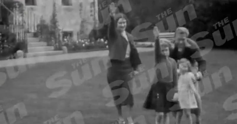
Queen Elizabeth and Edward VII give the Nazi solute.

Queen Elizabeth and Edward VII give the Nazi solute.

Britain is one of only two major industrial nations to have a monarch and the only one where the monarch is an actual ambassador. The British Monarchy is not all bad, but it’s certainly inefficient. Britain benefits from the major royals, the Queen and crown prince in terms of tourism and good will. In this she’s rather like our Mickey Mouse or Disneyland. The problem for England has to do with the other royals, We don’t spend anything on Mickey’s second cousins or grandchildren. And we don’t elevate Micky’s relatives to military or political prominence. England’s royal leaders gave it horrors like the charge of the light brigade in the Crimean war (and the Crimean war itself), Natzi-ism doing WWII, the Grand Panjandrum in WWII, and the attack on Bunker Hill. There is a silliness to its imperialism via a Busby-hatted military. Britain’s powdered-wigged jurors are equally silly.

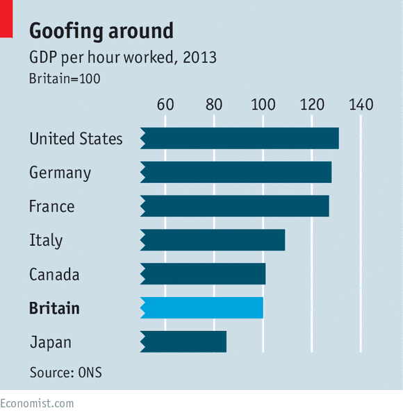
Per hour worker productivity in the industrial world.

Per hour worker productivity in the industrial world.

As the chart shows, England has the second lowest per-hour productivity of the industrial world. Japan, the other industrial giant with a monarch, has the lowest. They do far better per worker-year because they work an ungodly number of hours per year. French and German workers produce 20+% more per hour: enough that they can take off a month each year and still do as well. Much of the productivity advantage of France, Germany, and the US derive from manufacturing and management flexibility. US Management does not favor as narrow a gene pool. Our workers are allowed real input into equipment and product decisions, and are given a real chance to move up. The result is new products, efficient manufacture, and less class-struggle.

The upside of British manufacturing tradition is the historical cachet of English products. Americans and Germans have been willing to pay more for the historical patina of British whiskey, suits, and cars. Products benefit from historical connection. British suits remind one of the king, or of James Bond; British cars maintain a certain style, avoiding fads of the era: fins on cars, or cup-holders, and electric accessories. A lack of change produces a lack of flaws too, perhaps the main things keeping Britain from declining faster. A lack of flaws is particularly worthwhile in some industries, like banking and diamonds, products that have provided an increasing share of Britain’s foreign exchange. The down-side is a non-competitive military, a horrible food industry, and an economy that depends, increasingly on oil.

Britain has a low birthrate too, due in part to low social mobility, I suspect. Social mobility looked like it would get worse when Britain joined the European Union. An influx of foreign workers entered taking key jobs including those that with historical cachet. The Brits reacted by voting to leave the EC, a vote that seems to have taken the upper class by surprise, With Brexit, we can hope to see many years more of manufacturing by the traditional and silly.

Robert Buxbaum, December 31, 2016. I’ve also written about art, good and bad, about the US aesthetic of strength, about the French tradition of innovation, And about European vs US education.

Skilled labor isn’t cheap; cheap labor isn’t skilled

Popular emblem for hard hats in the USA. The original quote is attributed to Sailor Jack, a famous tattoo artist.

Popular emblem for hard hats in the USA. The original quote is attributed to Sailor Jack, a famous tattoo artist.

The title for this post is a popular emblem on US hard-hats and was the motto of a famous, WWII era tattoo artist. It’s also at the heart of a divide between the skilled trade unions and the labor movement. Skilled laborers expect to be paid more than unskilled, while the labor movement tends to push for uniform pay, with distinctions based only on seniority or courses taken. Managers and customers prefer skilled work to not, and usually don’t mind paying the skilled worker more. It’s understand that, if the skilled workers are not rewarded, they’ll go elsewhere or quit. Management too tends to understand that the skilled laborer is effectively a manager, often more responsible for success than the manager himself/herself. In this environment, a skilled trade union is an advantage as they tend to keep out the incompetent, the addict, and the gold-brick, if only to raise the stature of the rest. They can also help by taking some burden of complaints. In the late 1800s, it was not uncommon for an owner to push for a trade union, like the Knights of Labor, or the AFL, but usually just for skilled trades for the reasons above.

An unskilled labor union, like the CIO is a different animal. The unskilled laborer would like the salary and respect of the skilled laborer without having to develop the hard-to-replace skills. Management objects to this, as do the skilled workers. A major problem with unions, as best I can tell, is a socialist bent that combines the skilled and unskilled worker to the disadvantage of the skilled trades.

Not all unionists harbor fondness for welfare or socialism.

Also popular. Few workers harbor a fondness for welfare or socialism. Mostly they want to keep their earnings.

Labor union management generally prefer a high minimum wage — and often favor high taxes too as a way of curing societal ills. This causes friction, both in wage-negotiation and in political party support. Skilled workers tend to want to be paid more than unskilled, and generally want to keep the majority of their earnings. As a result, skilled laborers tend to vote Republican. Unskilled workers tend to vote for Democrats. Generally, there are more unskilled workers than skilled, and the union management tends to favor Democrats. Many union leaders have gone further — to international socialism. They push for high welfare payments with no work requirement, and for aid the foreign socialist poor. The hard-hats themselves tend to be less than pleased with these socialist pushes.

During the hippie-60’s and 70’s the union split turned violent. It was not uncommon for unionized police and construction workers to hurl insults and bricks on the anti-war leftists and non-working students and welfare farmers. Teamster boss Jimmy Hoffa, supported Nixon, Vietnam, and the idea that his truckers should keep their high wages at the expense of unskilled. Rival teamster boss, Frank Fitzsimmons pushed for socialist unity with the non-working of the world, a split that broke the union and cost Hoffa his life in 1975. Eventually the split became moot. The war ended, US factories closed and jobs moved overseas, and even the unskilled labor and poor lost.

Skilled workers are, essentially managers, and like to be treated that way.

Skilled workers are, essentially managers, and like to be treated that way.

The Americans with Disability Act is another part of the union split. The act was designed to protect the sick, pregnant and older worker, but has come to protect the lazy, nasty, and slipshod, as well as the drug addict and thief. Any worker who’s censored for these unfortunate behaviors can claim a disability. If the claim is upheld the law requires that the company provide for them. The legal status of the union demands that the union support the worker in his or her claim of disability. In this, the union becomes obligated to the worker, and not to the employer, customer, or craft — something else that skilled workers tend to object to. Skilled workers do not like having their neighbors show them high-priced, badly made products from their assembly line. Citing the ADA doesn’t help, nor does it help to know that their union dues support Democrats, welfare, and legislation that takes money from the pocket of any one who takes pride in good work. We’ll have to hope this split in the union pans out better than in 1860.

Robert Buxbaum, June 5, 2016. I’m running for water commissioner. I’d like to see my skilled sewer workers rewarded for their work and skill. Currently experienced workers get only $18/hour and that’s too little for their expertise. If they took off, they’d be irreplaceable, and the city would likely fall to typhus or the plague.

High minimum wages hurt the poor; try a negative tax

It is generally thought (correctly I suspect) that welfare is a poor way to help the poor as it robs them of the dignity of work. Something like welfare is needed to keep the poor from starving, and the ideal alternative to welfare seems to be a minimal job — that is one that is easy enough for a minimally skilled worker to do it, and high-paying enough so that this worker is able to support a family of 4. Such jobs are hard to produce, and hard to sell to those currently getting welfare — that is those getting paid the same amount for no work at all. I’d like to propose something better, a negative tax along with the removal of our minimum wage.

I suspect that our current system of minimum wage hurts the desperate poor and middle class at least as much as it helps the working poor. One problem with it is that it flattens the wage structure, hurting the ego and incentive of those who work harder or with higher skills. The minimum wage encourages lax work, and reduces the incentive of workers to improve. A higher talented or more experienced worker should make more than an unskilled beginner, but with the current minimum wages they hardly do. Our high minimum wage also hurts the desperate poor by cutting the lower rungs off of the employment ladder. Poor, unskilled, young folks are not hired because it will take a while before they’re productive enough to justify the minimum wage. And anyway, why should the minimum wage number assume that every worker lives independently (or should) and that every job deserves to support a family of four. Most unskilled workers are neither independent nor are they supporting a family of four. Most unskilled workers are not independent, nor are they the sole support of a family.

I suspect that people push for high minimum wages as a way to help without giving themselves. The cost is borne by the company, and companies are seen as evil, faceless oppressors. They prefer not to notice that the a high minimum wage creates high unemployment in central cities and other low skill areas, like Detroit before bankruptcy, and Puerto Rico today. In Detroit before bankruptcy, the living wage was set so high that companies could not compete and went bankrupt or fled. The ones that stayed hired so selectively that the unskilled were basically unemployable. Even the city couldn’t pay its wages and bills.

A high minimum wage increases the need for welfare, as some workers will be unemployable — because of disability, because of lack of skill, or from an ingrained desire to not work. The punishments a community can mete out are limited, and sooner or later some communities stop working and stop learning as they see no advantage.

The difficulties of taking care of the genuinely needy and disabled while the lazy and unskilled has gotten even some communist to reconsider wealth as a motivator. The Chinese have come to realize that workers work better at all levels if there is a financial reward to experience and skill at all levels. But that still leaves the question of who should pay to help those in need and how.  Currently the welfare system only helps the disabled and the “looking” unemployed, but I suspect they should do more replacing some of the burden that our minimum wage laws places on the employers of unskilled labor. But I suspect the payment formula should be such that the worker ends up richer for every additional hour of work. That is, each dollar earned by a welfare recipient should result in less than one dollar reduction in welfare payment. Welfare would thus be set up as a negative tax that would continue to all levels of salary and need so that there is no sudden jump when the worker suddenly starts having to pay taxes. The current and proposed tax / welfare structure is shown below:

Currently someone's welfare check decreases by $1 for each dollar earned. I propose a system of negative tax (less than 100%) so each dollar earned puts a good fraction in his/her pocket.

Currently (black) someone’s welfare check decreases by $1 for each dollar earned, then he enters a stage of no tax — one keeps all he earns, and then a graduated tax. I propose a system of negative tax (red) so each dollar earned adds real income.

The system I propose (red line) would treat identically someone who is  incapacitated as someone who decided not to work, or to work at a job that paid $0/hr (e.g. working for a church). In the current system treats them differently, but there seems to be so much law and case-work and phony doctor reports involved in getting around it all that it hardly seems worth it. I’d use money as the sole motivator (all theoretical, and it may not work, but hang with me for now).

In the proposed system, a person who does not work would get some minimal income based on family need (there is still some need for case workers). If they are employed the employer would not have to pay minimum wage (or there would be a low minimum wage — $3/hr) but the employer would have to report the income and deduct, for every dollar earned some fraction in tax — 40¢ say. The net result would be that the amount of government subsidy received by the worker (disabled or not) would decrease by, for 40¢ for every dollar earned. At some salary the worker would discover that he/she was paying net tax and no longer receiving anything from the state. With this system, there is always an incentive to work more hours or develop more skills. If the minimum wage were removed too, there would be no penalty to hiring a completely unskilled worker.

At this point you may ask where the extra money will come from. In the long run, I hope the benefit comes from the reduced welfare rolls, but in the short-term, let me suggest tariffs. Tariffs can raise income and promote on-shore production. Up until 1900 or so, they were the main source of revenue for the USA. As an experiment, to see if this system works, it could be applied to enterprise zones, e.g. in Detroit.

R. E. Buxbaum, June 27, 2014. I worked out the math for this while daydreaming in an economics lecture. It strikes me as bizarre, by the way, that one can contract labor for barter, pay a pizza for two hours labor, but you can’t contract labor for less than the minimum cash-rate $7.45/hr. You can go to jail by paying less than this in cash, but not in food. In Canada they have something even more bizarre: equal wages for equal skills — a cook and a manager must earn the same, independent of how well the cook cooks or how needed the work is. No wonder violent crime is higher in Canada.

Dada, or it’s hard to look cool sucking on a carrot.

When it’s done right, Dada art is cool. It’s not confusing or preachy; it’s not out there, or sloppy; just cool. And today I found the most wonderful Dada piece: “Attention”, by Gabriel -Belladonna, shown below from “deviant art” (sorry about the water-mark).

At first glance it’s an advertisement against smoking, drinking, and eating sweets. The smoker has blackened lungs, the drinker has an enlarged liver, and the eater of sweets a diseased stomach. But something here isn’t right; the sinners are happy and young. These things are clearly bad for you but they’re enjoyable too and “cool” — Smoking is a lot cooler than sucking on a carrot.

Dada at it's best: Attention by Mio Belladonna. The sinners are happy.

Dada at it’s best: “Attention” by Dadaist Gabriel (Mio) Belladonna, 2012; image from deviant art. If I were to choose the title it would be “But it’s hard to look cool sucking on a carrot.”

At its best, Dada turns advertising and art on its head; it uses the imagery of advertising to show the shallowness of that, clearly slanted medium, or uses art-museum settings to show the narrow definition of what we’ve come to call “art”. In the above you see the balance of life- reality and the mind control of advertising.

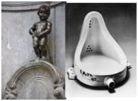
Marcel Duchamp's fountain and "Manikken Pis" Similar idea, Manikken is better executed, IMHO.

Marcel Duchamp’s fountain and “Manikken Pis.”

Any mention of dada should also, I suppose, mention Duchamp’s fountain (at right, signed fancifully by R. Mutt). In 2004, fountain was voted “the most influential artwork of the 20th century” by a panel of artists and art historians. The basic idea was to show the slight difference between art and not-art (to be something, there has to be a non-something, as in this joke). Beyond this, the idea would be that same as for the Manikken Pis sculpture in Brussels. Duchamp’s was done with a lot less work — just by signing a “found object.” He submitted the work for exhibition in 1917, but it was rejected as not being art — proving, I guess, the point. Fountain is related to man: his life, needs, and vain ambitions; it’s sort-of beautiful, so why ain’t it art? (It has something to do with skill, I’d say.)

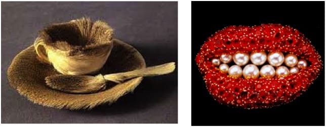
Duchamp designed two major surrealist exhibitions — a similar approach, but surrealism typically employs more skill and humor than Dada, with less shock. Below is another famous work of dada, Oppenheim’s fur-lined tea-cup (Breakfast in fur — see it at the Modern Museum in NYC) compared to a wonderful (and in my mind similar) surreal work, “Ruby lips” by Dali. Oppenheim made the tea-cup and spoon disgusting by making it out of a richer material, fur. That’s really cool, and sort-of shocking, even today.

Duchap's tea cup (left), and Dali's ruby lips (right). Similar ideas treated as Dada or Surreal.

Meret Oppenheim’s fur tea-cup (Breakfast in fur) and Dali’s ruby lips; the same idea (I think); dada vs surreal.

Dali’s “ruby libs” brooch took more skill than gluing fur to a cup and spoon; that adds to the humor, I’d say, but took from the shock. It’s made from real rubies and pearls: hard materials for something that should be soft; it’s sort of disgusting this way, and the message is more or less the same as Oppenheim’s, I’d say, but the message gets a little lost in the literal joke (pearly teeth, ruby lips…). I could imagine someone wearing Dali’s brooch, but no one would use the fur-lined cup. 

There is a lot of bad dada, too unfortunately, and it tends to be awful: incomprehensible, trite, or advertising. An unfortunate tendency is to collect some found pieces of garbage, and set it out in an attempt to scandalize the art world, or put down “the man” for his closed mindset. But that’s fountain, and it’s been done. A key way to tell if it’s good dada — is it cool; is it something that makes you say “Wow.” Christo’s surrounded islands certainly have the wow-cool factor, IMHO. 

Christo's wrapped Islands. Islands near Miami Beach wrapped in pink (fuscha) plastic.

Christo’s surrounded Islands: Islands near Miami Beach wrapped in pink (fuchsia) plastic.

A nice thing about Christo is that he takes it down 2 weeks or so after he makes the sculptures. Thus, the wow factor of his work never has a chance to go stale. Sorry to say, most dada stays around. Duchamp’s “fountain” sits in a museum and has grown stale, at least to me and Duchamp. What was scandalous and shocking in 1917 is passé and boring in 2014. The decline in shock is somewhat less for “breakfast in fur,” I think because the work is better crafted, a benefit I see in “Attention” too; skill matters.

Paris Street art. I don't know the artist, but it's cool.

Paris Street art; it’s just cool.

At the height of his success, Duchamp left art for 30 years and played chess. He became a chess grand master (life is as strange as art) and played for France in international tournaments. He later came back to art and did one, last, final piece, a very fine one, seen only through a peephole. Here’s some further thoughts on good vs bad modern art, and on surrealism, and on the aesthetic of strength in engineering: what materials to use; how strong should it be, and on architecture humor

Robert E. Buxbaum. April 4-7, 2014. Here is a link to my attempt at good Dada: Kilroy with eyes that follow you, and at right some Paris street art that I consider good dada too. As far as what the word “dada” means, I translate it as “cool,” “wow,” “gnarly,” or “go go.” It’s dada, man, y’ dig?

Near-Poisson statistics: how many police – firemen for a small city?

In a previous post, I dealt with the nearly-normal statistics of common things, like river crests, and explained why 100 year floods come more often than once every hundred years. As is not uncommon, the data was sort-of like a normal distribution, but deviated at the tail (the fantastic tail of the abnormal distribution). But now I’d like to present my take on a sort of statistics that (I think) should be used for the common problem of uncommon events: car crashes, fires, epidemics, wars…

Normally the mathematics used for these processes is Poisson statistics, and occasionally exponential statistics. I think these approaches lead to incorrect conclusions when applied to real-world cases of interest, e.g. choosing the size of a police force or fire department of a small town that rarely sees any crime or fire. This is relevant to Oak Park Michigan (where I live). I’ll show you how it’s treated by Poisson, and will then suggest a simpler way that’s more relevant.

First, consider an idealized version of Oak Park, Michigan (a semi-true version until the 1980s): the town had a small police department and a small fire department that saw only occasional crimes or fires, all of which required only 2 or 4 people respectively. Lets imagine that the likelihood of having one small fire at a given time is x = 5%, and that of having a violent crime is y =5% (it was 6% in 2011). A police department will need to have to have 2 policemen on call at all times, but will want 4 on the 0.25% chance that there are two simultaneous crimes (.05 x .05 = .0025); the fire department will want 8 souls on call at all times for the same reason. Either department will use the other 95% of their officers dealing with training, paperwork, investigations of less-immediate cases, care of equipment, and visiting schools, but this number on call is needed for immediate response. As there are 8760 hours per year and the police and fire workers only work 2000 hours, you’ll need at least 4.4 times this many officers. We’ll add some more for administration and sick-day relief, and predict a total staff of 20 police and 40 firemen. This is, more or less, what it was in the 1980s.

If each fire or violent crime took 3 hours (1/8 of a day), you’ll find that the entire on-call staff was busy 7.3 times per year (8x365x.0025 = 7.3), or a bit more since there is likely a seasonal effect, and since fires and violent crimes don’t fall into neat time slots. Having 3 fires or violent crimes simultaneously was very rare — and for those rare times, you could call on nearby communities, or do triage.

In response to austerity (towns always overspend in the good times, and come up short later), Oak Park realized it could use fewer employees if they combined the police and fire departments into an entity renamed “Public safety.” With 45-55 employees assigned to combined police / fire duty they’d still be able to handle the few violent crimes and fires. The sum of these events occurs 10% of the time, and we can apply the sort of statistics above to suggest that about 91% of the time there will be neither a fire nor violent crime; about 9% of the time there will be one or more fires or violent crimes (there is a 5% chance for each, but also a chance that 2 happen simultaneously). At least two events will occur 0.9% of the time (2 fires, 2 crimes or one of each), and they will have 3 or more events .09% of the time, or twice per year. The combined force allowed fewer responders since it was only rarely that 4 events happened simultaneously, and some of those were 4 crimes or 3 crimes and a fire — events that needed fewer responders. Your only real worry was when you have 3 fires, something that should happen every 3 years, or so, an acceptable risk at the time.

Before going to what caused this model of police and fire service to break down as Oak Park got bigger, I should explain Poisson statistics, exponential Statistics, and Power Law/ Fractal Statistics. The only type of statistics taught for dealing with crime like this is Poisson statistics, a type that works well when the events happen so suddenly and pass so briefly that we can claim to be interested in only how often we will see multiples of them in a period of time. The Poisson distribution formula is, P = rke/r! where P is the Probability of having some number of events, r is the total number of events divided by the total number of periods, and k is the number of events we are interested in.

Using the data above for a period-time of 3 hours, we can say that r= .1, and the likelihood of zero, one, or two events begin in the 3 hour period is 90.4%, 9.04% and 0.45%. These numbers are reasonable in terms of when events happen, but they are irrelevant to the problem anyone is really interested in: what resources are needed to come to the aid of the victims. That’s the problem with Poisson statistics: it treats something that no one cares about (when the thing start), and under-predicts the important things, like how often you’ll have multiple events in-progress. For 4 events, Poisson statistics predicts it happens only .00037% of the time — true enough, but irrelevant in terms of how often multiple teams are needed out on the job. We need four teams no matter if the 4 events began in a single 3 hour period or in close succession in two adjoining periods. The events take time to deal with, and the time overlaps.

The way I’d dealt with these events, above, suggests a power law approach. In this case, each likelihood was 1/10 the previous, and the probability P = .9 x10-k . This is called power law statistics. I’ve never seen it taught, though it appears very briefly in Wikipedia. Those who like math can re-write the above relation as log10P = log10 .9 -k.

One can generalize the above so that, for example, the decay rate can be 1/8 and not 1/10 (that is the chance of having k+1 events is 1/8 that of having k events). In this case, we could say that P = 7/8 x 8-k , or more generally that log10P = log10 A –kβ. Here k is the number of teams required at any time, β is a free variable, and Α = 1-10 because the sum of all probabilities has to equal 100%.

In college math, when behaviors like this appear, they are incorrectly translated into differential form to create “exponential statistics.” One begins by saying ∂P/∂k = -βP, where β = .9 as before, or remains some free-floating term. Everything looks fine until we integrate and set the total to 100%. We find that P = 1/λ e-kλ for k ≥ 0. This looks the same as before except that the pre-exponential always comes out wrong. In the above, the chance of having 0 events turns out to be 111%. Exponential statistics has the advantage (or disadvantage) that we find a non-zero possibility of having 1/100 of a fire, or 3.14159 crimes at a given time. We assign excessive likelihoods for fractional events and end up predicting artificially low likelihoods for the discrete events we are interested in except going away from a calculus that assumes continuity in a world where there is none. Discrete math is better than calculus here.

I now wish to generalize the power law statistics, to something similar but more robust. I’ll call my development fractal statistics (there’s already a section called fractal statistics on Wikipedia, but it’s really power-law statistics; mine will be different). Fractals were championed by Benoit B. Mandelbrot (who’s middle initial, according to the old joke, stood for Benoit B. Mandelbrot). Many random processes look fractal, e.g. the stock market. Before going here, I’d like to recall that the motivation for all this is figuring out how many people to hire for a police /fire force; we are not interested in any other irrelevant factoid, like how many calls of a certain type come in during a period of time.

To choose the size of the force, lets estimate how many times per year some number of people are needed simultaneously now that the city has bigger buildings and is seeing a few larger fires, and crimes. Lets assume that the larger fires and crimes occur only .05% of the time but might require 15 officers or more. Being prepared for even one event of this size will require expanding the force to about 80 men; 50% more than we have today, but we find that this expansion isn’t enough to cover the 0.0025% of the time when we will have two such major events simultaneously. That would require a 160 man fire-squad, and we still could not deal with two major fires and a simultaneous assault, or with a strike, or a lot of people who take sick at the same time. 

To treat this situation mathematically, we’ll say that the number times per year where a certain number of people are need, relates to the number of people based on a simple modification of the power law statistics. Thus:  log10N = A – βθ  where A and β are constants, N is the number of times per year that some number of officers are needed, and θ is the number of officers needed. To solve for the constants, plot the experimental values on a semi-log scale, and find the best straight line: -β is the slope and A  is the intercept. If the line is really straight, you are now done, and I would say that the fractal order is 1. But from the above discussion, I don’t expect this line to be straight. Rather I expect it to curve upward at high θ: there will be a tail where you require a higher number of officers. One might be tempted to modify the above by adding a term like but this will cause problems at very high θ. Thus, I’d suggest a fractal fix.

My fractal modification of the equation above is the following: log10N = A-βθ-w where A and β are similar to the power law coefficients and w is the fractal order of the decay, a coefficient that I expect to be slightly less than 1. To solve for the coefficients, pick a value of w, and find the best fits for A and β as before. The right value of w is the one that results in the straightest line fit. The equation above does not look like anything I’ve seen quite, or anything like the one shown in Wikipedia under the heading of fractal statistics, but I believe it to be correct — or at least useful.

To treat this politically is more difficult than treating it mathematically. I suspect we will have to combine our police and fire department with those of surrounding towns, and this will likely require our city to revert to a pure police department and a pure fire department. We can’t expect other cities specialists to work with our generalists particularly well. It may also mean payments to other cities, plus (perhaps) standardizing salaries and staffing. This should save money for Oak Park and should provide better service as specialists tend to do their jobs better than generalists (they also tend to be safer). But the change goes against the desire (need) of our local politicians to hand out favors of money and jobs to their friends. Keeping a non-specialized force costs lives as well as money but that doesn’t mean we’re likely to change soon.

Robert E. Buxbaum  December 6, 2013. My two previous posts are on how to climb a ladder safely, and on the relationship between mustaches in WWII: mustache men do things, and those with similar mustache styles get along best.

Ab Normal Statistics and joke

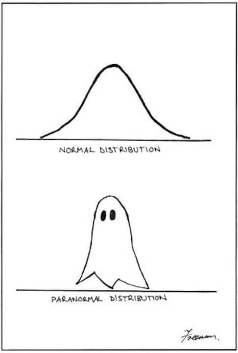
The normal distribution of observation data looks sort of like a ghost. A Distribution  that really looks like a ghost is scary.

The normal distribution of observation data looks sort of like a ghost. A Distribution that really looks like a ghost is scary.

It’s funny because …. the normal distribution curve looks sort-of like a ghost. It’s also funny because it would be possible to imagine data being distributed like the ghost, and most people would be totally clue-less as to how to deal with data like that — abnormal statistics. They’d find it scary and would likely try to ignore the problem. When faced with a statistics problem, most people just hope that the data is normal; they then use standard mathematical methods with a calculator or simulation package and hope for the best.

Take the following example: you’re interested in buying a house near a river. You’d like to analyze river flood data to know your risks. How high will the river rise in 100 years, or 1000. Or perhaps you would like to analyze wind data to know how strong to make a sculpture so it does not blow down. Your first thought is to use the normal distribution math in your college statistics book. This looks awfully daunting (it doesn’t have to) and may be wrong, but it’s all you’ve got.

The normal distribution graph is considered normal, in part, because it’s fairly common to find that measured data deviates from the average in this way. Also, this distribution can be derived from the mathematics of an idealized view of the world, where any variety derives from multiple small errors around a common norm, and not from some single, giant issue. It’s not clear this is a realistic assumption in most cases, but it is comforting. I’ll show you how to do the common math as it’s normally done, and then how to do it better and quicker with no math at all, and without those assumptions.

Lets say you want to know the hundred-year maximum flood-height of a river near your house. You don’t want to wait 100 years, so you measure the maximum flood height every year over five years, say, and use statistics. Lets say you measure 8 foot, 6 foot, 3 foot (a draught year), 5 feet, and 7 feet.

The “normal” approach (pardon the pun), is to take a quick look at the data, and see that it is sort-of normal (many people don’t bother). One now takes the average, calculated here as (8+6+3+5+7)/5 = 5.8 feet. About half the times the flood waters should be higher than this (a good researcher would check this, many do not). You now calculate the standard deviation for your data, a measure of the width of the ghost, generally using a spreadsheet. The formula for standard deviation of a sample is s = √{[(8-5.8)2 + (6-5.8)2 + (3-5.8)2 + (5-5.8)2 + (7-5.8)2]/4} = 1.92. The use of 4 here in the denominator instead of 5 is called the Brussels correction – it refers to the fact that a standard of deviation is meaningless if there is only one data point.

For normal data, the one hundred year maximum height of the river (the 1% maximum) is the average height plus 2.2 times the deviation; in this case, 5.8 + 2.2 x 1.92 = 10.0 feet. If your house is any higher than this you should expect few troubles in a century. But is this confidence warranted? You could build on stilts or further from the river, but you don’t want to go too far. How far is too far?

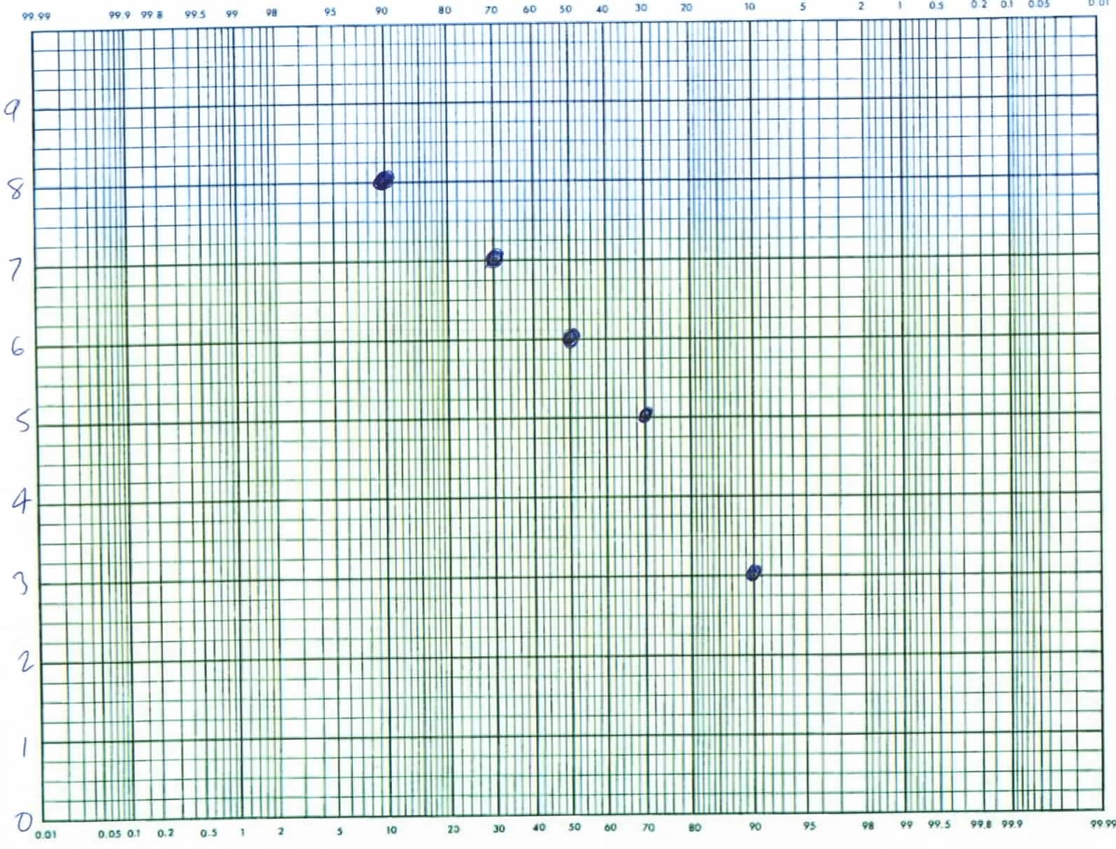
So let’s do this better. We can, with less math, through the use of probability paper. As with any good science we begin with data, not assumptions, like that the data is normal. Arrange the river height data in a list from highest to lowest (or lowest to highest), and plot the values in this order on your probability paper as shown below. That is on paper where likelihoods from .01% to 99.99% are arranged along the bottom — x axis, and your other numbers, in this case the river heights, are the y values listed at the left. Graph paper of this sort is sold in university book stores; you can also get jpeg versions on line, but they don’t look as nice.

probability plot of maximum river height over 5 years -- looks reasonably normal, but slightly ghost-like.

Probability plot of the maximum river height over 5 years. If the data suggests a straight line, like here the data is reasonably normal. Extrapolating to 99% suggests the 100 year flood height would be 9.5 to 10.2 feet, and that it is 99.99% unlikely to reach 11 feet. That’s once in 10,000 years, other things being equal.

For the x axis values of the 5 data points above, I’ve taken the likelihood to be the middle of its percentile. Since there are 5 data points, each point is taken to represent its own 20 percentile; the middles appear at 10%, 30%, 50%, etc. I’ve plotted the highest value (8 feet) at the 10% point on the x axis, that being the middle of the upper 20%. I then plotted the second highest (7 feet) at 30%, the middle of the second 20%; the third, 6 ft at 50%; the fourth at 70%; and the draught year maximum (3 feet) at 90%.  When done, I judge if a reasonably straight line would describe the data. In this case, a line through the data looks reasonably straight, suggesting a fairly normal distribution of river heights. I notice that, if anything the heights drop off at the left suggesting that really high river levels are less likely than normal. The points will also have to drop off at the right since a negative river height is impossible. Thus my river heights describe a version of the ghost distribution in the cartoon above. This is a welcome finding since it suggests that really high flood levels are unlikely. If the data were non-normal, curving the other way we’d want to build our house higher than a normal distribution would suggest. 

You can now find the 100 year flood height from the graph above without going through any the math. Just draw your best line through the data, and look where it crosses the 1% value on your graph (that’s two major lines from the left in the graph above — you may have to expand your view to see the little 1% at top). My extrapolation suggests the hundred-year flood maximum will be somewhere between about 9.5 feet, and 10.2 feet, depending on how I choose my line. This prediction is a little lower than we calculated above, and was done graphically, without the need for a spreadsheet or math. What’s more, our predictions is more accurate, since we were in a position to evaluate the normality of the data and thus able to fit the extrapolation line accordingly. There are several ways to handle extreme curvature in the line, but all involve fitting the curve some way. Most weather data is curved, e.g. normal against a fractal, I think, and this affects you predictions. You might expect to have an ice age in 10,000 years.

The standard deviation we calculated above is related to a quality standard called six sigma — something you may have heard of. If we had a lot of parts we were making, for example, we might expect to find that the size deviation varies from a target according to a normal distribution. We call this variation σ, the greek version of s. If your production is such that the upper spec is 2.2 standard deviations from the norm, 99% of your product will be within spec; good, but not great. If you’ve got six sigmas there is one-in-a-billion confidence of meeting the spec, other things being equal. Some companies (like Starbucks) aim for this low variation, a six sigma confidence of being within spec. That is, they aim for total product uniformity in the belief that uniformity is the same as quality. There are several problems with this thinking, in my opinion. The average is rarely an optimum, and you want to have a rational theory for acceptable variation boundaries. Still, uniformity is a popular metric in quality management, and companies that use it are better off than those that do nothing. At REB Research, we like to employ the quality methods of W. Edwards Deming; we assume non-normality and aim for an optimum (that’s subject matter for a further essay). If you want help with statistics, or a quality engineering project, contact us.

I’ve also meant to write about the phrase “other things being equal”, Ceteris paribus in Latin. All this math only makes sense so long as the general parameters don’t change much. Your home won’t flood so long as they don’t build a new mall up river from you with runoff in the river, and so long as the dam doesn’t break. If these are concerns (and they should be) you still need to use statistics and probability paper, but you will now have to use other data, like on the likelihood of malls going up, or of dams breaking. When you input this other data, you will find the probability curve is not normal, but typically has a long tail (when the dam breaks, the water goes up by a lot). That’s outside of standard statistic analysis, but why those hundred year floods come a lot more often than once in 100 years. I’ve noticed that, even at Starbucks, more than 1/1,000,000,000 cups of coffee come out wrong. Even in analyzing a common snafu like this, you still use probability paper, though. It may be ‘situation normal”, but the distribution curve it describes has an abnormal tail.

by Dr. Robert E. Buxbaum, November 6, 2013. This is my second statistics post/ joke, by the way. The first one dealt with bombs on airplanes — well, take a look.

An Aesthetic of Mechanical Strength

Back when I taught materials science to chemical engineers, I used the following except of a poem to teach an aesthetic for good design, at least as concerns mechanical strength:

“…The secret to design, as the parson explained, is that the weakest part must withstand the strain. And if that part is to withstand the test, then it must be made as strong as all the rest….” (by R.E. Buxbaum, based on “The Wonderful, One-hoss Shay, by Oliver Wendell Holmes, 1858).

I figured that students needed an idea they could remember of what good design looked like. I wanted them to realize that there is always a weakest part in any device or process, and that this is the likely point of failure. Good design accepts this truth and designs everything around it. You make sure that the device will fail at a part or time of your choosing, and that, when it fails (not if), it’s preferably at at time and place where you can repair it easily and cheaply (a fuse, or a door hinge), and that doesn’t cause too much mayhem when it fails. Once this failure part is chosen and in place, I taught that the rest should be stronger, but there is no point in making any other part vastly stronger than your weakest link. Thus for example, once you’ve decided to use a fuse that fails at a certain amperage, there is no point in choosing wiring to take more than 2-3 times the amperage of the fuse.

This is an aesthetic argument, of course, but it’s important for a person to know what good work looks like (to me, and perhaps to the student). An engineer needs a positive view of craftwork beyond compliments from the boss or grades from me. Some day, I’ll be gone, and the boss won’t be looking. Only self-esteem keeps you going.

Many engineering aspects relate to failure points. If you don’t know what the failure point is, make a prototype and test it to failure. Then, if you don’t like what you see, remodel accordingly. If you like the point of failure but decide you really want to make the device stronger or more robust, be aware that this may involve more than strengthening that part only. You may need to re-engineer the entire chain of parts so they are as failure resistant as this part.

I also wanted to teach that there are many failure chains to look out for: many ways that things can wrong beyond breaking. Check for failure by fire, melting, explosion, smell, shock, rust, and even color change. Color change should not be ignored, BTW; there are many products that people won’t use as soon as they look bad (cars, for example). Make sure that each failure chain has it’s own, known weak links. In a car, the paint should fade, chip, or peel before the metal underneath starts rusting or sagging (at least that’s my aesthetic). And in the DuPont gun-powder mill below, one wall should be weaker so that the walls blow outward the right way (away from traffic). Be aware that human error is the most common failure mode: design should be acceptably idiot-proof.

Dupont powder mills had a thinner wall and a stronger wall so that, if there were an explosion it would blow out towards the river. This mill has a second wall to protect workers. The thinner wall should be barely strong enough to stand up to wind and rain; the stronger walls should stand up to explosions that blow out the other wall.

Dupont powder mills had a thinner wall and a stronger wall so that, if there were an explosion, it would blow out ‘safely.’ This mill has a second wall to protect workers. The thinner wall must be strong enough to stand up to wind and rain; the stronger walls should stand up to all likely explosions.

Related to my aesthetic of mechanical strength, I tried to teach an aesthetic of cost, weight, appearance, and green-soundness: Choose materials that are cheaper, rather than more expensive and that weigh less rather than more. Use materials that look better if you’ve the choice, and use recyclable materials. These all derive from the well-known axiom, omit needless stuff. Or, as William of Occam put it, “Entia non sunt multiplicanda sine necessitate.” As an aside, I’ve found that, when engineers use Latin, we sound smarter: “lingua bona lingua motua est.” (a good language is a dead language) — it’s the same with quoting dead 19th century poets. Dead 19th century poets are far better than undead ones, but I digress.

Use of recyclable materials gets you out of lots of problems relative to materials that must be disposed of. E.g. if you use aluminum insulation (recyclable) instead of ceramic fiber, you will have an easier time getting rid of the scrap. As a result, you are not as likely to expose your workers (or you) to mesothelioma, or similar disease. You should not have to pay someone to haul away excess or damaged product; a scraper will oblige, and he may even pay you for it if you have enough. Recycling helps cash flow with decommissioning too, when money is tight. It’s better to find your $1 worth of scrap is now worth $2 instead of discovering that your $1 worth of garbage now costs $2 to haul away. By the way, most heat loss is from black body radiation, so aluminum foil may actually work better than ceramics of the same thermal conductivity.

Buildings can be recycled too. Buy them and sell them as needed. Shipping containers make for great lab buildings because they are cheap, strong, and movable. You can sell them off-site when you’re done. We have a shipping container lab building, and a shipping container storage building — both worth more now than when I bought them. They are also rather attractive with our advertising on them — attractive according to my design aesthetic. Here’s an insight into why chemical engineers earn more than chemists; and insight into the difference between mechanical engineering and civil engineering. Here’s an architecture aesthetic. Here’s one about the scientific method.

Robert E. Buxbaum, October 31, 2013