Tag Archives: map

Waffle house life and cardiac death

Cardiac death rates vary by a factor of six or more across regions of the US, from very low rates in Arizona, Utah, Washington, about 1/1000/year, to well over 6/1000/year in the US southeast. This is shown in the map below based on CDC data from 2013, mapped by Dr. Robert-J using ArcGIS Pro in 2015, Source here.

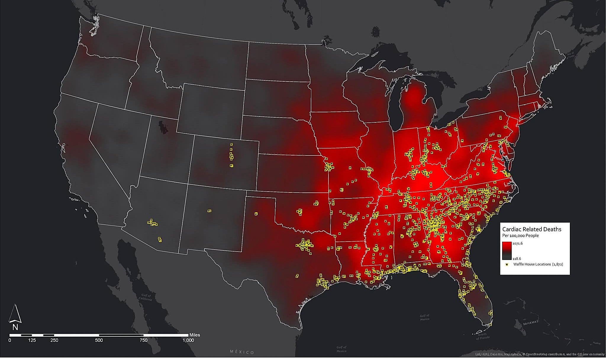
The author of this graph humorously(?) overlayed the cardiac death data with yellow dots showing the location of all US waffle houses. I infer from this something that Dr. J. denies: that waffle houses, or waffle eating is a significant contributor to these cardiac deaths. Other possibilities (my own list) include opioids, pollution, low exercise, depression, and poor healthcare. Still, I can’t help thinking that diet is a big contributor.

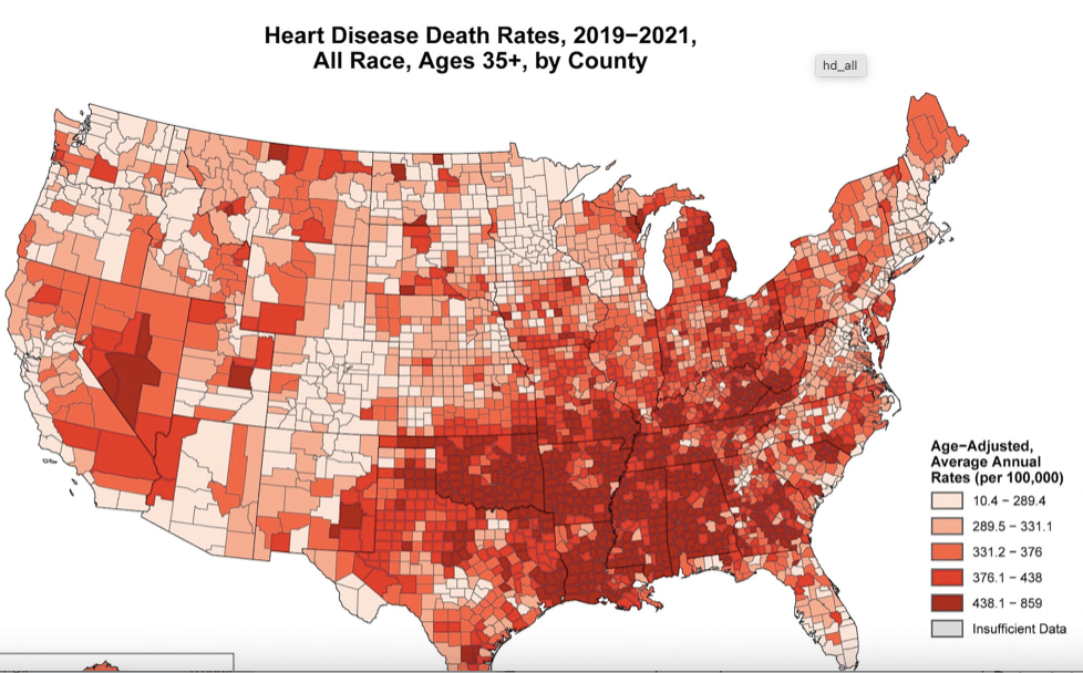
Here is a more up-to-date map, by county, showing that cardiac deaths still concentrate in the southeast, but now they are joined by Nevada and eastern California. I downloaded this map directly from the CDC, but this time, the map is in terms of Age Adjusted Mortality Rates, that is lives lost per 100,000 persons, relative to some ideal, people living in Minnesota, Colorado, and Massachusetts, I suppose. As before, the red areas are those with a higher cardiac death rates. Why are West Californians healthier and folks in Minnesota and Colorado, perhaps because they exercise more, and exercise is a good thing, but these could also be areas with better healthcare, or fewer opioids. Some cities are healthier, some are worse. Why?.

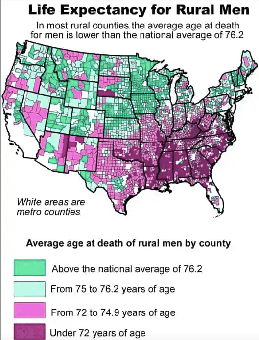
Things have been getting worse in recent years. From 2019 to 2022, the national Cardio-vascular disease caused AAMR increased by 9.3%. Some of this may be COVID or the COVID vaccine, I suppose, or depression. Men seem to be hit harder than women, with the same regional differences. As shown in the map at right, southeast rural men have a lifespan more than 4 years shorter than the national average, or about 7 years shorter than that for women. And this is on top of their already significantly shorter lifespan compared to other developed countries. There’s no obvious reason.

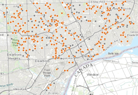
As a marketing thought, assuming that the cause of cardiac death is that people eat high-carb, high fat meals, then the owners of Waffle House might have noticed, and chosen to build there. If so this would be a case where apparent causation is reversed: the relationship between Waffle houses and death is that Waffle houses were built where people were dying of heart disease. It’s a scary thought, but not unlikely. I’d expect new Waffle houses would appear in mid-Michigan, mid Georgia, northern New Jersey, and NW Indiana. These are places where people will likely like the food and ambiance. I’ve taken a light hearted view here because the alternative is too depressing. These rates are dramatic and horrible. I hope RFK Jr. will help increase US lifespans, but have no great faith in him. Trump gave him two years to show significant improvements.

Robert Buxbaum, February 24, 2025.

The main route of lead poisoning is from the soil by way of food, dust, and smoke.

While several towns have had problems with lead in their water, the main route for lead entering the bloodstream seems to be from the soil. The lead content in the water can be controlled by chemical means that I reviewed recently. Lead in the soil can not be controlled. The average concentration of lead in US water is less than 1 ppb, with 15 ppb as the legal limit. According to the US geological survey, of lead in the soil, 2014., the average concentration of lead in US soil is about 20 ppm. That’s more than 1000 times the legal limit for drinking water, and more than 20,000 times the typical water concentration. Lead is associated with a variety of health problems, including development problems in children, and 20 ppm is certainly a dangerous level. Here are the symtoms of lead poisoning.

Several areas have deadly concentrations of lead and other heavy metals. Central Colorado, Kansas, Washington, and Nevada is particularly indicated. These areas are associated with mining towns with names like Leadville, Telluride, Silverton, Radium, or Galena. If you live in an areas of high lead, you should probably not grow a vegetable garden, nor by produce at the local farmer’s market. Even outside of these towns, it’s a good idea to wash your vegetables to avoid eating the dirt attached. There are hardly any areas of the US where the dust contains less than 1000 times the lead level allowed for water.

Lead content of US soils, from the US geological survey of soils, 2014. Michigan doesn’t look half bad.

Breathing the dust near high-lead towns is a problem too. The soil near Telluride Colorado contains 1010 mg/kg lead, or 0.1%. On a dust-blown day in the area, you could breath several grams of the dust, each containing 1 mg of lead. That’s far more lead than you’d get from 1000 kg of water (1000 liters). Tests of blood lead levels, show they rise significantly in the summer, and drop in the winter. The likely cause is dust: There is more dust in the summer.

Recalled brand of curry powder associated with recent poisoning.

Produce is another route for lead entering the bloodstream. Michigan produce is relatively safe, as the soil contains only about 15 ppm, and levels in produce are generally far smaller than in the soil. Ohio soils contains about three times as much lead, and I’d expect the produce to similarly contain 3 times more lead. That should still be safe if you wash your food before eating. When buying from high-lead states, like Colorado and Washington, you might want to avoid produce that concentrates heavy metals. According Michigan State University’s outreach program, those are leafy and root vegetables including mustard, carrots, radishes, potatoes, lettuce, spices, and collard. Fruits do not concentrate metals, and you should be able to buy them anywhere. (I’d still avoid Leadville, Telluride, Radium, etc.). Spices tend to be particularly bad routes for heavy metal poisoning. Spices imported from India and Soviet Georgia have been observed to have as much as 1-2% lead and heavy metal content; saffron, curry and fenugreek among the worst. A recent outbreak of lead poisoning in Oakland county, MI in 2018 was associated with the brand of curry powder shown at left. It was imported from India.

Marijuana tends to be grown in metal polluted soil because it tolerates soil that is too polluted fro most other produce. The marijuana plant concentrates the lead into the leaves and buds, and smoking sends it to the lungs. While tobacco smoking is bad, tobacco leaves are washed and the tobacco products are regulated and tested for lead and other heavy metals. If you choose to smoke cigarettes, I’d suggest you chose brands that are low in lead. Here is an article comparing the lead levels of various brands. . Better yet, I’s suggest that you vape. There are several advantages of vaping relative to smoking the leaf directly. One of them is that the lead is removed in the process of making concentrate.

Some states test the lead content of marijuana; Michigans and Colorado do not, and even in products that are tested, there have been scandals that the labs under-report metal levels to help keep tainted products on the shelves. There is also a sense that the high cost encourages importers to add lead dust deliberately to increase the apparent density. I would encourage the customer to buy vape or tested products, only.

Here is a little song, “pollution” from Tom Lehrer, to lighten the mood.

Robert Buxbaum, November 24, 2019. I ran for water commissioner in 2016 and lost. I may run again in 2020. Who knows, this time I may win.

Link

Here’s a murder map showing Detroit’s 387 homicides in 2012, plus the homicides in the surrounding areas. Courtesy of the Detroit Free Press. It shows you where the murder took place; click on the dot, and you’ll  get more details: dates, weapons, etc. 

Here is an updated map for 2014 + half of 2015. The link has some details of the various crimes, but less than before. Detroit has not gotten measurably safer.

Murder map for 2014 (orange dots) and Jan to june 29 2015 (grey dots) From here