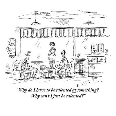
Most people who’ve been in university are familiar with feminist historical analysis: the history of the world as a long process of women’s empowerment. I thought there was a need for a masculinist history of the world, too, and as this was no-shave November, I thought it should focus on the importance of face hair in the modern world. I’d like to focus this post on the importance of beards, particularly in the rise of communism and of the Republican party. I note that all the early communists and Republicans were bearded. More-so, the only bearded US presidents have been Republicans, and that their main enemies from Boss Tweed, to Castro to Ho Chi Minh, have all been bearded too. I note too, that communism and the Republican party have flourished and stagnated along with the size of their beards, with a mustache interlude of the early to mid 20th century. I’ll shave that for my next post.
Marxism and the Republican Party started at about the same time, bearded. They then grew in parallel, with each presenting a face of bold, rugged, machismo, fighting the smooth tongues and chins of the Democrats and of Victorian society,and both favoring extending the franchise to women and the oppressed through the 1800s against opposition from weak-wristed, feminine liberalism.
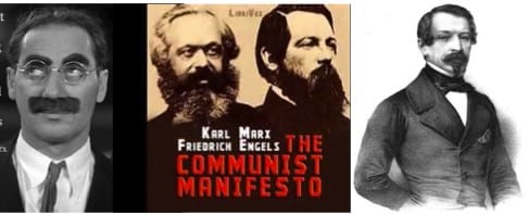
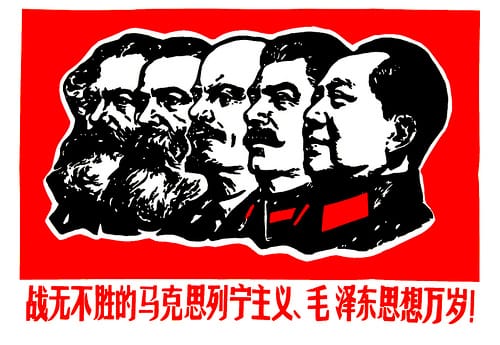
Marx and Engels (middle) wrote the Communist Manifesto in 1848, the same year that Lincoln joined the new Republican Party, and the same year that saw Louis Napoleon (right) elected in France. The communists both wear full bards, but there is something not-quite sincere in the face hair at right and left.
Karl Marx (above, center left, not Groucho, left) founded the Communist League with Friedrich Engels, center right, in 1847 and wrote the communist manifesto a year later, in 1848. In 1848, too, Louis Napoleon would be elected, and the same year 1848 the anti-slavery free-soil party formed, made up of Whigs and Democrats who opposed extending slavery to the free soil of the western US. By 1856 the Free soils party had collapsed, along with the communist league. The core of the free soils formed the anti-slavery Republican party and chose as their candidate, bearded explorer John C. Fremont under the motto, “Free soil, free silver, free men.” For the next century, virtually all Republican presidential candidates would have face hair.
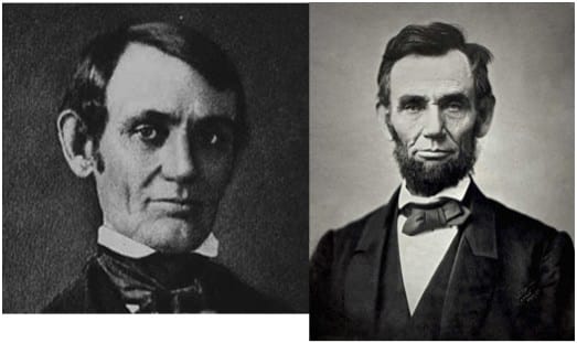
Lincoln, the Whig, had no beard — he was the western representative of the party of eastern elites. Lincoln, the Republican, grew whiskers. He was now a log-cabin frontiersman, rail-splitter.
In Europe, revolution was in the air: the battle of the barricades against clean-chined, Louis Napoleon. Marx (Karl) writes his first political economic work, the Critique of Political Economy, in 1857 presenting a theory of freedom by work value. The political economic solution of slavery: abolish property. Lincoln debates Douglas and begins a run for president while still clean-shaven. While Mr. Lincoln did not know about Karl Marx, Marx knew about Lincoln. In the 1850s and 60s he was employed as a correspondent for the International Herald Tribune, writing about American politics, in particular about the American struggle with slavery and inflation/ deflation cycles.
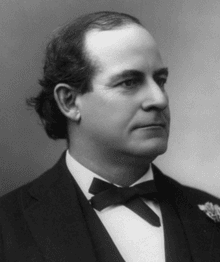
William Jennings Bryan was three-times the Democratic presidential candidate; more often than anyone else. He opposed alcohol, gambling, big banks, intervention abroad, monopoly business, teaching evolution, and gold — but he supported the KKK, and unlike most Democrats, women’s suffrage.
As time passed, bearded frontier Republicans would fight against the corruption of Tammany Hall, and the offense to freedom presented by prohibition, anti industry sentiment, and anti gambling laws. Against them, clean-shaven Democrat elites could claim they were only trying to take care of a weak-willed population that needed their help. The Communists would gain power in Russia, China, and Vietnam fighting against elites too, not only in their own countries but American and British elites who (they felt) were keeping them down by a sort of mommy imperialism.
In the US, moderate Republicans (with mustaches) would try to show a gentler side to this imperialism, while fighting against Democrat isolationism. Mustached Communists would also present a gentler imperialism by helping communist candidates in Europe, Cuba, and the far east. But each was heading toward a synthesis of ideas. The republicans embraced (eventually) the minimum wage and social security. Communists embraced (eventually) some limited amount of capitalism as a way to fight starvation. In my life-time, the Republicans could win elections by claiming to fight communism, and communists could brand Republicans as “crazy war-mongers”, but the bureaucrats running things were more alike than different. When the bureaucrats sat down together, it was as in Animal Farm, you could look from one to the other and hardly see any difference.
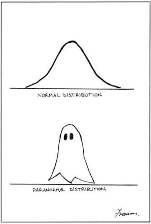
The history of Communism seen as a decline in face hair. The long march from the beard to the bare. From rugged individualism to mommy state socialism. Where do we go from here?
Today both movements provide just the barest opposition to the Democratic Party in the US, and to bureaucratic socialism in China and the former Soviet Union. All politicians oppose alcohol, drugs, and gambling, at least officially; all oppose laser faire, monopoly business and the gold standard in favor of government created competition and (semi-controlled) inflation. All oppose wide-open immigration, and interventionism (the Republicans and Communists a little less). Whoever is in power, it seems the beardless, mommy conservatism of William Jennings Bryan has won. Most people are happy with the state providing our needs, and protecting our morals. is this to be the permanent state of the world? There is no obvious opposition to the mommy state. But without opposition won’t these socialist elites become more and more oppressive? I propose a bold answer, not one cut from the old cloth; the old paradigms are dead. The new opposition must sprout from the bare chin that is the new normal. Behold the new breed of beard.
The future opposition must grow from the barren ground of the new normal. Another random thought on the political implications of no-shave November.
by Robert E. Buxbaum, No Shave, November 15, 2013. Keep watch for part 2 in this horrible (tongue in) cheek series: World War 2: Big mustache vs little mustache. See also: Roosevelt: a man, a moose, a mustache, and The surrealism of Salvador: man on a mustache.