Large chunks of Michigan shut down for the prime days of hunting season, from the middle of October to early November. About 8% of the state gets a hunting license each year, some 800,000 people, all trying to “Bag a buck.” Michigan is an open carry state for rifles and holstered pistols, something seen recently in the state capitol, I’d say this was an illegal example since there is also a brandishing law, but it gives a sense of things here. About 29% of the state owns at least one gun, and usually more. There are about as many guns as people. Getting bullets, on the other hand, is near impossible, both for handguns and for most rifles, shotguns excluded.
A lot of the attraction of hunting is that you get to eat what you kill. Mot people do this or donate it to a food back. Hunting is also cheaper than golf. Rural farmers also hunt to protect their crops from crows, squirrels, rabbits, rats, snakes, and raccoons. This is legitimate hunting, in my opinion, even though you typically don’t eat crow. Some people do hunt bear, but that’s a different story (I like to be dressed). It’s possible that the bullet shortage is just a hiccup in the supply chain, “supply and demand” but it’s been going on for 12 years now so I suspect it’s here to stay.
Michigan, was once a Republican, pro-gun stronghold. It has swung Democrat and anti-gun for the last few years. Bulletes have been scare for about that long, at least since the Obama election or the Sandy Hook shooting. Behind this is a general trend of urbanization and class-action law suits. At this point, few sporting stores carry guns or bullets, and those that do, tend to hide them in a back room. Amazon carries neither bullets nor guns, and the same holds at e-bay, Craig’s list, and Walmart on line. Dunhams still sells guns but the only bullets, when I visited today were, 17 caliber, 227 and duck-hunting, shotgun shells. Gone were normal handgun calibers: 22, 25, 32, 38, 45, 357, and 9mm. The press seems OK with duck or moose hunting; not so OK with anything else.
The salesman at Dunham’s said that he had moved to bow hunting, something that’s becoming common, but it’s incredibly difficult even with modern bows. I can rarely hit a non-moving target at 50 feet on the first arrow, and I can only imagine the frustration of trying to hit a moving target after sitting in a cold blind for days waiting for one to appear whose distance and placement is unknown, and that might disappear at any moment, or attack me then disappear.
Part of the problem is that arrows travel at only about 250 ft/s, or about 1/6 the speed of a bullet. Thus, an arrow fired from 50 yards takes about 0.6 seconds to hit. In that time it drops about 6 feet and must be aimed 6 feet above the deer if you hope to hit it. A riffle bullet falls only about 2 inches, about 1/36 as much. Whaat’s more, though an arrow is about three times heavier than a hunting bullet, its slow speed means it hits with only about 1/10 the kinetic energy, about the same as hunting with a 22 from a handgun.
There are those who say the bullet shortage will go away on its own because of supply and demand. That’s true until the government steps in in the name of public safety. Though recreational marijuana and moonshine are both legal, government regulation means that prices are high and supply is limited, with a grey market of people buying high and selling higher. I’m seeing the same with ammunition; there is tight supply, a grey market, and a fair number of people trying to reload spent ammunition using match-tips for primers. Talk about white lightning.
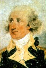
Philip Schuyler as a Major General in the Revolution. His statue was removed.
What most folks know about Alexander Hamilton’s father in law, Philip Schuyler, is that he was “loaded”, that he had three daughters, and that he quickly took to young Alexander. But an important fact varnished over is that Schuyler made his money in the slave trade, a trade that Hamilton was likely in when he met the young Schuyler daughters. Schuyler was also a slave owner, owning 13 slaves, by his record, and perhaps another 17 indentured servants working at two mansions. So far, only the Philip Schyler statue has been taken down. It seems possible that many monuments to Hamilton may follow.
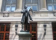
Statue of Alexander Hamilton, proudly stands in front of Columbia University. The ten dollar founding father.
The play “Hamilton” proclaims Hamilton’s genius and exceptional work ethic, mentioning that, at the young age of 14 (more likely 16) he was left in charge of a trading company. This was for 5 months in 1771, while the owner was over seas doing business. Hamilton knew the business well; he’d been hired as a clerk at 11 at Beekman and Cruger, a similar import-export trading firm. What items did these firms trade — cotton, sugar, rum, and most profitable slaves. This likely was the business that kept the owner overseas for 5 months while Alexander ran the shop. There are at least two notifications of slave ships entering the harbor with human good for sale. Among Hamilton’s likely jobs would have been fattening and oiling the goods for sale. Hamilton himself seems to have owned a slave-boy named Ajax who he inherited (briefly) from his mother, Rachel. His mother is listed on the tax records as white. She owned five saves at one time, suggesting she was not entirely impoverished. Hamilton’s father, though a failed businessman, was a Scottish Laird (a Lord). As for the court-mandated transfer of Ajax from Alexander, it was to his half-brother James because James was “Legitimate.”
I base Hamilton’s age on the Nevis-St Kitts record of his birth, January 11, 1755.”[1] The play takes as a fact Hamilton’s claim to have been born two years later, January 11, 1757. I trust the written records here, and imagine Hamilton wanted to present himself as a young genius, rather than as a bright, but older fellow. In 1772, at at age 17, Hamilton wrote a “fire and brimstone” description of a deadly hurricane, describing it as “divine rebuke to human vanity and pomposity.”[2] Between this, and his skill at trading, the community leaders collected money to send him to New York, but unlike the play’s description, it was not only for further education. The deal was that he continue trading for the firm,[3] and this is likely how he met his future father in law. “[4]
In New York, Hamilton met Schuyler and his daughters. It seems likely that he met the father first, likely as possible customer for the slave trade from the Caribbean, or perhaps as a customer for rum and sugar. A 1772 letter in Hamilton’s handwriting [4] asks for the purchase of “two or three poor boys” for plantation work, “bound in the most reasonable manner you can.” As in the play, Hamilton was friends with John Laurens, an abolitionist, and among his first lodgings was with Hercules Mulligan, a tailor’s apprentice. Hercules is presented as black in the play, but he was quite white (see picture) with a black slave, Cato. Cato ran most of the messages. According to the play, “I’m joining the rebellion cuz I know it’s my chance To socially advance, Instead of sewin’ some pants, I’m taking my shot. No, Hercules was socially advanced ,married into the British Admiralty, even. He was a true believer in freedom and a slave-holder. His older brother, Hugh Mulligan, was one of the traders that Hamilton was supposed to work with.[5] As for Laurens and his anti-slavery organization, most of those in the organization owned slaves, and though they opposed slavery, they could never decide on when or how to end it. There is no evidence that Cato was ever set free.
The appointment to Washingtons staff was not likely a coincidence. The elder Schuyler was one of the four top generals appointed in 1775 to serve directly under Washington. Phillip oversaw, at a distance, the disastrous attack on Quebec and the victory at Saratoga– both, Burr served admirably. Phillip’s main role was as a quartermaster/supplier, and this is not a small role. Phillip Schuyler had been a quarter-master in the French and Indian war. It’s likely that it was Schuyler who got Hamilton his appointment to Washington’s staff.
Once on Washington’s staff, Hamilton served admirably. Originally serving as a secretary, Hamilton wrote many of Washington’s dispatches. Then, according to tradition, as a cannon commander, he took particular pleasure in the attack on Princeton University. He then served well as secretary of the Treasury, and as head of the Bank of The United States, the only major US bank until Burr opened the Bank of the Manhattan company. Despite his aversion to slavery, Hamilton also continued to deal in slaves. A 1796 cash book entry records Hamilton’s payment of $250 to his father-in-law for “2 Negro servants purchased by him for me.” This is only 3 years before 1799, when New York began to end slavery in the state with the Act for the Gradual Abolition of Slavery. Children of slaves born after July 4, 1799, were to be legally free, but required indentured servitude: to age 28 for males and 25 for females. Those born before July 4, 1799 became free in 1817. There is no evidence that Hamilton was a leader in any of this, but Burr, another slave-owning abolitionist, was a leader in the NY legislature at the time.
I’m with Burr.He was flawed, a slave-owning abolitionist, but vehimently against the Alien and Sedition Acts, a Hamiltonian horror.
It seems that Robert Morris introduced Hamilton to the importance of tariffs, and to the idea of using debt service as a backing to currency. It’s brilliant idea, but Hamilton understood it and took to it. Hamilton also understood the need for a coast guard to enforce the tariffs. As for Hamilton’s character, or Burr’s. Both, in my understanding, were imperfect people who did great deeds. I’ve already written that Hamilton was likely setting up Burr for murder, perhaps because of Burr’s vehement opposition to the Alien and Sedition Acts — That’s why Hamilton wore his glasses and fiddled with the gun so much. Burr was also gaining power through his Manhattan corporation and Tammany organization. both of which got his support among the immigrants.
My intent here is not to knock the image of Hamilton, Schuyler, Laurens and Mulligan, nor to raise that of Burr, but to correct some current fictions in the play “Hamilton”, and to fight a disease of our age, the cancel culture. The cancel culture elevates their heroes (Hamilton, Mulligan) to god-status. They will lie to cover the flaws of their heroes, and will lie also to claim a drop of black blood in them; neither Hamilton nor Mulligan were black and both owned slaves, as did Burr. The other side of the cancel culture is to cancel — to eliminate the validity — of the reactionaries, the non-revolutionary. In the play, these include Samuel Seebury and Aaron Burr. Great building is almost always the work of contradictory people. They need some talent, and a willingness to act, and because building requires a group, they have to work in a group, tolerating flaws of the others in the group. It is just these flawed, contradictory builders that are being cancelled, and I don’t think that’s right or healthy.
The minimum US postage rate to send a 1 oz to 8 oz package across the street is $8.30. This is the price for any size package going in “zone 1”. That is, to a nearby, instate address. It costs more to send a package to nearby states or across the country, zones 2,3,4,5,6,7, 8 You don’t get shipping updates or delivery confirmation unless you pay more. By comparison the US post office charges no more than $1.50 to Chinese companies to deliver packages of up to 4.4 lbs (2 kg) and they get shipping and delivery confirmation thrown in free. The high US rates are, in part, because the post office is losing money to subsidize postage from China.
On the internet folks are amazed at how cheap things are shipped from China (I copied this post from this Forbes article)
US producers can not compete on the sale of small items, in part, because we subsidize the shipping costs. Go to Amazon or e-Bay and you can buy from China packaged items shipped by air for a total price of $1 or so. That includes the price of the item, the shipping cost, and some profit for Amazon or eBay. A US supplier could not sell this cheap even if it were a box of air. The low shipping costs result from a poorly negotiated postage deal of 2011 between us (Obama’s negotiator) and the Chinese. Until 2021, we are committed to deliver a package of 50g or less, (2 oz) for 5 Chinese Yuan, or 70¢ at the current exchange rate of 14¢/NCY. Additional ounces are billed at 35¢ up to 4.4 lbs; use the following table of prices and apply the dollar to CNY conversion. We threw in tracking services and an e-mail confirmation for free, in part because China was poor, and we were rich. Also, the deal was pushed by e-Bay and Amazon, two big supporters of Obama’s presidency.
US suppliers cannot compete.
Adding insult to injury, Obama raised the de minimis amount for billing tariffs from the normal $100 to $800 making almost all purchases from China duty free. Obama made some complaints about unfair trade, and about the counterfeits and knockoffs but no major enforcement. In 2012 and 2014, the Obama administration signed similar postage deals with Korea, Hong Kong, and the EU. The Germans applauded as it allows them to ship goods to the US for far less than the cost of us shipping to Germany. The US post office loses money on this and makes up for it by charging us more for domestic mail.
The Washington Post praised Obama on these deals claiming that they benefitted US customer and promoted democracy. Of course, the Washington Post is owned by Amazon’s main stock holder, Jeff Bezos– someone who benefits very much by the deal. He is among the relatively few people and organizations that own the media outlets. The Post loses money on newspaper sales but benefits the owners by the propaganda value of the stories, a situation also found with Al Jazeera and the emir of Qatar.
Trump has informed China that these special rates will end when the treaty runs out in January 1, 2021. A per-package ship fee will be $3.00 for a one ounce package, with 11¢ per additional once. This is less than the domestic rate, but far higher than the current 35¢ for 1 oz. I’d probably have raised their postage even more, but this is an election year, and Biden may well reverse any deal Trump signs.
Robert Buxbaum, July 14, 2020. Though I’m appalled by this postage deal, I just bought a 50 lb kayak from China, $99.99 including shipping. The prices are too low to pass up.
Readers of this blog know that I am not a fan of very harsh punishments for crime, in particular for crimes that have no direct victim, e.g. drug possession and sales. Prostitution is another crime with no direct victim. One could argue that society as a whole is the victim, but my sense is that punishments should be minimal and targeted, e.g. to prevent involuntary human trafficking and disease. Our current laws, depicted here, are clearly not designed for this, but there was a brief period where prostitution laws did make more sense. During the civil war, civil war, prostitution was legal and regulated to prevent disease.
In 1862, Union forces captured the southern cities of Nashville and Memphis, Tenn. Major Gen. William Rosecrans set up headquarters in Nashville. Before the war, Nashville was home to 198 white prostitutes and nine “mulatto,” operating in a two-block area known as “Smoky Row.”
By the end of 1862, Smokey row had grown and these numbers swelled to 1,500 “public women”. White southern women turned to prostitution out of poverty, largely. Their husbands were dead, or ill paid, and they were joined by recently freed slaves. Benton E. Dubbs, a Union private, reported a saying that “no man culd [sic] be a soldier unless he had gone through Smokey Row,” … “The street was about three-fourths of a mile long and every house or shanty on both sides was a house of ill fame. Women had no thought of dress or decency. They say Smokey Row killed more soldiers than the war.”
By 1863, venerial disease was becoming a major problem. The Surgeon General would document 183,000 cases of venereal disease in the Union Army alone, “…the Pocks and the Clap. The cases of this complaint is numerous, especially among the officers.”
Permit for Legal prostitution signed by Col George Spaulding.
At first General Rosecrans directed his assistant, Colonel Spaulding, to remove the women by sending them to other states, first by train, and then by boat commandeering the ship, Idaho for the purpose. The effect was horrible, not only was the ship turned back by every city, but the departure of these ladies just resulted in the appearance of a new cohort of sex-workers. By the time the Idaho had returned, Rosecrans had been relieved of command following embarrassing defeats at Chickamauga and Chattanooga . Col. Spaulding now tried a new technique to stop the plague of VD: legalized prostitution. It worked.
Women’s hospital during the war, Nashville.
For a $5/month fee a “public woman” could become a legal prostitute, or “Public Woman” so long as she submitted to monthly health inspections for a certificate of her soundness. If found infected, she was to report to a hospital dedicated to this treatment, was subject to imprisonment if she operated without the license and certificate. The effect was a major decline in sexually-transmitted disease, and an improvement (so it is claimed) in the quality of the services. The fees collected were sufficient to cover the cost of the operation and hospital, nearly.
At the end of the war, Col Spaulding and the union soldiers left Nashville, and prostitution returned to being illegal, if tolerated. One assumes that the VD rates went up as well.
George Spaulding, Congressman..
Colonel Spaulding and Maj. General Rosecrans are interesting characters beyond the above. Spaulding had entered the war as a private and rose through the ranks by merit. The rise didn’t stop at colonel. After the war, he became postmaster of Monroe Michigan, 1866 to 1870, US Treasury agent, 1871 to 1875, Mayor of Monroe, 1876 to ?, President of the board of education, a lawyer in 1878, and congressman for the MI 2nd district (Republican) 1894 -1898. He also served as board member of the Home for Girls 1885 to 1897, and postmaster of Monroe, 1899 to 1907.
William Rosecrans was a Catholic, engineer-inventor from West Point. Before the war, in 1853, he designed St. Mary’s Roman Catholic Church, one of the largest US churches at the time, site of the wedding of John Kennedy and Jacqueline Bouvier. He also designed and installed one of the first lock systems in Western Virginia. He and two partners built an early oil refinery. He patented a method of soap making and the first kerosene lamp to burn a round wick, and was one of the eleven incorporators of the Southern Pacific Railroad. After the war, he served as Ambassador to Mexico, 1868-69 and was congressman from California, 1st district (Democrat) 1880 – 1884. A true Democrat, Rosecrans could not stand either Grant or Garfield, and fought against Grant getting a retirement package.
Robert Buxbaum, June 5, 2020. There are other ways to stop the spread of sexual diseases. During the AIDS epidemic, condoms were the preferred method, and during the current COVID crisis, face masks are being touted. My preference is iodine hand wash. All methods work if they can reduce the transmission rate, Ro below 1.
Before Brexit, I opined, against all respectable economists, that a vote for Bexit would not sink the British economy. Switzerland, I argued, was outside the EU, and their economy was doing fine. Similarly, Norway, Iceland, and Israel — all were outside the EU and showed no obvious signs of riots, food shortages, or any of the other disasters predicted for an exited Britain. Pollsters were sure that Britain would vote “No” but, as it happened, they voted yes. The experts despaired, but the London stock market surged. It’s up 250% since the Brexit vote.
Lodon stock market prices from January 2016 through the Brexit vote, August 2016, to the Boris Johnson election, August 2019. The price has risen by more than 250%.
A very similar thing happened with the election of Trump and of Boris Johnson. In 2016 virtually every news paper supported Ms Clinton, and every respectable economic expert predicted financial disaster if he should, somehow win. As with Brexit, the experts were calmed by polls showing that Trump would, almost certainly lose. He won, and as with Brexit, the stock market took off. Today, after a correction that I over-worried about, the S+P index remains up 35% from when Trump was elected. As of today, it’s 2872, not far from the historic high of 3049. Better yet, unemployment is down to record levels, especially for black and hispanic workers, and employment is way up, We’ve added about 1% of adult workers to the US workforce, since 2017, see Federal Reserve chart below.
Returning to Britain, the economic establishment have been predicting food shortages, job losses and a strong stock market correction unless Brexit was re-voted and rejected. Instead, the ruling Conservative party elected Boris Johnson to prime-minister, “no deal” Brexiter. The stock market responded with a tremendous single day leap. See above
Ratio of Civilian Employment to US Population. Since Trump’s election, we’ve added about 1% of the working age US population to the ranks of the employed.
You’d think the experts would show embarrassment for their string of errors. Perhaps they would save some face by saying they were blinded by prejudice, or that their models had a minor flaw that they’ve now corrected, but they have not said anything of the sort. Paul Krugman of the New York Times, for example, had predicted a recession that would last as long as Trump did, and has kept up his predictions. He’s claimed a bone rattling stock crash continuously for nearly three years now, predicting historic unemployment. He has been rewarded with being wrong every week, but he’s also increased the readership of the New York Times. So perhaps he’s doing his job.
I credit our low un-employment rate to Trump’s tariffs and to immigration control. When you make imports expensive, folks tend to make more at home. Similarly, with immigration, when you keep out illegal workers, folks hire more legal ones. I suspect the same forces are working in Britain. Immigration is a good thing, but I think you want to bring in hard-working, skilled, honest folks to the extent possible. I’m happy to have fruit pickers, but would like to avoid drug runners and revolutionaries, even if they have problems at home.
I still see no immediate stock collapse, by the way. One reason is P/E analysis, in particular Schiller’s P/E analysis (he won a Nobel prize for this). Normal P/E analysis compares the profitability of companies to their price and to the bond rate. The inverse of the P/E is called the earnings yield. As of today, it’s 4.7%. This is to say, every dollar worth of the average S+P 500 stock generates 4.7¢ in profits. Not great, but it’s a lot better than the 10-year bond return, today about 1.5%.
The Schiller P/E is an improved version of this classic analysis. It compares stock prices to each company’s historic profitability, inflation adjusted for 10 years. Schiller showed that this historic data is a better measure of profitability than this year’s profitability. As of today, the Schiller P/E is 29.5, suggesting an average corporate profitability of 3.5%. This is still higher than the ten-year bond rate. The difference between them is 2%, and that is about the historic norm. Meanwhile, in the EU, interest rates are negative. The ten year in Germany is -0.7%. This suggests to me that folks are desperate to avoid German bank vaults, and German stocks. From my perspective, Trump, Johnson, and the Fed seem to be doing much better jobs than the EU bankers and pendents.
Newspapers remain the primary source for verified news. Facts presumed to be sifted to avoid bias, while opinions and context is presumed to be that of the reporter whose name appears as the byline. We may look to other media sources for confirmation and fact-checking: news magazines, Snopes, and Facebook. Since 2016 these sources have been unanimous in their agreement about the dangers of biassed news. Republicans, including the president have claimed that the left-media spreads “fake news”, against him, while Democrats claim that Trump and the Russians have been spreading pro-Trump, fake news, While Trump and the Republicans claim that the left-media spreads fake news. In an environment like this, it’s worthwhile to point out that the left-wing and right-wing press is owned by a very few rich people, and none of it is free of their influence. An example of this is the following compilation of many stations praising their news independence: CBS, ABC, NBC, and FOX, praising their independence in exactly the same words.
It costs quite a lot to buy a newspaper or television station, and a lot more to keep it running. Often these are money-losing ventures, and as a result, the major newspapers tend to be owned by a few mega-rich individuals who have social or political axes to grind. As the video above shows, one main axe they have is convincing you of their own independence and reliability. The Sinclair news service, owned by the Smith news family came up with the text, and all the independent journalists read it in as convincing a voice as they could muster. This is not to say. that all the news is this bad or that the mega rich don’t provide a service by providing us the news, but it’s worth noting that they extract a fee by controlling what is said, and making sure that the news you see fits their agendas – agendas that are often obvious and open to the general view.
Perhaps the most prominent voice on the right is Rupert Murdoch who owns The New York Post, and The Wall Street Journal. He used to own Fox too, and is still the majority controller and guiding voice, but Fox is now owned by Disney who also owns ABC. Murdoch uses his many media outlets to make money and promote conservative and Republican causes. You might expect him to support Trump, but he has a person feud with him that boils up in the Post’s cover pages. Disney’s ABC tends to present news on the left, but as in the compilation above, left and right journalists have no problem parroting the same words. Here is another, older compilation, more journalistl saying the same thing in the same words, e.g. playing up the Conan O’Brian show.
Another media master is Ted Turner. He tends to own media outlets on the left including CNN. Turner manages to make CNN, and his other properties profitable, in part by courting controversy. His wife for a time was Jane Fonda, otherwise known as Hanoi Jane.
Another left-leaning media empire (whatever that means) is MSNBC. It is owned by Time-Warner, also owner of The Huffington Post. Both are anti-israel, and both promote zero-tariff, Pacific-rim trade, but as seen above, MSNBC anchors will read whatever trash they are told to read, and often it’s the same stuff you’d find on Fox.
Rounding out the list of those with a complete US media empires, I include the Emir of Qatar, perhaps the richest man in the world. He operates Al Jazeera, “the most respected news site for Middle east reporting” as an influence-buying vehicle. Al Jazeera is strongly anti-fracking, anti nuclear, and anti oil (Qatar is Asia’s latest supplier of natural gas). It is strongly anti-Israel, and anti Saudi. Qatar propagandist, Jamal Khashoggi worked for AlJazeera, and was likely killed for it. They’re also reliably pro-Shia, with positive stories about Hamas, The Muslim Brotherhood, and Iran, but negative stories about Sunni Egypt and Turkey. They present news, but not unbiassed.
But you don’t have to buy a complete media empire to present your politics as unbiassed news. Jeff Bezos, founder Amazon, bought The Washington Post for $250 million (chump change to hm). For most of the past two years, the paper mostly promoted anti-tariff views, and liberal causes, like high tax rates on the rich. Amazon thrives on cheep Chinese imports, and high tax rates don’t hurt because Amazon manages to not pay any taxes on $11 billion/year profits (by clever accounting they actually get a rebate). Recently Joe Biden made the mistake of calling out Amazon for not paying on $11 billion in profits, and The Washington Post has returned the favor by bashing Biden. As for why Bezos bought the money-losing Post, he said: “It is the newspaper in the Capital City of the most important country in the world… [As such] … “it has an incredibly important role to play in this democracy.”
Moving on to The New Your Times, its editorial slant is controlled by another contestant for world’s richest man: telecom mogul, Carlos “Slim” Helú. Carlos’s views are very similar to Bezos’s, with more of an emphasis on free trade with Mexico. Steve Jobs’s widow runs “The Atlantic” for the same reasons. It’s free on line, well written and money losing. Like with the above, it seems to be a vanity project to promote her views. It’s a hobby, but sh can afford it.
Like her, Chris Hughes, Facebook’s Co-founder and Zuckerberg room-mate, bought and runs the money losing “The New Republic“. He was Facebook’s director of marketing and communications before joining the Obama campaign as it internet marketing head. The New Republic’s had a stellar reputation, back in the day. Zuckerberg himself runs a media empire, but it’s different from the above: it’s social media where people pay for placement, and where those whose views he doesn’t like get censored: put in Facebook jail. He’s gotten into trouble over it, but as a media giant, there seem to have been no consequences.
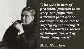
H.L. Menken on the fake news of the early – mid 20th century.
And it’s not only rich individuals who turn trusted news sources into propaganda outlets. The US CIA did this for years, and likely still do. Then there are the Russians, the Chinese, the Israelis, the British (BBC) and our very own NPRt. These sources present news that benefits them in the most positive light and scream about dangers to democracy and the world if their position is touched or their veracity is questioned. As these sources are all government funded, there is a they are unanimous supporters big governments as a cure to all ills. Closer to home, I’d like to mention that Detroit has two major papers, but only one owner. The left leaning Detroit Free Press, and the right-leaning Detroit News are owned by the same people, share a considerable staff, and generally agree on important issues. There are a dozen smaller papers in Metro Detroit; all but one is owned by one media group.
I’d like to end with a positive note. Not every reporter is in this sad grab-bag. In Detroit, Setve Neveling, “the motor-city muckraker” manages to present is independent, active news. Then there is Los Angeles’s Biotech billionaire, Patrick Soon-Shiong. He bought the LA Times in June 2018, claiming he will use it to fight fake news, “the cancer of our time.” I wish him luck. So far, I’d say, he’s made the LA Times is the best Newspaper in the US with The NY Post a close second ( love the snarky headlines).
The number and cash value of bitcoin transactions has surged in the last two years, and it seems that a lot of the driving motivation is avoidance of Trump’s tariffs. If you want to avoid Trump’s tariffs, claim that the value of the shipment is less than it really is. Pay part via the normal banking system through the bill of lading (and pay tariffs on that) and pay the rest in bitcoin with no record and no taxes paid. The average bitcoin transaction amount has increased to $33,504, and that seems to be the amount of taxable value being dodged on each shipment. As noted in the journal, Cryptopolitan, “Smugglers attempting to export Chinese goods to the USA illegally have been found to be among the largest purchasers of Bitcoin.” https://www.cryptopolitan.com/is-us-china-trade-war-fueling-bitcoin-price-rally-to-7500/
Average transaction amount for several crypto currencies. The amount has surged for Bitcoin, blue line.
Bitcoin isn’t the only beneficiary of tariffs, of course, but it is the largest. The chart at right shows the average transaction value of the major cryptocurrencies. The average for most are in the dollar range that you’d expect for someone evading tariffs in containerized shipments. Someone who wants to import $100,000 worth of Chinese printers will arrange to have them shipped with a lower price bill of lading. The rest of the payment, 1/3 say, would be paid by a bitcoin transfer whose escrow is tied to the legally binding bill of lading.
Number of transactions per day for several cryptocurrencies, data available from Bitinfocharts.com
Bitcoin does not stand out from the other cryptocurrencies so much in the amount of its average transaction, but in the number of transactions per day. As shown at left there are 333,050 bitcoin transactions per day at an average value of $33,504 per transaction. Multiplying these numbers together, we see that Bitcoin is used for some $11.2 billion in transactions per day, or $4.1 trillion dollars worth per year. The legitimate part of the US economy is only $58 billion per day, or $21 trillion per year. The amount will certainly rise if further tariffs are put into effect.
Most other cryptocurrencies have fewer transactions per day, and the few that have similar (or higher) numbers deal in lower amounts. Etherium is used in 2.5 time more transactions, but the average Etherium transaction is only $679. This suggests that the total Etherium business is only $586 million per day. The dollar amounts of Etherium suggests that it is mostly used for drug trafficking,
Cash-money is the old fashioned way to avoid tariffs, buy drugs, and do other illegal money transfers. This method isn’t going away any time soon. A suitcase of $100 bills gets handed over and the deal is done. Though it gets annoying as the amounts get large, there is a certain convenience at the other end, when you try to spend your ill-gotten gains. Thus, when Obama wanted to ransom the ten sailors that Iran had captured in 2016, he sent paper bills. According to the LA Times, this was three airplane shipments s of all non-US currency: Euros and Swiss Francs mostly. The first payment was $400 million, delivered as soon as Iran agreed to the release. The rest, $1.3 billion, was sent after the prisoners were released. Assuming that the bundles shown below contained only 100 Euro notes, each bundle would have held about $170 million dollars. We’d have had to send ten bundles of this size to redeem ten US sailors. The US ships, the laptops of sensitive information, and the weapons were granted as gifts to the Iranians. Obama claimed that all this was smart as it was cheaper than a war, and it likely is. The British had 15 sailors captured by Iran in 2009 and paid as well. In the late 1700s, John Adams (an awful president) paid 1/4 of the US budget as ransom to North African pirates. He paid in gold.
These are supposedly the pallets of cash used to ransom our sailors. Obama has justified the need to transfer the cash this way, and indeed a ransom is a lot cheaper than a war.
Obama could not have ransomed the sailors with Bitcoin as there was hardly enough Bitcoin value in existence at the time. Besides, the Iranians would have had a hard time spending it since, it is hard to spend Bitcoin on anything legal without first switching to bank checks or cash. Legitimate sellers want proof that they’ve paid, and financial watchdogs are always there sniffing at the conversion step. Things are simpler with paper money; not totally simple when there is no apparent source, but simply enough for mullahs.
Iranian released this picture of the US sailors captured. Obama ransomed them for $1.7 billion in Euros.
To get a sense of the amount of paper money used in illegal commerce, consider that there are $1.1 trillion in hundred dollar bills in circulation. This is four times more than the value of all Bitcoin in circulation currently. Based on the wear on our $100 bills, it seems each bill is used on average 30 times per year. This suggests there are $33 trillion dollars in trade that goes on with $100 bills. Not all of this trade is illegal, but I suspect a good fraction is, and this is eight times the trade in Bitcoin. The downside of cash is that cost of transferring large bails of it can be high, but at least it’s easy to make change for a bundle of $100 bills. With bitcoin, there is a fee for transfer too, and a fee charged to convert Bitcoin to cash; it’s often in excess of 1%, and that adds up when you do billion-dollar kidnappings and billion dollar arms buys. In case you are wondering how German uranium enrichment centrifuges got to Iran when there is an export embargo, I’m guessing it was done through an intermediary country using cash and/or Bitcoin payments.
It’s worth speculating on whether Bitcoin prices will rise as its use continues to rise. I think it will but don’t expect a fast rise. Over a year ago, I’d predicted that the price of Bitcoin would be about $10,500 each. I’d based that on Fisher’s monetary equation, that relates the value of a currency to the amount spent and the speed of money. As it happens I got the right dollar value because I’d underestimated the amount of Bitcoin purchases and the speed of the money by the same factor of four. For the price of a Bitcoin to rise, it is not enough for it to be used more. There also has to be no parallel rise in the velocity of transactions (turnovers per year). My sense is that both numbers will rise together and thus that the bitcoin price will level out, long term, with lots of volatility following daily changes in use and velocity.
As a political thought, I expect is that Bitcoin traders will mostly support Trump. My expectation here is for the classic alliance the existed between bootleggers and the prohibition police during prohibition. During prohibition, jobs among the police, plus salaries and bonuses depended on liquor being illegal, and thus they supported prohibition. Bootleggers benefitted too: their high prices and profits depended on prohibition. I thus expect Bitcoin traders will support Trump as a way of protecting profits and value. Real estate moguls, I suspect, support Trump because they benefit from the ability to sell real-estate with off tariff Bitcoin. If the tariffs went away, so would the amount of smuggling income going into real estate. Amazon’s owner, Jeff Bezos, is currently anti Trump, I suspect, because Amazon still pays tariffs.
“Riding on the City of New Orleans Illinois Central Monday morning rail Fifteen cars and fifteen restless riders Three conductors and twenty-five sacks of mail All along the southbound odyssey The train pulls out at Kankakee Rolls along past houses, farms and fields Passin’ trains that have no names Freight yards full of old black men And the graveyards of the rusted automobiles…”
Every weekday, this train leaves Chicago at 9:00 PM and gets into New Orleans twenty hours later, at 5:00 PM. It’s a 925 mile trip at a 45 mph average: slow and money-losing, propped up by US taxes. Like much of US passenger rail, it “has the disappearing railroad blues.” It’s a train service that would embarrass the Bulgarians: One train a day?! 45 mph average speed!? It’s little wonder is that there are few riders, and that they are rail-enthusiasts: “the sons of Pullman porters, and the sons of engineers, Ride[ing] their father’s magic carpets made of steel.” The wonder, to me was that there was ever fifteen cars for these, “15 restless riders”.
A sack of mail being picked up on the fly.
I would be happy to see more trips and a faster speed, at an average speed of at least 60 mph. This would require 85 mph or higher between stops, but it would save on salaries, and it would bring in some new customers. But even if these higher speeds cost nothing extra, in net, you’d still need something more to make the trip profitable; a lot more if the goal is to add another train. Air-traffic will always be faster, and the automobile, more convenient. I find a clue to profitability in the fifteen cars of the song and in the sacks of mail.
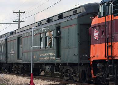
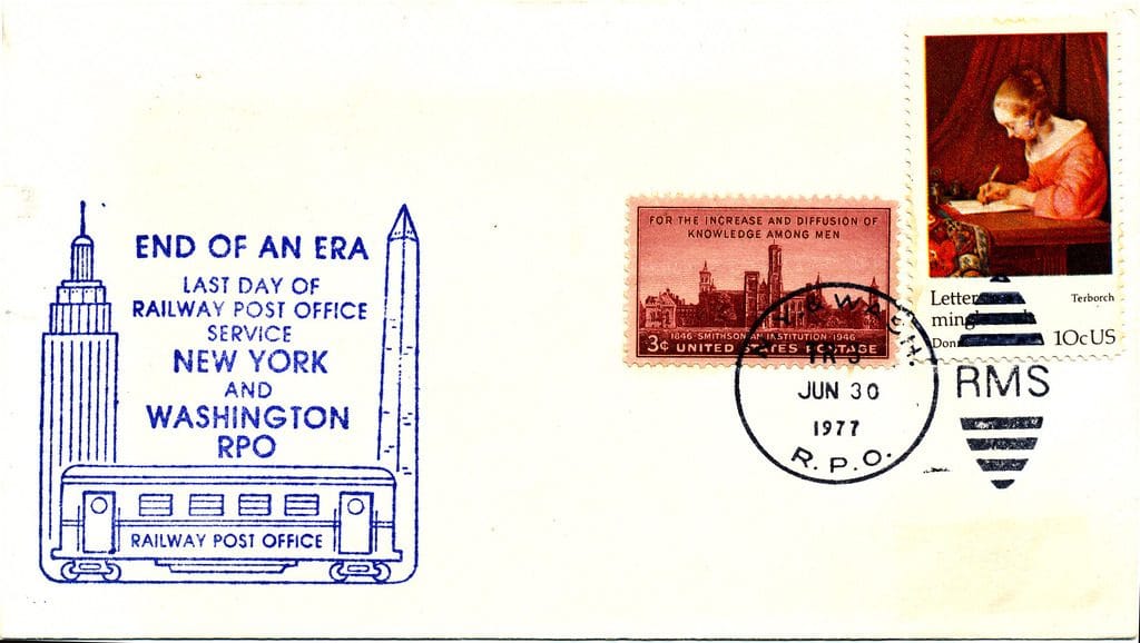
Unless I’m mistaken, mail traffic was at least as profitable as passenger traffic, and those “twenty-five sacks of mail” were either very large, or just the number on-loaded at Kankakee. Passenger trains like ‘the city of New Orleans’ were the main mail carriers till the late 1970s, a situation that ended when union disputes made it unprofitable. Still, I suspect that mail might be profitable again if we used passenger trains only for fast mail — priority and first class — and if we had real fast mail again. We currently use trucks and freight trans for virtually all US mail, we do not have a direct distribution system. The result is that US mail is vastly slower than it had been. First class mail used to arrive in a day or two, like UPS now. But these days the post office claims 2 to 4 business days for “priority mail,” and ebay guarantees priority delivery time “within eight business days”. That’s two weeks in normal language. Surely there is room for a faster version. It costs $7.35 for a priority envelope and $12.80 for a priority package (medium box, fixed price). That’s hardly less than UPS charges.
Last day of rail post service New York to Washington, DC. .June 30, 1977.
Passenger trains could speed our slow mail a lot, even with our slow speed trains. The City of New Orleans makes its trip in less than a day, with connections to major cities across the US. If priority mail went north-south in under one day, people would use it more, and that could make the whole operation profitable. Trains are far cheaper than trucks when you are dealing with large volumes; there are fewer drivers per weight, and less energy use per weight. Still there are logistical issues to making this work, and you want to move away from having many post men handling individual sacks, I think. There are logistical advantages to on-loading and off-loading much larger packages and to the use of a system of standard sizes on a moving conveyor.
How would a revised mail service work? I’d suggest using a version of intermodal logistics. Currently this route consists of 20 stops including the first and last, Chicago and New Orleans. This suggests an average distance between stops of 49 Miles. Until the mid 70s, , mail would be dropped off and picked up at every stop, with hand sorting onboard and some additional on-off done on-the-fly using sacks and hooks, see picture above. For a modern version, I would suggest the same number of passenger stops, but fewer mail pick ups and drop offs, perhaps only 1/3 as many. These would be larger weight, a ton or more, with no hand sorting. I’d suggest mail drop offs and pick ups every 155 miles or so, and only of intermodal containers or pods: ten to 40 foot lengths. These containers plus their contents would weigh between 2,500 and 25,000 pounds each. They would travel on flatcars at the rear of the passenger cars, and contain first class and priority mail only. Otherwise, what are you getting for the extra cost?
The city of New Orleans would still leave Chicago with six passenger cars, but now these would be followed by eight to ten flatcars holding six or more containers. They’d drop off one of the containers at a stop around the 150 mile mark, likely Champaign Urbana, and pick up five or so more (they’d now have ten). Champaign Urbana is a major east-west intermodal stop, by the way. I’d suggest the use of six or more heavy forklifts to speed the process. At the next mail-stop, Centralia, two containers might come off and four or more might come on. Centralia is near St. Louis, itself a major rail hub for trains going west. See map below. The next mail stop might be Memphis. Though it’s not shown as such, Memphis is a major east-west rail hub; it’s a hub for freight. A stripped down mail-stop version of passenger train mail like this seems quite do-able — to me at least. It could be quite profitable, too.
Amtrak Passenger rail map. The city of New Orleans is the dark blue line going north-south in the middle of the map.
Intermodal, flat-bed trucks would take the mail to sorting locations, and from there to distribution points. To speed things, the containers might hold pre-sorted sacks of mail. Intermodal trucks might also carry some full containers east and west e.g. from Centralia to St. Louis, and some full flatcars could be switched on and off too. Full cars could be switched at the end, in New Orleans for travel east and west, or in the middle. There is a line about “Changing cars in Memphis Tennessee.” I imagine this relates to full carloads of mail joining or leaving the train in Memphis. Some of these full intermodal containers could take priority mail east and west. One day mail to Atlanta, and Houston would be nice. California in two days. That could be a money maker.
At this point, I would like to mention “super-fast” rail. The top speeds of these TGV’s “Transports of Grande Vitess” are in the range of 160 mph (265 km/hr) but the average speeds are lower because of curves and the need to stop. The average speeds are roughly 125 mph on the major routes in Europe, but they require special rails and rail beds. My sense is that this sort of special-use improvement is not worth the cost for US rail traffic. While 60 -90 mph can be handled on the same rails that carry freight, the need for dedicated track comes with a doubling of land and maintenance costs. And what do you have when you have it? The bullet rail is still less than half as fast as air travel. At an average speed of 125 mph, the trip between Chicago and New Orleans would take seven hours. For business travelers, this is not an attractive alternative to a two hour flight, and it is not well suited for intermodal mail. The fuel costs are unlikely to be lower than air travel, and there is no easy way to put mail on or off a TGV. Mail en-route would slow the 125 mph speed further, and the use of intermodal containers would dramatically increase the drag and fuel cost. Air travel has less drag because air density is lower at high altitude.
Meanwhile, at 60 mph average speeds, train travel can be quite profitable. Energy use is 1/4 as high at 60 mph average as at 120 mph. An increase of average speed to 60 mph would barely raise the energy use compared to TGV, but it would shorten the trip by five hours. The new, 15 hour version of “The City of New Orleans” would not be competitive for business travel, but it would be attractive for tourists, and certainly for mail. Having fewer hours of conductor/ engineer time would save personnel costs, and the extra ridership should allow the price to stay as it is, $135 one-way. A tourist might easily spend $135 for this overnight trip: leaving Chicago after dinner and arriving at noon the next day. This is far nicer than arriving at 5:00 PM, “when the day is done.”
Robert Buxbaum, June 21, 2019. One summer during graduate school, I worked in the mail room of a bank, stamping envelopes and sorting them by zip code into rubber-band tied bundles. The system I propose here is a larger-scale version of that, with pre-sorted mail bags replacing the rubber bands, and intermodal containers replacing the sacks we put them in.
On a street corner about 1/4 mile from my house, at the intersection of the two busiest of the local streets, in the center-median of the street, is parked a police car. He’s there, about 18 hours a day, looking to give out tickets. The cross-street that this officer watches is where drivers get off the highway. In theory, they should instantly go from 65 mph on the highway to 35 mph now. Very few people do. The officer does not ticket every car, by the way, but seems to target those of poor people from outside the city limits. The only time ai was ticketed, I was driving a broken-down car while mine was in the shop. As best I can tell, he choose cars for revenue, not for safety. It’s a speed trap. It’s appalling. And our city isn’t alone in having one.
Speed traps are an annoyance to rich, local folk who sometimes get ticketed, but they’re a disaster for the poor. Poor people are targeted, and these people don’t have any savings. They don’t have the means to pay a suddenly imposed bill of $150 or more. Meanwhile, the speed-trap officer is incentivized to increase revenue and look for other violations: expired registrations or insurance, seat-belt violations, open alcohol, unpaid tickets. Double and triple fines are handed out, and sometimes the car is impounded. A poor driver is often left without any legal way to get to work, to earn money to pay the fines. Police officers behave this way because they are evaluated based on the revenue they generate, based on the number of tickets they write. It’s a horrible situation, especially for the poor
An article on the effect of speed traps. It appears they do little good and cause much pain, especially to the poor. Here is a link to the whole article.
The article above looks at the impact of speed traps on poor people. The damage is extreme. The folks targeted are often black, barely holding it together financially. They are generally not in a position to pay $150 for “impeding traffic,” and even less in a position to deal with having their car impounded. How are they supposed to pay the bill? And yet they are told they are lucky to have been given this ticket — impeding traffic, a ticket with no “points.” But they are not lucky. They are victims. Tickets with no points is are money generators, and many poor people realize it. If they were to get a speeding ticket, they would have the opportunity to void the penalty by going to traffic school. With a ticket for impeding traffic, there is no school option. Revenue stays local, mostly in that police precinct. Poor people know it, and they don’t like it. I don’t either. After a while, poor people cease to trust the police, or to even speak to them.
In what world should you pay $150 for impeding traffic, by the way? In what world should the police be taken from their main job protecting the people and turned into a revenue arm for the city? I’d like to see this crazy cycle ended. The first steps, I think, are to end speed traps, and to limit the incentive for giving minor tickets, like impeding traffic. As it is we have too many people in jail and too many harsh penalties.
Robert Buxbaum, April 10, 2019. I ran for water commissioner in 2016, and may run again in 2020.
Here is a classic math paradox for your amusement, and perhaps your edification: (edification is a fancy word for: beware, I’m trying to learn you something).
You are on a TV game show where you will be asked to choose between two, identical-looking envelopes. All you know about the envelopes is that one of them has twice as much money as the other. The envelopes are shuffled, and you pick one. You peak in and see that your envelope contains $400, and you feel pretty good. But then you are given a choice: you can switch your envelope with the other one; the one you didn’t take. You reason that the other envelope either has $800 or $200 with equal probability. That is, a switch will either net you a $400 gain, or loose you $200. Since $400 is bigger than $200, you switch. Did that decision make sense. It seems that, at this game, every contestant should switch envelopes. Hmm.
The solution follows: The problem with this analysis is an error common in children and politicians — the confusion between your lack of knowledge of a thing, and actual variability in the system. In this case, the contestant is confusing his (or her) lack of knowledge of whether he/she has the big envelope or the smaller, with the fixed fact that the total between the two envelopes has already been set. It is some known total, in this case it is either $600 or $1200. Lets call this unknown sum y. There is a 50% chance that you now are holding 2/3 y and a 50% chance you are holding only 1/3y. therefore, the value of your current envelope is 1/3 y + 1/6y = 1/2 y. Similarly, the other envelope has a value 1/2y; there is no advantage is switching once it is accepted that the total, y had already been set before you got to choose an envelope.
And here, unfortunately is the lesson:The same issue applies in reverse when it comes to government taxation. If you assume that the total amount of goods produced by the economy is always fixed to some amount, then there is no fundamental problem with high taxes. You can print money, or redistribute it to anyone you think is worthy — more worthy than the person who has it now – and you won’t affect the usable wealth of the society. Some will gain others will lose, and likely you’ll find you have more friends than before. On the other hand, if you assume that government redistribution will affect the total: that there is some relationship between reward and the amount produced, then to the extent that you diminish the relation between work and income, or savings and wealth, you diminish the total output and wealth of your society. While some balance is needed, a redistribution that aims at identical outcomes will result in total poverty.
This is a variant of the “two-envelopes problem,” originally posed in 1912 by German, Jewish mathematician, Edmund Landau. It is described, with related problems, by Prakash Gorroochurn, Classic Problems of Probability. Wiley, 314pp. ISBN: 978-1-118-06325-5. Wikipedia article: Two Envelopes Problem.