Category Archives: Science: Physics, Astronomy, etc.

Why the earth is magnetic with the north pole heading south.

The magnetic north pole, also known as true north, has begun moving south. It had been moving toward the north pole thought the last century. It moved out of Canadian waters about 15 years ago, heading toward Russia. This year it passed as close to the North pole as it is likely to, and begun heading south (Das Vedanga, old friend). So this might be a good time to ask “why is it moving?” or better yet, “Why does it exist at all?” Sorry to say the Wikipedia page is little help here; what little they say looks very wrong. So I thought I’d do my thing and write an essay.

The motion of the magnetic (true) north pole over the last century; it's nearly at the north pole.

Migration of the magnetic (true) north pole over the last century; it’s at 8°N and just passed the North Pole.

Your first assumption of the cause of the earth’s magnetic field would involve ferromagnetism: the earth’s core is largely iron and nickel, two metals that permanent magnets. Although the earth’s core is very hot, far above the “Curie Temperature” where permanent magnets form, you might imagine that some small degree of magnetizability remains. You’d be sort of right here and sort of wrong; to see why, lets take a diversion into the Curie Temperature (Pierre Curie in this case) before presenting a better explanation.

The reason there is no magnetism above the Curie temperature is similar to the reason that you can’t have a plague outbreak or an atom bomb if R-naught is less than one. Imagine a magnet inside a pot of iron. The surrounding iron will dissipate some of the field because magnets are dipoles and the iron occupies space. Fixed dipole effects dissipate with a distance relation of r-4; induced dipoles with a relation r-6. The iron surrounding the magnet will also be magnetized to an extent that augments the original, but the degree of magnetization decreases with temperature. Above some critical temperature, the surrounding dissipates more than it adds and the effect is that the original magnetic effect will die out if the original magnet is removed. It’s the same way that plagues die out if enough people are immunized, discussed earlier.

The earth rotates, and the earth's surface is negatively charged. There is thus some room for internal currents.

The earth rotates, and the earth’s surface is negatively charged. There is thus some room for internal currents.

It seems that the earth’s magnetic field is electromagnetic; that is, it’s caused by a current of some sort. According to Wikipedia, the magnetic field of the earth is caused by electric currents in the molten iron and nickel of the earth’s core. While there is a likely current within the core, I suspect that the effect is small. Wikipedia provides no mechanism for this current, but the obvious one is based on the negative charge of the earth’s surface. If the charge on the surface is non-uniform, It is possible that the outer part of the earth’s core could become positively charged rather the way a capacitor charges. You’d expect some internal circulation of the liquid the metal of the core, as shown above – it’s similar to the induced flow of tornadoes — and that flow could induce a magnetic field. But internal circulation of the metallic core does not seem to be a likely mechanism of the earth’s field. One problem: the magnitude of the field created this way would be smaller than the one caused by rotation of the negatively charged surface of the earth, and it would be in the opposite direction. Besides, it is not clear that the interior of the planet has any charge at all: The normal expectation is for charge to distribute fairly uniformly on a spherical surface.

The TV series, NOVA presents a yet more unlikely mechanism: That motion of the liquid metal interior against the magnetic field of the earth increases the magnetic field. The motion of a metal in a magnetic field does indeed produce a field, but sorry to say, it’s in the opposing direction, something that should be obvious from conservation of energy.

The true cause of the earth’s magnet field, in my opinion, is the negative charge of the earth and its rotation. There is a near-equal and opposite charge of the atmosphere, and its rotation should produce a near-opposite magnetic field, but there appears to be enough difference to provide for the field we see. The cause for the charge on the planet might be due to solar wind or the ionization of cosmic rays. And I notice that the average speed of parts of the atmosphere exceeds that of the surface —  the jet-stream, but it seems clear to me that the magnetic field is not due to rotation of the jet stream because, if that were the cause, magnetic north would be magnetic south. (When positive charges rotate from west to east, as in the jet stream, the magnetic field created in a North magnetic pole a the North pole. But in fact the North magnetic pole is the South pole of a magnet — that’s why the N-side of compasses are attracted to it, so … the cause must be negative charge rotation. Or so it seems to me.  Supporting this view, I note that the magnet pole sometimes flips, north for south, but this is only following a slow decline in magnetic strength, and it never points toward a spot on the equator. I’m going to speculate that the flip occurs when the net charge reverses, thought it could also come when the speed or charge of the jet stream picks up. I note that the magnetic field of the earth varies through the 24 hour day, below.

The earth's magnetic strength varies regularly through the day.

The earth’s magnetic strength varies regularly through the day.

Although magnetic north is now heading south, I don’t expect it to flip any time soon. The magnetic strength has been decreasing by about 6.3% per century. If it continues at that rate (unlikely) it will be some 1600 years to the flip, and I expect that the decrease will probably slow. It would probably take a massive change in climate to change the charge or speed of the jet stream enough to reverse the magnetic poles. Interestingly though, the frequency of magnetic strength variation is 41,000 years, the same frequency as the changes in the planet’s tilt. And the 41,000 year cycle of changes in the planet’s tilt, as I’ve described, is related to ice ages.

Now for a little math. Assume there are 1 mol of excess electrons on a large sphere of the earth. That’s 96500 Coulombs of electrons, and the effective current caused by the earth’s rotation equals 96500/(24 x3600) = 1.1 Amp = i. The magnetic field strength, H =  i N µ/L where H is magnetizability field in oersteds, N is the number of turns, in this case 1, µ is the magnetizability. The magnetizability of air is 0.0125 meter-oersteds/ per ampere-turn, and that of a system with an iron core is about 200 times more, 2.5 meter-tesla/ampere-turn. L is a characteristic length of the electromagnet, and I’ll say that’s 10,000 km or 107 meters. As a net result, I calculate a magnetic strength of 2.75×10⁻⁷ Tesla, or .00275 Gauss. The magnet field of the earth is about 0.3 gauss, suggesting that about 100 mols of excess charge are involved in the earth’s field, assuming that my explanation and my math are correct.

At this point, I should mention that Venus has about 1/100 the magnetic field of the earth despite having a molten metallic core like the earth. It’s rotation time is 243 days. Jupiter, Saturn and Uranus have greater magnetic fields despite having no metallic cores — certainly no molten metallic cores (some theorize a core of solid, metallic hydrogen). The rotation time of all of these is faster than the earth’s.

Robert E. Buxbaum, February 3, 2019. I have two pet peeves here. One is that none of the popular science articles on the earth’s magnetic field bother to show math to back their claims. This is a growing problem in the literature; it robs science of science, and makes it into a political-correctness exercise where you are made to appreciate the political fashion of the writer. The other peeve, related to the above concerns the game it’s thoroughly confusing, and politically ego-driven. The gauss is the cgs unit of magnetic flux density, this unit is called G in Europe but B in the US or England. In the US we like to use the tesla T as an SI – mks units. One tesla equals 104 gauss. The oersted, H is the unit of magnetizing field. The unit is H and not O because the English call this unit the henry because Henry did important work in magnetism One ampere-turn per meter is equal to 4π x 10−3 oersted, a number I approximated to 0.125 above. But the above only refers to flux density; what about flux itself? The unit for magnetic flux is the weber, Wb in SI, or the maxwell, Mx in cgs. Of course, magnetic flux is nothing more than the integral of flux density over an area, so why not describe flux in ampere-meters or gauss-acres? It’s because Ampere was French and Gauss was German, I think.

Disease, atom bombs, and R-naught

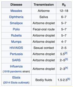
A key indicator of the speed and likelihood of a major disease outbreak is the number of people that each infected person is likely to infect. This infection number is called R-naught, or Ro; it is shown in the table below for several major plague diseases.

R-naught - communicability for several contagious diseases, CDC.

R-naught – infect-ability for several contagious diseases, CDC.

Of the diseases shown, measles is the most communicable, with an Ro of 12 to 18. In an unvaccinated population, one measles-infected person will infect 12- 18 others: his/her whole family and/ or most of his/her friends. After two weeks or so of incubation, each of the newly infected will infect another 12-18. Traveling this way, measles wiped out swaths of the American Indian population in just a few months. It was one of the major plagues that made America white.

While Measles is virtually gone today, Ebola, SARS, HIV, and Leprosy remain. They are far less communicable, and far less deadly, but there is no vaccine. Because they have a low Ro, outbreaks of these diseases move only slowly through a population with outbreaks that can last for years or decades.

To estimate of the total number of people infected, you can use R-naught and the incubation-transmission time as follows:

Ni = Row/wt

where Ni is the total number of people infected at any time after the initial outbreak, w is the number of weeks since the outbreak began, and wt is the average infection to transmission time in weeks.

For measles, wt is approximately 2 weeks. In the days before vaccine, Ro was about 15, as on the table, and

Ni = 15w/2.

In 2 weeks, there will be 15 measles infected people, in 4 weeks there will be 152, or 225, and in 6 generations, or 12 weeks, you’d expect to have 11.39 million. This is a real plague. The spread of measles would slow somewhat after a few weeks, as the infected more and more run into folks who are already infected or already immune. But even when the measles slowed, it still infected quite a lot faster than HIV, Leprosy, or SARS (SARS is a form of Influenza). Leprosy is particularly slow, having a low R-naught, and an infection-transmission time of about 20 years (10 years without symptoms!).

In America, more or less everyone is vaccinated for measles. Measles vaccine works, even if the benefits are oversold, mainly by reducing the effective value of Ro. The measles vaccine is claimed to be 93% effective, suggesting that only 7% of the people that an infected person meets are not immune. If the original value of Ro is 15, as above, the effect of immunization is to reduce the value Ro in the US today to effectively 15 x 0.07 = 1.05. We can still  have measles outbreaks, but only on a small-scale, with slow-moving outbreaks going through pockets of the less-immunized. The average measles-infected person will infect only one other person, if that. The expectation is that an outbreak will be captured by the CDC before it can do much harm.

Short of a vaccine, the best we can do to stop droplet-spread diseases, like SARS, Leprosy, or Ebola is by way of a face mask. Those are worn in Hong Kong and Singapore, but have yet to become acceptable in the USA. It is a low-tech way to reduce Ro to a value below 1.0, — if R-naught is below 1.0, the disease dies out on its own. With HIV, the main way the spread was stopped was by condoms — the same, low tech solution, applied to sexually transmitted disease.

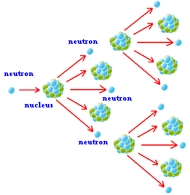
Image from VCE Physics, https://sites.google.com/site/coyleysvcephysics/home/unit-2/optional-studies/26-how-do-fusion-and-fission-compare-as-viable-nuclear-energy-power-sources/fission-and-fusion---lesson-2/chain-reactions-with-dominoes

Progress of an Atom bomb going off. Image from VCE Physics, visit here

As it happens, the explosion of an atom bomb follows the same path as the spread of disease. One neutron appears out of somewhere, and splits a uranium or plutonium atom. Each atom produces two or three more neutrons, so that we might think that R-naught = 2.5, approximately. For a bomb, Ro is found to be a bit lower because we are only interested in fast-released neutrons, and because some neutrons are lost. For a well-designed bomb, it’s OK to say that Ro is about 2.

The progress of a bomb going off will follow the same math as above:

Nn = Rot/nt

where Nn is the total number of neutrons at any time, t is the average number of nanoseconds since the first neutron hit, and nt is the transmission time — the time it takes between when a neuron is given off and absorbed, in nanoseconds.

Assuming an average neutron speed of 13 million m/s, and an average travel distance for neutrons of about 0.1 m, the time between interactions comes out to about 8 billionths of a second — 8 ns. From this, we find the number of neutrons is:

Nn = 2t/8, where t is time measured in nanoseconds (billionths of a second). Since 1 kg of uranium contains about 2 x 1024 atoms, a well-designed A-bomb that contains 1 kg, should take about 83 generations (283 = 1024). If each generation is 8 ns, as above, the explosion should take about 0.664 milliseconds to consume 100% of the fuel. The fission power of each Uranium atom is about 210 MeV, suggesting that this 1 kg bomb could release 16 billion Kcal, or as much explosive energy as 16 kTons of TNT, about the explosive power of the Nagasaki bomb (There are about 38 x10-24 Kcal/eV).

As with disease, this calculation is a bit misleading about the ease of designing a working atomic bomb. Ro starts to get lower after a significant faction of the atoms are split. The atoms begin to move away from each other, and some of the atoms become immune. Once split, the daughter nuclei continue to absorb neutrons without giving off either neutrons or energy. The net result is that an increased fraction of neutrons that are lost to space, and the explosion dies off long before the full power is released.

Computers are very helpful in the analysis of bombs and plagues, as are smart people. The Manhattan project scientists got it right on the first try. They had only rudimentary computers but lots of smart people. Even so, they seem to have gotten an efficiency of about 15%. The North Koreans, with better computers and fewer smart people took 5 tries to reach this level of competence (analyzed here). They are now in the process of developing germ-warfare — directed plagues. As a warning to them, just as it’s very hard to get things right with A-bombs, it’s very hard to get it right with disease; people might start wearing masks, or drinking bottled water, or the CDC could develop a vaccine. The danger, if you get it wrong is the same as with atom bombs: the US will not take this sort of attack lying down.

Robert Buxbaum, January 18, 2019. One of my favorite authors, Issac Asimov, died of AIDS; a slow-moving plague that he contacted from a transfusion. I benefitted vastly from Isaac Asimov’s science and science fiction, but he wrote on virtually every topic. My aim is essays that are sort-of like his, but more mathematical.

Measles, anti-vaxers, and the pious lies of the CDC.

Measles is a horrible disease that contributed to the downfall that had been declared dead in the US, wiped out by immunization, but it has reappeared. A lot of the blame goes to folks who refuse to vaccinate: anti-vaxers in the popular press. The Center for Disease Control is doing its best to promote to stop the anti-vaxers, and promote vaccination for all, but in doing so, I find they present the risks of measles worse than they are. While I’m sympathetic to the goal, I’m not a fan of bending the truth. Lies hurt the people who speak them and the ones who believe them, and they can hurt the health of immune-compromized children who are pushed to vaccinate. You will see my arguments below.

The CDC’s most-used value for the mortality rate for measles is 0.3%. It appears, for example, in line two of the following table from Orenstein et al., 2004. This table also includes measles-caused complications, broken down by type and patient age; read the full article here.

Measles complications, death rates, US, 1987-2000, CDC.

Measles complications, death rates, US, 1987-2000, CDC, Orenstein et. al. 2004.

The 0.3% average mortality rate seems more in tune with the 1800s than today. Similarly, note that the risk of measles-associated encephalitis is given as 10.1%, higher than the risk of measles-diarrhea, 8.2%. Do 10.1% of measles cases today produce encephalitis, a horrible, brain-swelling disease that often causes death. Basically everyone in the 1950s and early 60s got measles (I got it twice), but there were only 1000 cases of encephalitis per year. None of my classmates got encephalitis, and none died. How is this possible; it was the era before antibiotics. Even Orenstein et. al comment that their measles mortality rates appear to be far higher today than in the 1940s and 50s. The article explains that the increase to 3 per thousand, “is most likely due to more complete reporting of measles as a cause of death, HIV infections, and a higher proportion of cases among preschool-aged children and adults.”

A far more likely explanation is that the CDC value is wrong. That the measles cases that were reported and certified as such are the ones that are the most severe. There were about 450 measles deaths per year in the 1940s and 1950s, and 408 in 1962, the last year before the MMR vaccine was developed and by Dr. Hilleman of Merck (a great man of science, forgotten). In the last two decades there were some 2000 measles cases reported US cases but only one measles death. A significant decline in cases, but the ratio does not support the CDC’s death rate. For a better estimate, I propose to divide the total number of measles deaths in 1962 by the average birth rate in the late 1950s. That is to say, I propose to divide 408 by the 4.3 million births per year. From this, I calculate a mortality rate just under 0.01% in 1962, That’s 1/30th the CDC number, and medicine has improved since 1962.

I suspect that the CDC inflates the mortality numbers, in part by cherry-picking its years. It inflates them further by treating “reported measles cases.” as if they were all measles cases. I suspect that the reported cases in these years were mainly the very severe ones. Mild case measles clears up before being reported or certified as measles. This seems the only normal explanation for why 10.1% of cases include encephalitis, and only 8.2% diarrhea. It’s why the CDC’s mortality numbers suggest that, despite antibiotics, our death rate has gone up by a factor of 30 since 1962.

Consider the experience of people who lived in the early 60s. Most children of my era went to public elementary schools with some 1000 other students, all of whom got measles. By the CDC’s mortality number, we should have seen three measles deaths per school, and 101 cases of encephalitis. In reality, if there had been one death in my school it would have been big news, and it’s impossible that 10% of my classmates got encephalitis. Instead, in those years, only 48,000 people were hospitalized per year for measles, and 1,000 of these suffered encephalitis (CDC numbers, reported here).

To see if vaccination is a good idea, lets now consider the risk of vaccination. The CDC reports their vaccine “is virtually risk free”, but what does risk-free mean? A British study finds vaccination-caused neurological damage in 1/365,000 MMR vaccinations, a rate of 0.00027%, with a small fraction leading to death. These problems are mostly found in immunocompromised patients. I will now estimate the neurological risk for actual measles based on the ratio of encephalitis to births, as before using the average birth rate as my estimate for measles cases; 1000/4,300,000 = 0.023%. This is far lower than the risk the CDC reports, and more in line with experience.

The risk for neurological damage from measles that I calculate is 86 times higher risk than the neurological risk from vaccination, suggesting vaccination is a very good thing, on average: The vast majority of people should get vaccinated. But for people with a weakened immune system, my calculations suggest it is worthwhile to not immunize at 12 months as doctors recommend. The main cause of vaccination death is encephalitis, but this only happens in patients with weakened immune systems. If your child’s immune system is weakened, even by a cold, I’d suggest you wait 1-3 months, and would hope that your doctor would concur. If your child has AIDS, ALS, Lupus, or any other, long-term immune problem, you should not vaccinate at all. Not vaccinating your immune-weakened child will weaken the herd immunity, but will protect your child.

We live in a country with significant herd immunity: Even if there were a measles outbreak, it is unlikely there would be 500 cases at one time, and your child’s chance of running into one of them in the next month is very small assuming that you don’t take your child to Disneyland, or to visit relatives from abroad. Also, don’t hang out with anti-vaxers if you are not vaccinated. Associating with anti-vaxers will dramatically increase your child’s risk of infection.

As for autism: there appears to be no autism advantage to pushing off vaccination. Signs of autism typically appear around 12 months, the same age that most children receive their first-stage MMR shot, so some people came to associate the two. Parents who push-off vaccination do not push-off the child’s chance of developing autism, they just increase the chance their child will get measles, and that their child will infect others. Schools are right to bar such children, IMHO.

I’ve noticed that, with health care in, particular, there is a tendency for researchers to mangle statistics so that good things seem better than they are. Health food: is not necessarily so healthy as they say; nor is weight lossBicycle helmets: ditto. Sometimes this bleeds over to outright lies. Generic modified grains were branded as cancer-causing based on outright lies and  missionary zeal. I feel that I help a bit, in part by countering individual white lies; in part by teaching folks how to better read statistic arguments. If you are a researcher, I strongly suggest you do not set up your research with a hypothesis so that only one outcome will be publishable or acceptable. Here’s how.

Robert E. Buxbaum, December 9, 2018.

James Croll, janitor scientist; man didn’t cause warming or ice age

When politicians say that 98% of published scientists agree that man is the cause of global warming you may wonder who the other scientists are. It’s been known at least since the mid 1800s that the world was getting warmer; that came up talking about the president’s “Resolute” desk, and the assumption was that the cause was coal. The first scientist to present an alternate theory was James Croll, a scientist who learned algebra only at 22, and got to mix with high-level scientists as the janitor at the Anderson College in Glasgow. I think he is probably right, though he got some details wrong, in my opinion.

James Croll was born in 1821 to a poor farming family in Scotland. He had an intense interest in science, but no opportunity for higher schooling. Instead he worked on the farm and at various jobs that allowed him to read, but he lacked a mathematics background and had no one to discuss science with. To learn formal algebra, he sat in the back of a class of younger students. Things would have pretty well ended there but he got a job as janitor for the Anderson College (Scotland), and had access to the library. As janitor, he could read journals, he could talk to scientists, and he came up with a theory of climate change that got a lot of novel things right. His idea was that there were  regular ice ages and warming periods that would follow in cycles. In his view these were a product of the precession of the equinox and the fact that the earth’s orbit was not round, but elliptical, with an eccentricity of 1.7%. We are 3.4% closer to the sun on January 3 than we are on July 4, but the precise dates changes slowly because of precession of the earth’s axis, otherwise known as precession of the equinox.

Currently, at the spring equinox, the sun is in “the house of Pisces“. This is to say, that a person who looks at the stars all the night of the spring equinox will be able to see all of the constellations of the zodiac except for the stars that represent Pisces (two fish). But the earth’s axes turns slowly, about 1 days worth of turn every 70 years, one rotation every 25,770 years. Some 1800 years ago, the sun would have been in the house of Ares, and 300 years from now, we will be “in the age of Aquarius.” In case you wondered what the song, “age of Aquarius” was about, it’s about the precession of the equinox.

Our current spot in the precession, according to Croll is favorable to warmth. Because we are close to the sun on January 3, our northern summers are less-warm than they would be otherwise, but longer; in the southern hemisphere summers are warmer but shorter (southern winters are short because of conservation of angular momentum). The net result, according to Croll should be a loss of ice at both poles, and slow warming of the earth. Cooling occurs, according to Croll, when the earth’s axis tilt is 90° off the major axis of the orbit ellipse, 6300 years before or after today. Similar to this, a decrease in the tilt of the earth would cause an ice age (see here for why). Earth tilt varies over a 42,000 year cycle, and it is now in the middle of a decrease. Croll’s argument is that it takes a real summer to melt the ice at the poles; if you don’t have much of a tilt, or if the tilt is at the wrong time, ice builds making the earth more reflective, and thus a little colder and iceier each year; ice extends south of Paris and Boston. Eventually precession and tilt reverses the cooling, producing alternating warm periods and ice ages. We are currently in a warm period.

Global temperatures measured from the antarctic ice showing stable, cyclic chaos and self-similarity.

Global temperatures measured from the antarctic ice showing stable, cyclic chaos and self-similarity.

At the time Croll was coming up with this, it looked like numerology. Besides, most scientists doubted that ice ages happened in any regular pattern. We now know that ice ages do happen periodically and think that Croll must have been on to something. See figure; the earth’s temperature shows both a 42,000 year cycle and a 23,000 year cycle with ice ages coming every 100,000 years.

In the 1920s a Serbian Mathematician, geologist, astronomer, Milutin Milanković   proposed a new version of Croll’s theory that justified longer space between ice ages based on the beat frequency between a 23,000 year time for axis precession, and the 42,000 year time for axis tilt variation. Milanković used this revised precession time because the ellipse precesses, and thus the weather-related precession of the axis is 23,000 years instead of 25,770 years. The beat frequency is found as follows:

51,000 = 23,000 x 42,000 / (42000-23000).

As it happens neither Croll’s nor Milanković’s was accepted in their own lifetimes. Despite mounting evidence that there were regular ice ages, it was hard to believe that these small causes could produce such large effects. Then, in a 1976 study (Hayes, Imbrie, and Shackleton) demonstrated clear climate variations based on the mud composition from New York and Arizona. The variations followed all four of the Milankocitch cycles.

Southern hemisphere ice is growing, something that confounds CO2-centric experts

Southern hemisphere ice is growing, something that confounds CO2-centric experts

Further confirmation came from studying the antarctic ice, above. You can clearly see the 23,000 year cycle of precession, the 41,000 year cycle of tilt, the 51,000 year beat cycle, and also a 100,000 year cycle that appears to correspond to 100,000 year changes in the degree of elliptic-ness of the orbit. Our orbit goes from near circular to quite elliptic (6.8%) with a cycle time effectively of 100,000 years. It is currently 1.7% elliptic and decreasing fast. This, along with the decrease in earth tilt suggests that we are soon heading to an ice age. According to Croll, a highly eccentric orbit leads to warming because the minor access of the ellipse is reduced when the orbit is lengthened. We are now heading to a less-eccentric orbit; for more details go here; also for why the orbit changes and why there is precession.

We are currently near the end of a 7,000 year warm period. The one major thing that keeps maintaining this period seems to be that our precession is such that we are closest to the sun at nearly the winter solstice. In a few thousand years all the factors should point towards global cooling, and we should begin to see the glaciers advance. Already the antarctic ice is advancing year after year. We may come to appreciate the CO2 produced by cows and Chinese coal-burning as these may be all that hold off the coming ice age.

Robert Buxbaum, November 16, 2018.

Of God and gauge blocks

Most scientists are religious on some level. There’s clear evidence for a big bang, and thus for a God-of-Creation. But the creation event is so distant and huge that no personal God is implied. I’d like to suggest that the God of creation is close by and as a beginning to this, I’d like to discus Johansson gauge blocks, the standard tool used to measure machine parts accurately.

jo4

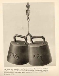
A pair of Johansson blocks supporting 100 kg in a 1917 demonstration. This is 33 times atmospheric pressure, about 470 psi.

Lets say you’re making a complicated piece of commercial machinery, a car engine for example. Generally you’ll need to make many parts in several different shops using several different machines. If you want to be sure the parts will fit together, a representative number of each part must be checked for dimensional accuracy in several places. An accuracy requirement of 0.01 mm is not uncommon. How would you do this? The way it’s been done, at least since the days of Henry Ford, is to mount the parts to a flat surface and use a feeler gauge to compare the heights of the parts to the height of stacks of precisely manufactured gauge blocks. Called Johansson gauge blocks after the inventor and original manufacturer, Henrik Johansson, the blocks are typically made of steel, 1.35″ wide by .35″ thick (0.47 in2 surface), and of various heights. Different height blocks can be stacked to produce any desired height in multiples of 0.01 mm. To give accuracy to the measurements, the blocks must be manufactured flat to within 1/10000 of a millimeter. This is 0.1µ, or about 1/5 the wavelength of visible light. At this degree of flatness an amazing thing is seen to happen: Jo blocks stick together when stacked with a force of 100 kg (220 pounds) or more, an effect called, “wringing.” See picture at right from a 1917 advertising demonstration.

This 220 lbs of force measured in the picture suggests an invisible pressure of 470 psi at least that holds the blocks together (220 lbs/0.47 in2 = 470 psi). This is 32 times the pressure of the atmosphere. It is independent of air, or temperature, or the metal used to make the blocks. Since pressure times volume equals energy, and this pressure can be thought of as a vacuum energy density arising “out of the nothingness.” We find that each cubic foot of space between the blocks contains, 470 foot-lbs of energy. This is the equivalent of 0.9 kWh per cubic meter, energy you can not see, but you can feel. That is a lot of energy in the nothingness, but the energy (and the pressure) get larger the flatter you make the surfaces, or the closer together you bring them together. This is an odd observation since, generally get more dense the smaller you divide them. Clean metal surfaces that are flat enough will weld together without the need for heat, a trick we have used in the manufacture of purifiers.

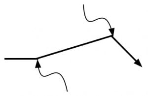
A standard way to think of quantum scattering is that the particle is scattered by invisible bits of light (virtual photons), the wavy lines. In this view, the force that pushes two flat surfaces together is from a slight deficiency in the amount of invisible light in the small space between them.

A standard way to think of quantum scattering of an atom (solid line) is that it is scattered by invisible bits of light, virtual photons (the wavy lines). In this view, the force that pushes two blocks together comes from a slight deficiency in the number of virtual photons in the small space between the blocks.

The empty space between two flat surfaces also has the power to scatter light or atoms that pass between them. This scattering is seen even in vacuum at zero degrees Kelvin, absolute zero. Somehow the light or atoms picks up energy, “out of the nothingness,” and shoots up or down. It’s a “quantum effect,” and after a while physics students forget how odd it is for energy to come out of nothing. Not only do students stop wondering about where the energy comes from, they stop wondering why it is that the scattering energy gets bigger the closer you bring the surfaces. With Johansson block sticking and with quantum scattering, the energy density gets higher the closer the surface, and this is accepted as normal, just Heisenberg’s uncertainly in two contexts. You can calculate the force from the zero-point energy of vacuum, but you must add a relativistic wrinkle: the distance between two surfaces shrinks the faster you move according to relativity, but measurable force should not. A calculation of the force that includes both quantum mechanics and relativity was derived by Hendrik Casimir:

Energy per volume = P = F/A = πhc/ 480 L4,

where P is pressure, F is force, A is area, h is plank’s quantum constant, 6.63×10⁻³⁴ Js, c is the speed of light, 3×10⁸ m/s, and L is the distance between the plates, m. Experiments have been found to match the above prediction to within 2%, experimental error, but the energy density this implies is huge, especially when L is small, the equation must apply down to plank lengths, 1.6×10⁻³⁵ m. Even at the size of an atom, 1×10⁻¹⁰m, the amount of the energy you can see is 3.6 GWhr/m3, 3.6 Giga Watts. 3.6 GigaWatt hrs is one hour’s energy output of three to four large nuclear plants. We see only a tiny portion of the Plank-length vacuum energy when we stick Johansson gauge blocks together, but the rest is there, near invisible, in every bit of empty space. The implication of this enormous energy remains baffling in any analysis. I see it as an indication that God is everywhere, exceedingly powerful, filling the universe, and holding everything together. Take a look, and come to your own conclusions.

As a homiletic, it seems to me that God likes friendship, but does not desire shaman, folks to stand between man and Him. Why do I say that? The huge force-energy between plates brings them together, but scatters anything that goes between. And now you know something about nothing.

Robert Buxbaum, November 7, 2018. Physics references: H. B. G. Casimir and D. Polder. The Influence of Retardation on the London-van der Waals Forces. Phys. Rev. 73, 360 (1948).
S. Lamoreaux, Phys. Rev. Lett. 78, 5 (1996).

Of God and Hubble

Edwin Hubble and Andromeda Photograph

Edwin Hubble and Andromeda Photograph

Perhaps my favorite proof of God is that, as best we can tell using the best science we have, everything we see today, popped into existence some 14 billion years ago. The event is called “the big bang,” and before that, it appears, there was nothing. After that, there was everything, and as best we can tell, not an atom has popped into existence since. I see this as the miracle of creation: Ex nihilo, Genesis, Something from nothing.

The fellow who saw this miracle first was an American, Edwin P. Hubble, born 1889. Hubble got a law degree and then a PhD (physics) studying photographs of faint nebula. That is, he studied the small, glowing, fuzzy areas of the night sky, producing a PhD thesis titled: “Photographic Investigations of Faint Nebulae.” Hubble served in the army (WWI) and continued his photographic work at the Mount Wilson Observatory, home to the world’s largest telescope at the time. He concluded that many of these fuzzy nebula were complete galaxies outside of our own. Most of the stars we see unaided are located relatively near us, in our own, local area, of our own, “Milky Way” galaxy, that is within a swirling star blob that appears to be some 250,000 light years across. Through study of photographs of the Andromeda “nebula”, Hubble concluded it was another swirling galaxy quite like ours, but some 900,000 light years away. (A light year is 5,900,000,000 miles, the distance light would travel in a year). Finding another galaxy was a wonderful find; better yet, there were more swirling galaxies besides Andromeda, about 100 billion of them, we now think. Each galaxy contains about 100 billion stars; there is plenty of room for intelligent life. 

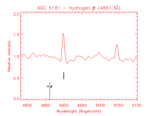
Emission from Galaxy NGC 5181. The bright, hydrogen ß line should be at but it's at

Emission spectrum from Galaxy NGC 5181. The bright, hydrogen ß line should be at 4861.3 Å, but it’s at about 4900 Å. This difference tells you the speed of the galaxy.

But the discovery of galaxies beyond our own is not what Hubble is most famous for. Hubble was able to measure the distance to some of these galaxies, mostly by their apparent brightness, and was able to measure the speed of the galaxies relative to us by use of the Doppler shift, the same phenomenon that causes a train whistle to sound differently when the train is coming towards you or going away from you. In this case, he used the frequency spectrum of light for example, at right, for NGC 5181. The color of the spectral lines of light from the galaxy is shifted to the red, long wavelengths. Hubble picked some recognizable spectral line, like the hydrogen emission line, and determined the galactic velocity by the formula,

V= c (λ – λ*)/λ*.

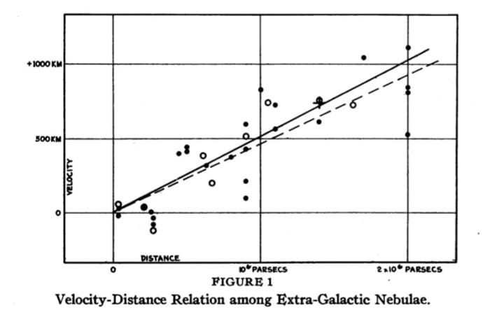
In this equation, V is the velocity of the galaxy relative to us, c is the speed of light, 300,000,000 m/s, λ is the observed wavelength of the particular spectral line, and λ*is the wavelength observed for non-moving sources. Hubble found that all the distant galaxies were moving away from us, and some were moving quite fast. What’s more, the speed of a galaxy away from us was roughly proportional to the distance. How odd. There were only two explanations for this: (1) All other galaxies were propelled away from us by some, earth-based anti-gravity that became more powerful with distance (2) The whole universe was expanding at a constant rate, and thus every galaxy sees itself moving away from every other galaxy at a speed proportional to the distance between them.

This second explanation seems a lot more likely than the first, but it suggests something very interesting. If the speed is proportional to the distance, and you carry the motion backwards in time, it seems there must have been a time, some 14 billion years ago, when all matter was in one small bit of space. It seems there was one origin spot for everything, and one origin time when everything popped into existence. This is evidence for creation, even for God. The term “Big Bang” comes from a rival astronomer, Fred Hoyle, who found the whole creation idea silly. With each new observation of a galaxy moving away from us, the idea became that much less silly. Besides, it’s long been known that the universe can’t be uniform and endless.

Hubble’s plot: Recession velocity vs distance from us in parsecs

Whatever we call the creation event, we can’t say it was an accident: a lot of stuff popped out at one time, and nothing at all similar has happened since. Nor can we call it a random fluctuation since there are just too many stars and too many galaxies in close proximity to us for it to be the result of random atoms moving. If it were all random, we’d expect to see only one star and our one planet. That so much stuff popped out in so little time suggests a God of creation. We’d have to go to other areas of science to suggest it’s a personal God, one nearby who might listen to prayer, but this is a start. 

If you want to go through the Hubble calculations yourself, you can find pictures and spectra of galaxies here for the 24 or so original galaxies studied by Hubble: http://astro.wku.edu/astr106/Hubble_intro.html. Based on your analysis, you’ll likely calculate a slightly different time for creation from the standard 14 billion, but you’ll find you calculate something close to what Hubble did. To do better, you’ll need to look deeper into space, and that would take a better telescope, e.g.  the “Hubble space telescope”

Robert E. Buxbaum, October 28, 2018.

Isotopic effects in hydrogen diffusion in metals

For most people, there is a fundamental difference between solids and fluids. Solids have long-term permanence with no apparent diffusion; liquids diffuse and lack permanence. Put a penny on top of a dime, and 20 years later the two coins are as distinct as ever. Put a layer of colored water on top of plain water, and within a few minutes you’ll see that the coloring diffuse into the plain water, or (if you think the other way) you’ll see the plain water diffuse into the colored.

Now consider the transport of hydrogen in metals, the technology behind REB Research’s metallic  membranes and getters. The metals are clearly solid, keeping their shapes and properties for centuries. Still, hydrogen flows into and through the metals at a rate of a light breeze, about 40 cm/minute. Another way of saying this is we transfer 30 to 50 cc/min of hydrogen through each cm2 of membrane at 200 psi and 400°C; divide the volume by the area, and you’ll see that the hydrogen really moves through the metal at a nice clip. It’s like a normal filter, but it’s 100% selective to hydrogen. No other gas goes through.

To explain why hydrogen passes through the solid metal membrane this way, we have to start talking about quantum behavior. It was the quantum behavior of hydrogen that first interested me in hydrogen, some 42 years ago. I used it to explain why water was wet. Below, you will find something a bit more mathematical, a quantum explanation of hydrogen motion in metals. At REB we recently put these ideas towards building a membrane system for concentration of heavy hydrogen isotopes. If you like what follows, you might want to look up my thesis. This is from my 3rd appendix.

Although no-one quite understands why nature should work this way, it seems that nature works by quantum mechanics (and entropy). The basic idea of quantum mechanics you will know that confined atoms can only occupy specific, quantized energy levels as shown below. The energy difference between the lowest energy state and the next level is typically high. Thus, most of the hydrogen atoms in an atom will occupy only the lower state, the so-called zero-point-energy state.

A hydrogen atom, shown occupying an interstitial position between metal atoms (above), is also occupying quantum states (below). The lowest state, ZPE is above the bottom of the well. Higher energy states are degenerate: they appear in pairs. The rate of diffusive motion is related to ∆E* and this degeneracy.

A hydrogen atom, shown occupying an interstitial position between metal atoms (above), is also occupying quantum states (below). The lowest state, ZPE is above the bottom of the well. Higher energy states are degenerate: they appear in pairs. The rate of diffusive motion is related to ∆E* and this degeneracy.

The fraction occupying a higher energy state is calculated as c*/c = exp (-∆E*/RT). where ∆E* is the molar energy difference between the higher energy state and the ground state, R is the gas constant and T is temperature. When thinking about diffusion it is worthwhile to note that this energy is likely temperature dependent. Thus ∆E* = ∆G* = ∆H* – T∆S* where asterisk indicates the key energy level where diffusion takes place — the activated state. If ∆E* is mostly elastic strain energy, we can assume that ∆S* is related to the temperature dependence of the elastic strain.

Thus,

∆S* = -∆E*/Y dY/dT

where Y is the Young’s modulus of elasticity of the metal. For hydrogen diffusion in metals, I find that ∆S* is typically small, while it is often typically significant for the diffusion of other atoms: carbon, nitrogen, oxygen, sulfur…

The rate of diffusion is now calculated assuming a three-dimensional drunkards walk where the step lengths are constant = a. Rayleigh showed that, for a simple cubic lattice, this becomes:

D = a2/6τ

a is the distance between interstitial sites and t is the average time for crossing. For hydrogen in a BCC metal like niobium or iron, D=

a2/9τ; for a FCC metal, like palladium or copper, it’s

a2/3τ. A nice way to think about τ, is to note that it is only at high-energy can a hydrogen atom cross from one interstitial site to another, and as we noted most hydrogen atoms will be at lower energies. Thus,

τ = ω c*/c = ω exp (-∆E*/RT)

where ω is the approach frequency, or the amount of time it takes to go from the left interstitial position to the right one. When I was doing my PhD (and still likely today) the standard approach of physics writers was to use a classical formulation for this time-scale based on the average speed of the interstitial. Thus, ω = 1/2a√(kT/m), and

τ = 1/2a√(kT/m) exp (-∆E*/RT).

In the above, m is the mass of the hydrogen atom, 1.66 x 10⁻²⁴ g for protium, and twice that for deuterium, etc., a is the distance between interstitial sites, measured in cm, T is temperature, Kelvin, and k is the Boltzmann constant, 1.38 x 10⁻¹⁶ erg/°K. This formulation correctly predicts that heavier isotopes will diffuse slower than light isotopes, but it predicts incorrectly that, at all temperatures, the diffusivity of deuterium is 1/√2 that for protium, and that the diffusivity of tritium is 1/√3 that of protium. It also suggests that the activation energy of diffusion will not depend on isotope mass. I noticed that neither of these predictions is borne out by experiment, and came to wonder if it would not be more correct to assume ω represent the motion of the lattice, breathing, and not the motion of a highly activated hydrogen atom breaking through an immobile lattice. This thought is borne out by experimental diffusion data where you describe hydrogen diffusion as D = D° exp (-∆E*/RT).

Screen Shot 2018-06-21 at 12.08.20 AM

You’ll notice from the above that D° hardly changes with isotope mass, in complete contradiction to the above classical model. Also note that ∆E* is very isotope dependent. This too is in contradiction to the classical formulation above. Further, to the extent that D° does change with isotope mass, D° gets larger for heavier mass hydrogen isotopes. I assume that small difference is the entropy effect of ∆E* mentioned above. There is no simple square-root of mass behavior in contrast to most of the books we had in grad school.

As for why ∆E* varies with isotope mass, I found that I could get a decent explanation of my observations if I assumed that the isotope dependence arose from the zero point energy. Heavier isotopes of hydrogen will have lower zero-point energies, and thus ∆E* will be higher for heavier isotopes of hydrogen. This seems like a far better approach than the semi-classical one, where ∆E* is isotope independent.

I will now go a bit further than I did in my PhD thesis. I’ll make the general assumption that the energy well is sinusoidal, or rather that it consists of two parabolas one opposite the other. The ZPE is easily calculated for parabolic energy surfaces (harmonic oscillators). I find that ZPE = h/aπ √(∆E/m) where m is the mass of the particular hydrogen atom, h is Plank’s constant, 6.63 x 10⁻²⁷ erg-sec,  and ∆E is ∆E* + ZPE, the zero point energy. For my PhD thesis, I didn’t think to calculate ZPE and thus the isotope effect on the activation energy. I now see how I could have done it relatively easily e.g. by trial and error, and a quick estimate shows it would have worked nicely. Instead, for my PhD, Appendix 3, I only looked at D°, and found that the values of D° were consistent with the idea that ω is about 0.55 times the Debye frequency, ω ≈ .55 ωD. The slight tendency for D° to be larger for heavier isotopes was explained by the temperature dependence of the metal’s elasticity.

Two more comments based on the diagram I presented above. First, notice that there is middle split level of energies. This was an explanation I’d put forward for quantum tunneling atomic migration that some people had seen at energies below the activation energy. I don’t know if this observation was a reality or an optical illusion, but present I the energy picture so that you’ll have the beginnings of a description. The other thing I’d like to address is the question you may have had — why is there no zero-energy effect at the activated energy state. Such a zero energy difference would cancel the one at the ground state and leave you with no isotope effect on activation energy. The simple answer is that all the data showing the isotope effect on activation energy, table A3-2, was for BCC metals. BCC metals have an activation energy barrier, but it is not caused by physical squeezing between atoms, as for a FCC metal, but by a lack of electrons. In a BCC metal there is no physical squeezing, at the activated state so you’d expect to have no ZPE there. This is not be the case for FCC metals, like palladium, copper, or most stainless steels. For these metals there is a much smaller, on non-existent isotope effect on ∆E*.

Robert Buxbaum, June 21, 2018. I should probably try to answer the original question about solids and fluids, too: why solids appear solid, and fluids not. My answer has to do with quantum mechanics: Energies are quantized, and always have a ∆E* for motion. Solid materials are those where ω exp (-∆E*/RT) has unit of centuries. Thus, our ability to understand the world is based on the least understandable bit of physics.

Most traffic deaths are from driving too slow

About 40,100 Americans lose their lives to traffic accidents every year. About 10,000 of these losses involve alcohol, and about the same number involve pedestrians, but far more people have their lives sucked away by waiting in traffic, IMHO. Hours are spent staring at a light, hoping it will change, or slowly plodding between destinations with their minds near blank. This slow loss of life is as real as the accidental type, but less dramatic.

Consider that Americans drive about 3.2 trillion miles each year. I’ll assume an average speed of 30 mph (the average speed registered on my car is 29 mph). Considering only the drivers of these vehicles, I calculate 133 billion man-hours of driving per year; that’s 15.2 million man-years or 217,000 man-lifetimes. If people were to drive a little faster, perhaps 10% faster, some 22,000 man lifetimes would be saved per year in time wasted. The simple change of raising the maximum highway speed to 80 mph from 70, I’d expect, would save half this, maybe 10,000 lifetimes. There would likely be some more accidental deaths, but not more accidents. Tiredness is a big part of highway accidents, as is highway congestion. Faster speeds decreases both, decreasing the number of accidents, but one expects there will be an increase in the deadliness of the accidents.

Highway deaths for the years before and after Nov. 1995. Most states raised speeds, but some left them unchanged.

Highway deaths for the years before and after speed limit were relaxed in Nov. 1995. At that time most states raised their speed limits, but some did not, leaving them at 65 rural, 55 urban; a few states were not included in this study because they made minor changes.

A counter to this expectation comes from the German Autobahn, the fastest highway in the world with sections that have no speed limit. German safety records show that there are far fewer accidents per km on the Autobahn, and that the fatality rate per km is about 1/3 that on other stretches of highway. This is about 1/2 the rate on US highways (see safety comparison). For a more conservative comparison, we could turn to the US experience of 1995. Before November 1995, the US federal government limited urban highway speeds to 55 mph, with 65 mph allowed only on rural stretches. When these limits were removed, several states left the speed limits in place, but many others raised their urban speed limits to 65 mph, and raised rural limits to 70 mph. Some western states went further and raised rural speed limits to 75 mph. The effect of these changes is seen on the graph above, copied from the Traffic Operations safety laboratory report. Depending on how you analyze the data, there was either a 2% jump (institute of highway safety) in highway deaths or perhaps a 5% jump. These numbers translate to a 3 or 6% jump because the states that did not raise speeds saw a 1% drop in death rates. Based on a 6% increase, I’d expect higher highway speed limits would cost some 2400 additional lives. To me, even this seems worthwhile when balanced against 10,000 lives lost to the life-sucking destruction of slow driving.

Texas has begun raising speed limits. Texans seem happy.

Texas has begun raising speed limits. So far, Texans seem happy.

There are several new technologies that could reduce automotive deaths at high speeds. One thought is to only allow high-speed driving for people who pass a high-speed test, or only for certified cars with passengers who are wearing a 5-point harness, or only on roads. More relevant to my opinion is only on roads with adequate walk-paths — many deaths involve pedestrians. Yet another thought; auto-driving cars (with hydrogen power?). Computer-aided drivers can have split second reaction times, and can be fitted with infra-red “eyes” that see through fog, or sense the motion of a warm object (pedestrian) behind an obstruction. The ability of computer systems to use this data is limited currently, but it is sure to improve.

I thought some math might be in order. The automotive current that is carried by a highway, cars/hour, can be shown to equal to the speed of the average vehicle multiplied by the number of lanes divided by the average distance between vehicles. C = v L/ d.

At low congestion, the average driving speed, v remains constant as cars enter and leave the highway. Adding cars only affects the average distance between cars, d. At some point, around rush hour, so many vehicles enter the highway that d shrinks to a distance where drivers become uncomfortable; that’s about d = 3 car lengths, I’d guess. People begin to slow down, and pretty soon you get a traffic jam — a slow-moving parking lot where you get less flow with more vehicles. This jam will last for the entirety of rush hour. One of the nice things about auto-drive cars is that they don’t get nervous, even at 2 car lengths or less at 70 mph. The computer is confident that it will brake as soon as the car in front of it brakes, maintaining a safe speed and distance where people will not. This is a big safety advantage for all vehicles on the road.

I should mention that automobile death rates vary widely between different states (see here), and even more widely between different countries. Here is some data. If you think some country’s drivers are crazy, you should know that many of the countries with bad reputations (Italy, Ireland… ) have highway death rates that are lower than ours. In other countries, in Africa and the mid-east death rates per car or mile driven are 10x, 100x, or 1000x higher than in the US. The countries have few cars and lots of people who walk down the road drunk or stoned. Related to this, I’ve noticed that old people are not bad drivers, but they drive on narrow country roads where people walk and accidents are common.

Robert Buxbaum, June 6, 2018.

What drives the jet stream

Having written on controversial, opinion things, I thought I’d take break and write about earth science: the jet stream. For those who are unfamiliar the main jet stream is a high-altitude wind blowing at about 40,000 feet (10 km) altitude at about 50° N latitude. It blows west to east at about 100 km/hr (60 mph), about 12% of the cruising of a typical jet airplane. A simple way to understand the source of the jet stream is to note that the earth spins slower (in mph) at the poles than at lower latitudes, but that the temperature difference between the poles and equator guarantees that air at high altitude is always traveling toward the poles from the lower latitudes.

Consider that the earth is about 40,000 km is circumference and turns once every 24 hours. This suggests a rotation speed of 1667 km/hr at the equator. At any higher latitude the speed is 1667 cos latitude. Thus it’s 1070 km/hr at 50° latitude, 0 km/hr at the north pole; 1667km/hr cos 50°= 1070 km/hr.

Idealize north-south circulation of air around our globe.

Idealized north-south circulation of air around our globe.

It’s generally colder at the poles than it is at lower latitudes — that is nearer the equator (here’s why). This creates a north-south wind where the air becomes more compact as it cools in northern climate (50°latitude  and further north), and this creates a vacuum at high altitudes and a high pressure zone at low altitudes. The result is a high altitude flow of air towards north, and a flow of low altitude air south, a process that is described by the idealized drawing at right.

At low altitudes in Detroit (where I am) we experience winds mostly from the north and from the east. Winds come from the east — or appear to — because of the rotation of the earth. The air that flows down from Canada is moving west to east at a slower speed than Detroit is moving west to east. We experience this as an easterly wind. At higher altitudes, the pattern is reversed. At 9 to 12 km altitudes, an airplane would experience winds mostly from the south-west. Warm air from lower latitudes is moving eastward at 1200 or more km/hr because that’s the speed of the earth. As it moves north, it discovers that the land is moving eastward at a much slower speed, and the result is the jet stream. The maximum speed of the jet stream is about 200 km/hr, the difference in the earth’s east-speed between that at 40°N and at 50°N, while the typical speed is about half of that, 100 km/hr. I’d attribute this slower speed to friction or air mixing.

One significance of the jet stream is that it speeds west-east air-traffic, e.g. flights from Japan to the US or from the US to Europe. Airlines flying west to east try to fly at the latitude and altitude of the jet stream to pick up speed. Planes flying the other way go closer to the pole and/or at different altitudes to avoid having the jet stream slowing them down, or to benefit from other prevailing winds.

I note that Hurricanes are driven by the same forces as the jet stream, just more localized. Tornados are the same, just more localized. A localized flow of this sort can pick stuff up here’s how they pick stuff upRobert Buxbaum, May 22, 2018

Alkaline batteries have second lives

Most people assume that alkaline batteries are one-time only, throwaway items. Some have used rechargeable cells, but these are Ni-metal hydride, or Ni-Cads, expensive variants that have lower power densities than normal alkaline batteries, and almost impossible to find in stores. It would be nice to be able to recharge ordinary alkaline batteries, e.g. when a smoke alarm goes off in the middle of the night and you find you’re out, but people assume this is impossible. People assume incorrectly.

Modern alkaline batteries are highly efficient: more efficient than even a few years ago, and that always suggests reversibility. Unlike the acid batteries you learned about in highschool chemistry class (basic chemistry due to Volta) the chemistry of modern alkaline batteries is based on Edison’s alkaline car batteries. They have been tweaked to an extent that even the non-rechargeable versions can be recharged. I’ve found I can reliably recharge an ordinary alkaline cell, 9V, at least once using the crude means of a standard 12 V car battery charger by watching the amperage closely. It only took 10 minutes. I suspect I can get nine lives out of these batteries, but have not tried.

To do this experiment, I took a 9 V alkaline that had recently died, and finding I had no replacement, I attached it to a 6 Amp, 12 V, car battery charger that I had on hand. I would have preferred to use a 2 A charger and ideally a charger designed to output 9-10 V, but a 12 V charger is what I had available, and it worked. I only let it charge for 10 minutes because, at that amperage, I calculated that I’d recharged to the full 1 Amp-hr capacity. Since the new alkaline batteries only claimed 1 amp hr, I figured that more charge would likely do bad things, even perhaps cause the thing to blow up.  After 5 minutes, I found that the voltage had returned to normal and the battery worked fine with no bad effects, but went for the full 10 minutes. Perhaps stopping at 5 would have been safer.

I changed for 10 minutes (1/6 hour) because the battery claimed a capacity of 1 Amp-hour when new. My thought was 1 amp-hour = 1 Amp for 1 hour, = 6 Amps for 1/6 hour = ten minutes. That’s engineering math for you, the reason engineers earn so much. I figured that watching the recharge for ten minutes was less work and quicker than running to the store (20 minutes). I used this battery in my firm alarm, and have tested it twice since then to see that it works. After a few days in my fire alarm, I took it out and checked that the voltage was still 9 V, just like when the battery was new. Confirming experiments like this are a good idea. Another confirmation occurred when I overcooked some eggs and the alarm went off from the smoke.

If you want to experiment, you can try a 9V as I did, or try putting a 1.5 volt AA or AAA battery in a charger designed for rechargeables. Another thought is to see what happens when you overcharge. Keep safe: do this in a wood box outside at a distance, but I’d like to know how close I got to having an exploding energizer. Also, it would be worthwhile to try several charge/ discharge cycles to see how the energy content degrades. I expect you can get ~9 recharges with a “non-rechargeable” alkaline battery because the label says: “9 lives,” but even getting a second life from each battery is a significant savings. Try using a charger that’s made for rechargeables. One last experiment: If you’ve got a cell phone charger that works on a car battery, and you get the polarity right, you’ll find you can use a 9V alkaline to recharge your iPhone or Android. How do I know? I judged a science fair not long ago, and a 4th grader did this for her science fair project.

Robert Buxbaum, April 19, 2018. For more, semi-dangerous electrochemistry and biology experiments.