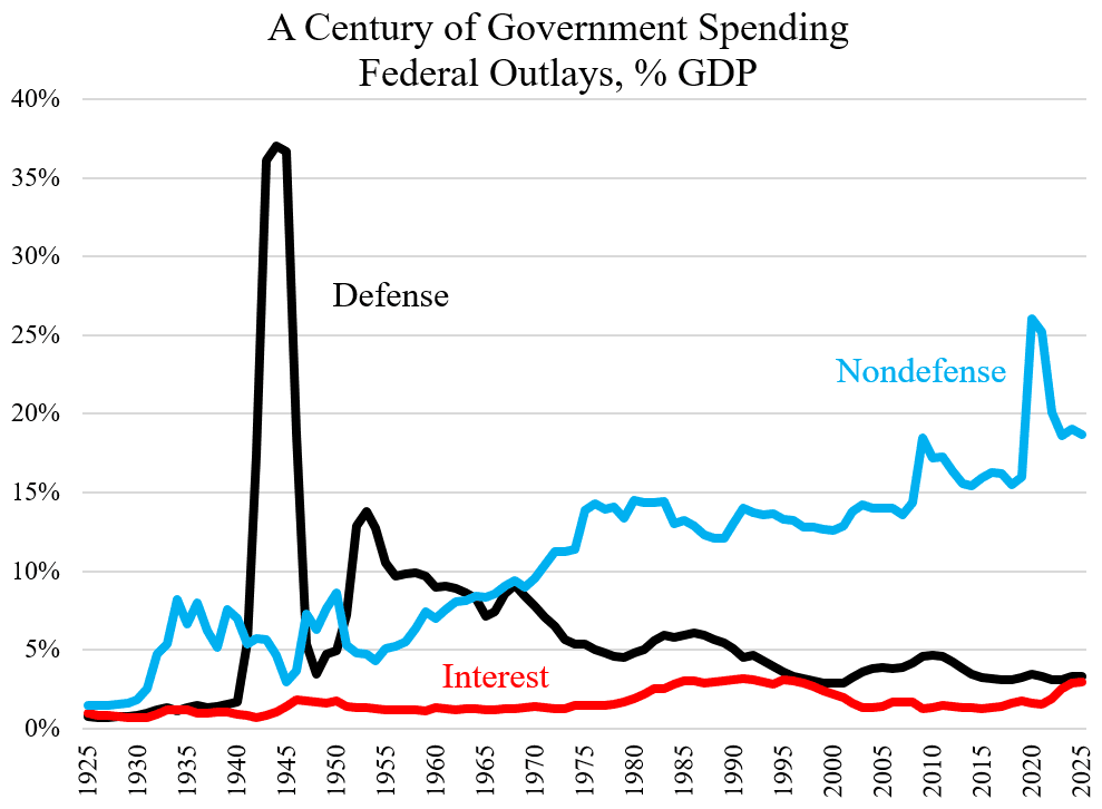
Donald Trump has announced his intent to build at least two battleships, the first built for our navy since the USS Missouri, 1944. The press has been largely negative on this, claiming that these ships are obsolete already, and will be more-so when they are completed — assuming they are completed. My sense is these are useful, overdue really, and I’d like to explain why.

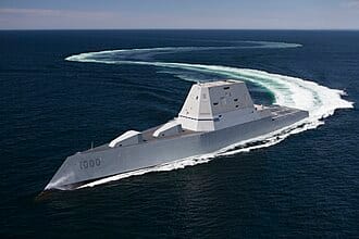
The centerpiece of America’s military power lies in our aircraft carrier groups, currently. We have 11 carriers in service: two modern, Ford class, and nine older, Nimitz class. Each of these weighs 100,000 tons, is 1100 feet long, and carries some 6000 men and women, 3200 navy crew, another 2500 in the air wing, and perhaps 300 support staff of doctors, nurses, and marines. Because they are vulnerable, each carrier travels in a group with six to ten other ships carrying an additional 3000 people, see photo. Without the support ships a carrier is deemed to be too vulnerable for use. Even with the support ships, Swedish and French submarines successfully “sank” U.S. carriers during exercises in 2005 and 2015.
The support ships are typically slower than the carrier and difficult to maintain. Many are old with relatively short range. Our carriers can go around the world, 30000 miles, traveling at 30+ knots, but the main support ships, Arleigh Burke destroyers, 9000 tons, 350 crew, have a range of only 4,400 nmi at a slower, 20 knots. They require regular refuelings for any major mission, like patrolling the Caribbean. Still, they’re “cheap,” about $2.5B each, capable, and work relatively well. We have some 75 in service, built since 1991, with more on order.
We also have nuclear missile submarines, but these are blunt instruments of policy, not suited to most navy missions, like keeping open shipping lanes in the Red Sea or stopping ISIS, or for blockading Venezuela. The mostly hold weapons of last resort.
The navy has recognized the need for a larger support ship for better carrier protection and more flexible roles, a cruiser likely, with good range and weapons, and with enough speed to keep up with a carrier crossing the Pacific. We’ve built many cruisers over the years, but these are old. Our latest are the Ticonderoga class guided-missile cruisers built from 1980 onward. They have good speed, 32.5kn, and good range, 6000nm, but are well past their retirement date, and break down a lot. Only 7 are still in service.
The supposed replacement, was a cruiser-size, stealth ship, the Zumwalt destroyer, 17,000 tons and 600 feet long. It is reasonably fast, 33.5kn, and carries a small crew, <100. We’ve managed to build three of these since 2008, but have cancelled the project due to operational problems and costs that rose to $8B per ship. Zumwalts have inward-sloped sides that deflect radar, but they become unstable in turns. Its main weapons are expensive, too: Aegis missiles and CPS hypersonics costing $28-$50 million each. That’s uneconomical compared to French Aster missiles, Mach 3, 80 mile range, $1.1 million. Originally, Zumwalt destroyers carried a rail gun, but it required so much power that you could not move the ship and fire at the same time. The rail guns were eventually replaced by conventional 5″ cannon with a 24 mile range. The three Zumwalts we have are hardly used today, and no more are on order. Something cheaper was needed at least for support, and that was supposed to be the Constellation Frigate, approved by Trump in 2017.
A frigate is smaller than a cruiser, in this case about half the weight. The Constellation was a proven Italian design, 492 feet long and only 7,291 tons. It had good speed, 26 kn, good range, 6000 nm at 16kn, and cost only $950 million, at least when built in Europe. The contract was awarded to Fincantieri Marinette Marine (FMM) of Marinette Wisconsin, the US division of the Italian company. What could go wrong? The problem was that the navy kept adding capabilities and weight. As of November 2025, eight years on, the weight had increased by 700 tons, the cost to $9 B for two, and no design has been finalized. The first Constellation frigate is only 12% built! Trump has not quite cancelled the program, but has reduced the order to two from the original eight.
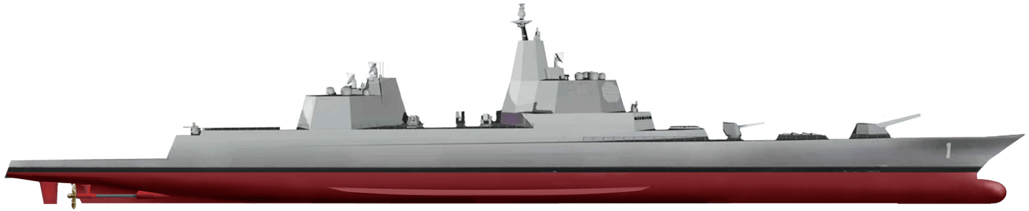
And that brings us to the current, Trump class battleship, shown above. It’s long, 840-880 feet, and heavy, 39,000 tons, or 2.5 times the weight of the cruiser-sized, Zumwalt. As was intended for the Zumwalt, the offensive weapons are missiles and a rail gun, 32 MJ, but now there is enough power run the ship and fire the weapon. Japanese versions of the rail gun have launched cheap shells at hypersonic speeds, ~5000 mph (hypersonic) at up to one per second to 100 miles. The shells cost only $85,000 each, a bargain.
For defense, these battleships are to carry two, 300kW, Helios lasers, similar to Israel’s “Iron beam,” but 3 times as powerful. They are augmented by smaller lasers, by four, 30 mm chain guns (Gatling guns), and two, 5″ conventional navy guns of 24 mile range. Engines are estimated to be two gas turbines, perhaps 50MW each, to power the weapons, plus ~100 MW in diesel power for cruising at good mpg. I thus estimate a total of ~200 MW, about as much as on a carrier. There is plentiful space for missiles and fuel too, and it should be ale to do some resupply of support ships. The crew size is bigger than on the Ticonderoga, 600 to 800, but far less than on a carrier. And the look is impressive. It could be a command ship. Still, there are objections.
A main complaint is vulnerability as discussed here. Some see these ships are “bomb magnets,” not stealthy, nor as heavily armored as the Iowas, with lasers and chain guns insufficient to defend them, e.g. from dedicated swarm attacks. Detractors note that Battleships like the Bismarck, Yamamoto, and Arizona have been sunk, typically by air attack, but what they don’t mention is that it took a lot of bombs and torpedos to sink these battleships. Also these battleships will typically travel with support.
Detractors also question the rail gun. Can it shoot down an airplane? can it sink a ship? We don’t know. They point of that the cost and construction time of the ship is high and likely to balloon. Wouldn’t it make more sense to fix the Constellation or the Zumwalt. The tests I’ve seen suggest that the rail gun can not sink a ship with one shot; that still needs a missile. If the gun can hit a plane or missile, it will destroy it, but accuracy may not be sufficient, at long range. The gun seems appropriate for shore bombardment and for slowing a Chinese navy that is already bigger than ours. As for the defensive lasers, these have been shown to stop drones and cruise missiles at a cost of only $10 per shot: nothing compared to a harpoon missile ($1.4 million each) or Aegis ($28 million). I don’t see a smaller ship being able to power these weapons, especially if you want extra room for expansion, like adding a nuclear reactor.
The time-line is what worries me most. For ten years at least, we will have to rely on short-range Arleigh Burkes that could not bombard the Houthis effectively on land, did not effectively defend US shipping in the Red Sea, and that uses million-dollar missiles to shoot down $20,000 drones. And in ten years, will we still want it.
Robert Buxbaum, January 5, 2026. As a totally side issue: I doubt this is a battleship: It currently carries only one powerful gun. You need at least two to be a battleship, IMHO.


